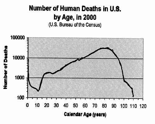
I’m reviving this thread because I finally crunched through the data that Galileo linked to, and I wanted to share my results here with anyone who is still vaguely interested. The data at that link includes deaths by age, which is what I had asked for in my OP. This was easy to plot by itself, but I also wanted to plot survival probabilities for defined periods, which was a bit more interesting.
The challenge in doing so is that over the past 100 years, very different numbers of babies were born each year. It’s actually varied by a factor of two, and not in the direction you’d expect:
Plot of US Cohort Births by Age in 2007
(please excuse the typo: the left vertical axis caption should read “…Population/100”, not "…“Population/100M”)
Note that the horizontal axis is “age in 2007”. So people who were 100 in 2007 were born in 1907. The birth *rate[/i ]was about twice as high then as it is now (30 vs. 14 live births per 1000 people), but the total population then was about 1/4 what it is now (70M vs. 300M). The net effect is that the total number of live births in 1907 was about half what it is now. So when you want to compute survival probabilities, you have to start by dividing the absolute number of fatalities in each cohort by the absolute number of live births in that cohort. Then you can run the numbers:
Plot of US Mortality and Conditional Survival Probability by Age in 2007
The blue trace is the raw number of fatalities in each 1-year cohort in 2007. So for example, if you were 83 in 2007, you saw 15X more of your friends die than your 20-year-old grandson did. When you correct these raw numbers for live births, you end up with the magenta trace, and it’s those corrected values that I used for computing survival probabilities. Those traces answer the question: “given that I have reached the age of X, what is the probability that I will survive another one/five/ten years?”
Some notes and speculations about the features in the data:
-Sadly, infant mortality is very real. An uncomfortably large number of infants died in their first year of life. If you’ve got a healthy toddler, give him/her a hug; they’ve made it through the scariest part of their childhood.
-Fatalities are very low for pre-teens. Once kids get to their upper teen years, something happens to cause higher fatality rates. I’m guessing this is related to teens’ poor judgment of risk and reduced parental supervision - car wrecks, drinking, violence, etc.
-Things calm down a bit in the late 20’s: young adults are getting smarter about risk, and are still relatively healthy.
-After 35, the fatality rate starts climbing steadily, presumably corresponding with a gradual decline of physical health.
-The raw fatality numbers did some funny things for people in their early 60’s. These are folks who were born during or shortly after WW2, when birth rates did correspondingly funny things. Normalizing for the number of live births squelched a lot of that zig-zag, though not quite all of it. I would assume deaths are well-documented these days, but maybe births were not as reliably documented in the 1940’s, so maybe that accounts for the remainder of the jiggling there.
-One-year survival probabilities for centenarians becomes increasingly noisy because in 2007 the number of fatalities in each cohort is very low. For supercentenarians (those who have reached/exceeded 110), the numbers fall to virtually nothing: six 110-YO’s died in 2007, and one 112-YO. The noise for the five-year and ten-year survival probabilities is much lower because they are calculated by multiplying five or ten of the subsequent one-year probabilities, which smooths things out quite a bit.