TriPolar -
Your point led me to this page: History of printing in East Asia - Wikipedia
Check out the section on “Comparison of Woodblock and Movable type in East Asia”
So, while I initially thought that it would be impossible to do manual type the way we usually think of it with the type sets in cases, in fact it does seem possible.
Just very time consuming and impractical.
So I somehow doubt they use similar methods today, although maybe.
AaronX -
Well, you can write a slightly incorrect version of English words and people might not notice or care. Doesn’t mean that if they wrote it themselves, they wouldn’t do it correctly.
Still, I guess it’s possible. I just figure if I learned something in week one of Chinese study, generally native speakers know it too.
(Sorry for all the Wikipedia cites. My download speed is throttled at the moment and I really can’t be bothered to spend ages loading a bunch of different sites. So if I am wrong about anything, please feel free to correct me)
I am a native Chinese speaker and I hope I can help you to clear your doubt regarding the formation of Chinese characters. I tried my best not to complicate stuff and make it as simple as possible though the last 2 categories are relatively difficult to explain and understand. But luckily, those 2 are not really common and important nowadays. Examples chosen are basically those well-known and easily-understandable ones.
*Traditional Chinese lexicography categorized Chinese characters into 6 classes called 六书 *liù shū *(the “Six Writings”).
*Just bear in mind that Chinese characters were not initially created based on these 六书, they were instead categorized into the 6 classes later.
*Chinese character has 3 elements-Image (form), Sound & Meaning. The “Six Writings” 六书:
*1. 象形xiàng xíng (Pictograms) Most ancient!
Are among the oldest characters created based on drawing. Those ancient characters found on Oracle bone basically falls under this category. Examples:
雨yǔ (rain); 目mù (eye); 山shān (mountain); 日rì (sun); 月yuè (moon)
*2. 指事*zhǐ shì (Ideographic characters)
Modification of pictographic characters using iconic indication. Examples:
上shàng-an extra stroke is added above the horizontal line/ horizon to indicate “up/above”
下xià- an extra stroke is added below the horizontal line/ horizon to indicate “down/below”
本 běn is formed from the word 木mù (tree) with an extra stroke at the base. So, it means the “base of the tree” aka the “root”.
末mò is simply the reverse of 本 . 末 is formed by 木 (tree) with an extra stroke at the top. So, it means the “apex” aka the “branch” in this context.
Something extra:
A 4-word Chinese idiom-本末倒置běn mò dào zhì *(literally: root branch reverse)means do thing in a wrong order, synonymous to “to put the cart before the horse” in English.
3. 会意*huì yì (Compound ideographs or Logical aggregates) Compounds of two or more pictographic or ideographic characters. Examples:
休xiū=人rén (man) +木mù (tree)–>a man leaning against tree, so it means “rest”
森sēn=3 木 (trees)–>means “forest”
焚fén =2木(woods) +火huǒ (fire)–>woods on fire, so it means “burn”
歪wāi= 不bù (not)+正zhèng (upright/straight)–>means “crooked/bent”
尘chén=小xiǎo (small)+土tǔ (soil)–>means “dust”
*4. 形声xíng shēng (Phono-semantic compound characters) Most common!
Majority of Chinese characters fall under this category.
It has 2 components:
a) 声shēng:The phoenetic component (which has approximately similar pronunciation to the new character) &
b) 形xíng:The semantic component (which is the element that provides some sort of meaning to the new character)
Examples:
梅méi (plum/ plum blossom)=木(the semantic part which means a tree)+每měi(the phonetic part)
*Note the similar pronunciation of 梅 & 每; 每 bears the meaning of “every” and has totally nothing to do with the “plum/plum blossom”. It simply contributes to the pronunciation part.
沐mù (bath)= 氵(the sementic part which means water) + 木mù (the phonetic part) Note: 氵is the radical form of 水shuǐ* (water) & here, 沐 and 木 have exactly the same pronunciation.
*Perhaps you would have noticed that the semantic part(形) is on the left whereas the phoenetic part (声) is on the right. But it is not necessary so. There are so many other forms. Eg. 形 on the right while 声 on the left// 形 is above while 声 is below ;vice versa// 形 is outside while 声 is inside; vice versa…………
At times, Chinese learners might encounter with a new word which they don’t know how to pronounce it. So they may tend to 有边读边yǒu biān dú biān* “read the side”, meaning to say they take one component of the Chinese character to be a phonetic, which often results in errors.
*5. 假借jiǎ jiè (Rebus/ phonetic loan characters) Relatively not important!
Literally “loaned and borrowed character”.
Are characters that are “borrowed” to write another homophonous or near-homophonous morpheme.
This is a bit complicated to explain.
Example:
長zhǎng initially meant “aged” in ancient times. Because the words for “aged” and “county head” were pronounced the same, the character 長was then borrowed to mean “county head”.
*Note: In this case, the loaned and borrowed characters both persist and this results in a character with multiple meanings. However, sometimes the loaned character will adopt another new character, totally different from the original one.
Example:
亦yì initially meant “armpit” in ancient times. Because the words for “armpit” and “also/too” were pronounced similar, the character 亦was then borrowed to mean “also/too” while the word “armpit” is represented by another new character 腋yè.
*6. 转注zhuǎn zhù (Derivative cognates) Relatively not important!
Is a method whereby the ancient people created several other words of similar meaning from an original word. Example:
老 lǎo 、耆qí、耋dié are all derived from the word 考 kǎo and bear the same meaning of “old/aged”.
Hereby I attached those online links that I had referred to in this write-up.
Also look at Mathematics’s Wiktionary link. Even on that page both variants are present. And in a Google search, both variations come up, even in calligraphy.
What is bizarre is that the same “how to write” site above that lists it with 3 strokes also says it comes from the radical “目”, which only has 2 strokes.
It might also be a font difference, even if you exclude Japanese. The first two have two strokes while the rest have three.
I’m a semi-literate native Chinese speaker and I never would’ve thought to check my computer’s fonts for the correct number of strokes. I’ll ask others about it later but I suspect they would never have thought about this either.
I would think the wrong number of strokes in a Chinese character would be similar to a spelling misteak in English.
Misteak is mispelled intentionally.
Sew was mispelled.
I don’t no how to spell so correctly, so that won was a misteak.
In Japanese there are only two strokes. I only have Japanese fonts on my computer and cutting and pasting the character only gives the same result, regardless of the size.
I asked my native Taiwanese wife and she said that when she was young, it was taught as having two strokes, but later changed to three. She wasn’t sure why. She’s in Japan at the moment and too busy to really follow up. I’ll ask the native Taiwanese later today at work.
There’s no question that 真, in Japanese, has only two strokes. Since this is a thread about fonts, I compared common Japanese fonts such as Kozuka Mincho and Osaka to Chinese fonts like SimSun and MingLiU, and indeed, the number of stroke is different.
I just spoke to another three native Chinese people. Two insisted it was two strokes, one said it was definitely three. One of their iPhones said it was 3 while this Windows computer says 2 (at least for the SDMB font).
And jovan, are you sure there aren’t variations in the Japanese fonts the same way there are in the Chinese fonts? Is the Japanese character even the same Unicode code point as the Chinese one?
Yes, it’s the same Unicode code point: CJK UNIFIED IDEOGRAPH-771F. However, the issue is that the Chinese and Japanese simplified characters are slightly different. In Japanese, you write (from top to bottom) : 十 目 ー 八. In Chinese, the vertical strokes of 目 are extended to touch the horizontal stroke, whereas in Japanese, 目 floats above it. this is where the extra stroke comes from. See the Japanese way of writing it: 「真」の書き方 - 漢字の正しい書き順(筆順)
Seeing Japanese has 2 and Chinese has 3, it may be a matter of fonts mixing up the 2, rather than simplifying due to lack of space. I still think it’s the latter. I’ll go look for more examples. Still, Chinese people mixing it up (I’ve never heard of it being 2 strokes in Chinese) proves my point of fonts influencing language. And as others have seen, it’s not rare.
Both modern Chinese and modern Japanese have been simplified from older traditional forms, but they’ve been simplified in different ways. I’m certain this is the reason for the stroke discrepancy cited above. Computer fonts have not influenced either writing system appreciably. All of the changes in modern characters were introduced after WWII, but far before computers became widespread. All of the changes are present in handwritten modern forms.
Computers weren’t a major factor in Japan until at least the early 80s and there were significant changes in even the most widespread encoding (JIS) up to the end of the 90s. There are still competing encoding standards for writing Japanese fonts, to the point where mojibake is a problem. Unicode doesn’t always work, neither does the usual fallback, Shift-JIS; sometimes it’s EUC or something even more obscure. We’re not talking opening a file in some proprietary standard, this is just plain, un-marked-up text — a bog-standard TXT file.
Here’s another example of writing differences:
[ul]
[li]traditional character 澤[/li][li]modern Japanese 沢[/li][li]modern Chinese 泽[/li][/ul]
Is it really that Japanese has 2 and Chinese has three? Or is there are the same number of horizontal strokes, and it’s just that the vertical lines are extended in Chinese so there is just confusion about what was being counted? I was counting the internal strokes within the 目 which have two. Counting the bottom of 目 as a stoke, you get three strokes.
Looking at this page on my Chinese language iPhone, I get the version with the extended vertical lines and on this Japanese laptop, I get the Japanese version. Same character, same number of horizontal lines, just that in Chinese the vertical lines extend to the ー while in Japanese the 目 floats above it.
Yeah, like I wrote, the Chinese and Japanese 真 have the same number of strokes, it’s just that the Chinese version connects the vertical strokes to the bottom line. However, that subtle difference is enough to change what we perceive as an “inside” stroke.
By the way, and back on track for the OP, I found a great article about famed typography designer Masahiko Kozuka.
He explains how, at the start of his career, he was making movable type fonts. At the time photographic film was too expensive and so after drawing the characters by hand, he would reverse them manually by painting in ink on transparent paper. This was all done in free hand.
He then goes on talking about how in the late 80s, they started using computers and moved towards a group-based design process, so that they could finish a font within six months. Before that it was just a single designer drafting thousands of glyphs by himself.
One of the things they did was to groups glyphs according to their shape. This is a very fine grouping: for instance, 体 侍 仏 働 仁 all have the same left part:イ. However, they don’t all have exactly the same proportions. There are actually seven typographical variations of this radical. So the first step is to group the characters according to these variations.
The lead designers then draw the most common or important characters for each group. Junior designers then use these as a template for their work on the less important (but far more numerous) characters. Much of that work can be done by recycling the parts drawn by the team leaders. Since the glyphs are grouped based on shape variations, there is no problem with copy-and-pasting.
The radical I mentioned earlier, イ, is used in about 230 characters, but Kozuka says that he only draws three characters for each of the seven variations, so only 1/10 of all the characters. His underlings do the rest.
It’s possible that fonts in which the vertical lines don’t extend all the way are Japanese, since the word 直 in those fonts doesn’t look the way it’s supposed to in Chinese either. (Second line is how they should look in Chinese, third line is ??? font)
But, my original point was: font design has to make concessions for screen resolution, and in fact they have to come up with special versions for low resolution (first line shows the same word, same font, just different size, which really only has 2 horizontal inner lines this time), they can’t just shrink it down. This has influenced how people see the word now (Sleel you have to prove people were writing it with 2 lines before computers came about if that’s what you mean).
I think you’re onto something about the separation of the two and bottom, at least if you look at this page – all the fonts which separate it into two parts make it look like the inside only has two strokes.
Not sure if it’s a Japanese vs Chinese difference, though. Wiktionary attributes that to both Japanese and Traditional (Chinese), and supposedly only the Simplified version has it connected.
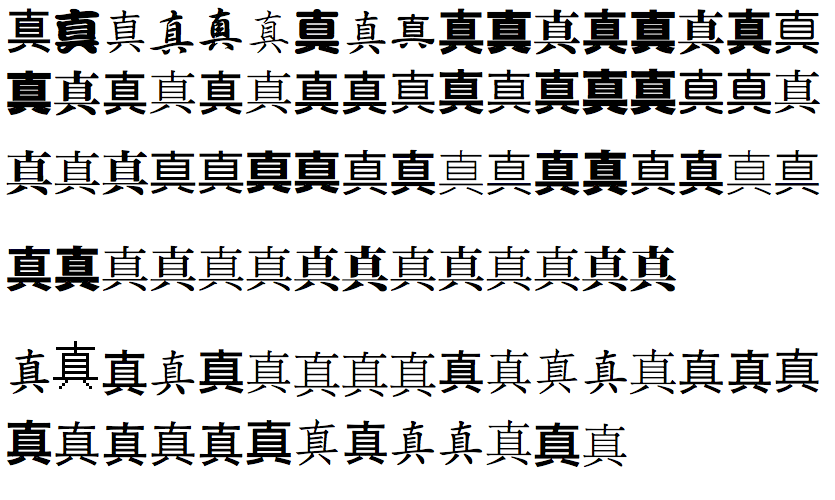
By the way, the font list you linked to is woefully lacking in Asian fonts. Here’s the same glyph shown with all the fonts on my computer. I put the Japanese fonts above and the Chinese fonts below. Can you see a pattern?
Now that we have confirmed what we are talking about, is there a pattern of fonts having two separate renditions for the same character, as is claimed above?
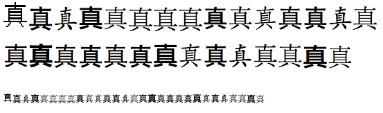
Here is 真 with Simplified Chinese fonts rendered in 36 and 13 points on my computer. Note that I am using OSX which has a very different font rendering engine than Windows. Asian fonts look significantly better on OSX so this screenshot may not be terribly representative. The anti-aliasing makes it appear as though there are only two strokes, but if you look closely it’s just that one stroke has been mostly blurred out; it’s still there.
