Note: I know this might be a Cafe Society thread. Sorry in advance if I guessed wrong by placing it here…
I’ve only just read about tilt-shifting photographic effects today – yeah, I’m behind the times as usual – and now I’m really curious about the whole thing.
A very dumbed-down explanation for those few as ignorant as myself (if such scary creatures there be!): Tilt-shifting is an effect used by photographers or mimicked in post-processing image-editing software to create a “miniature” effect on their subject. To me, as a layman, I’d explain it as using a very sharp focus on the subject while using very soft focus (or blurring?) on the background and foreground & other elements in the picture.
Of course, it’s far more technically complex than that, and it has to do with changing the lens’s rotation vs. the subject, yadda yadda. Here’s the tech explanation on Wikipedia. Truth is, I’m not so interested in the how as in the why.
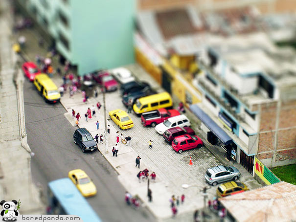
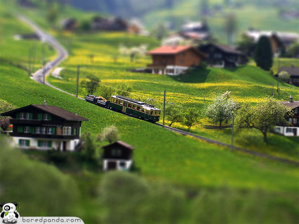
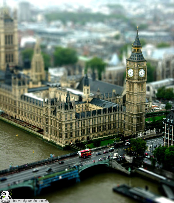
But before we go on, and since a picture is worth a thousand words – probably more in my case – let’s look at some cool examples:
(Credit where credit’s due: the first four are from BoredPanda.com)
So my question is: I’ve read the explanations of how the artists/photographers achieved the effect. I barely understand 'em, but I kinda get it. But what I don’t get is why it works. Why do our eyes perceive these objects as “mini” rather than simply very-sharply focused full-size objects?
(Geeze, you’d think after watching the eighty-billion hours of behind-the-scenes material on the LOTR trilogy I’d know all there is to know about how cameras fool the eye vis-a-vis miniatures… :D)
Boy, every time I come out from my cave where I live, I see something I never heard of before.
There are two things that are clearly happening here:
They use blurring effect above and below the center of the photo to imitate a very shallow depth of field. This makes the photo look just like an up-close portrait photo where the background is intentionally blurred by opening the aperture wide. It also looks very similar to macro shots of flowers, where everything in front of and beyond the photo is greatly blurred.
They punch up the saturation, making the colors look fake and toylike.
Ordinarily, when you take a picture of a life-sized parking lot or Parliament building or whatever, your distance from the scene is a much larger than the focal length of your lens, so everything in the scene is at effectively infinite distance, and so everything can be in focus at once. By contrast, when you’re taking pictures of miniatures, your camera is usually very close to the scene, compared to the focal length, and there’s a big difference between something being (say) 2f away and 3f away. So you can only focus on a small part of the scene, and things in front of or behind that are out of focus.
Tilt-shift doesn’t make subjects look like miniatures.
It makes things look like photographs of miniatures.
Macro photography - extreme close-ups of small things - has a very narrow depth of field, and thus produces selective focus much like you see in those tilt-shift images. Since the only time you’d otherwise see those visual cues (extremely selective focus with a mid-to-wide angle field of view) is in photographs of miniature models, your brain wants to interpret them as miniatures.
Your eye does the same thing, when you move close to a small object. In a photograph we don’t have binocular vision to judge size and distance, so we’re limited to cues like depth of field.
So … let me see if I have this right. You guys are saying that in ‘regular’ photos of, say, the Big Ben / Houses of Parliament, usually everything would be in focus (except, presumably, stuff that’s farther away, but I’d assume the transition from sharp focus to blurry would be fairly gradual). Our eyes are so used to this form of image composition that this is what we expect.
In contrast, when someone’s shooting a picture of something very close, the photographer has to use a ‘narrow depth of field’, which means (for dummies like me) super-sharp close-up that makes everything other than the immediate object blurry.
So… the effect of the tilt-shifted pics is that when I’m looking at Big Ben being super-sharp with everything else blurry, my brain is telling me, “this object must be very close to the camera.” And if Big Ben looks only three inches tall while being “close” to the camera, this must mean that this is not the full-sized Big Ben, but rather a miniature version.
There’s another effect in play besides depth of focus. When photographing a small object close up, the lens is wide enough that it’s capturing light from a considerable angle on either side of the direct line of sight between the center of the lens and the object being photographed. IOW, it’s as if the final image was a composite view of the object taken from widely differing angles. The effect can be duplicated for large objects by adjusting the aperture/focal length ratio, or multiple exposures from shifted angles.
The tilting itself does also help, too, because, in real life, you are more likely to encounter a toy in the shifted position than the object in question. The only way to get anywhere close is to tilt your head, and your senses of balance and proprioception compensate so the object does not appear tilted.
Another thing that I notice is that even in shots where there should be action, there’s no motion blurring of the main subjects. That makes them look posed and staged.
I figure if you’re looking at distant buildings/cars/people, the difference between focusing on an object 500 meters away vs. one that’s 520 meters away is trivial. However, when examining something smaller, focusing on an object 8 inches away and then trying to focus on one 16 inches away requires a significance adjustment, even though the absolute difference is much smaller - 8 inches vs. 20 meters.
Popular Mechanics article (well, blurb, really) on techniques and how/why they work.
It’s worse than that, actually. Even in relative terms, focus usually drops off more rapidly for close objects than distant ones.
For a given lens configuration (aperture, etc.) there is a measurement called hyperfocal distance. Roughly speaking, this is the distance away from the camera such that when focused on, all objects farther away than that point will also be in focus.
For typical configurations, this distance is on the order of a few meters. And so for typical outdoor shots, where all the objects are farther away than this, we expect that everything will be in focus. Even the moon and stars remain in focus, despite being essentially infinitely farther away than anything in the foreground.
The opposite is true of miniature/macro photography. Because the distances involved are well within the hyperfocal range, the focus drops off quickly outside of the focal plane–there is a narrow depth of field. A difference of 10% in depth may mean the difference between entirely in focus vs. entirely out of focus.
This is even more evident in video. A related trick is to decrease the frame rate to the 5-10 fps range. Again, the idea is to make it look like cheap stop-motion animation.
Tilt and shift are two different things. Shift is movement of the lens such that the optical axis remains normal to (i.e. at 90 degrees to) the film plane.
Tilt is the movement of the lens such that the optical axis is tilted away from the normal to the film plane. Shift is used to alter the perspective of the result. Architectural work is the common use, where it is possible to control the perspecive of the resulting image so that vertical lines in the object remain vertical in the final picture. Digital processing of images has left such control pretty much a thing of the past.
Tilt however means that you can control the plane of focus. Usually tilting is used to allow the photographer to place objects at different distances all in focus in the image. Clearly this is heavily constrained, the optical axis can only be tilted in one direction. So, at best, it is possible to tilt the lens so that a set of objects arranged on a line can be placed all in focus. Or it is possible to create a couple of zones of in-focus - for instance the foreground across the lower part of the picture and a middle distance component - and the rest of the picture out of focus. Usually such control is available only on view cameras, or some larger medium format cameras. So the use cases are restricted to studio shots and landscapes.
Clearly the opposite is possible - which is where the OP comes in. It is possible to deliberately tilt the lens so that only a small part of the object in the picture is in focus - much less than would be expected. And to place it so that it crosses the object in the picture at a range of distances.
Depth of field issues come about because when we take pictures of small things, we don’t use a correspondingly small camera. If you had a 1/72 scale model, and could take pictures of it with a 1/72 scale camera, with 1/72 scale film grain, or 1/72 scale pixels, the apparent depth of field would stay the same. (This ignores diffraction effects - perhaps we just scale wavelength too.) The critical problem is that we can’t scale the resolution of the film we use. We could build a tiny camera - with everything 1/72 sized - but since the film remains 1:1 in terms of technology the image would have 1/72 the resolution, and the picture would be useless. Depth of field is a somewhat arbitrary construct that is derived from the film resolution. Lens systems can only focus one distance correctly at one time. Anything else is blurred. However the amount of blur changes. We can geometrically define the size of the circle of confusion that appears on the film (or image device) for any point that is at the wrong distance. The circle gets bigger the further from the right distance you are. If you have film or an imaging device of a given resolution, clearly if the circle of confusion is smaller than the smallest size you can usefully resolve, the source effectively remains in focus. So a range of distances are in focus. Smaller appatures result in smaller circles of confusion, and so the range of distances (i.e. the depth) of objects in the field of view that appear to be usefully in focus increases. The whole analysis scales up, but because our film resolution does not change, we see effects where small focal lengths have greater depth of field - because they cover less film area from the same object, and longer focal lengths have less depth of field, because they use more film area. Larger format cameras appear to have worse depth of field than smaller cameras - simply because they offer greater resolution.
I think the perspective adjustment in these photos is a significant part of their reason for looking like models - yet this seems to be almost ignored in favour of depth of field.
When we look out of a window, we’re looking at a big scene - perspective is a really significant factor - the ratio between the depth of the scene vs our distance from the nearest object is comparatively high- whereas with a model, it’s all there right in front of us - the ratio between the depth of the scene and the distance from the nearest part is low - making everything appear more or less the same size, regardless of its place in the picture.
Two mistakes, here. First, in a distant scene, everything that’s far away will be in focus, no matter how far it is, since it’s all effectively at infinite distance, and you can’t be further away than infinity. Second, when you’re focused on something close, not only will things further away be blurry, but things that are even closer than your subject will also be blurry.
The effect you’re seeing in those photos is pretty much all tilt, not shift. I’ve worked with tilt-shift lenses before (mostly for architecture and keeping verticals and horizontals properly straight) and when I played around with doing some of the “miniature-looking” effects, it was a function of the tilt of the lens and having the plane of focus not being parallel to the plane of the film (or sensor). Shift doesn’t really contribute anything at all to the “miniature” feeling of the photos. Shift just sort of allows you to move your horizon (or vertical center) up and down without actually having to tilt your camera up or to the sides (which then ruins your true verticals or horizontals.)
Neat examples. I’ve wondered exactly the same thing before - why simply narrowing the depth of field should have such a dramatic effect. On the cars and train, it’s almost as if you can see the cheap moulding of a child’s toy, and yet they are real. Perception is weird.
Edit: Looking at the “before and after” set in this link, it seems that boosting the colour saturation is a big part of it, too.
Wow, that’s some horrific color over-saturation going on there. It’s not necessary for the “tilt-shift” miniature effect (the effect does work in black-and-white and with more natural color palettes–for example, the Vincent Laforet work in link #6 isn’t what I would call over-saturated), but I do agree that exaggerating the colors does help push the toy/miniature illusion along.