Modified from a simpler prompt found on Facebook, went through a few revisions of the image in Copilot, brought everything together into one prompt to get a similar image.
Summary
A hyper-realistic close-up photograph of a surreal fruit cluster growing on a grapevine. Each individual fruit resembles a small ancient, worn human skull with realistic folds and texture, forming a bunch similar to grapes. Each skull has different stains, chips, missing teeth, etc. No two alike. More clusters are on the vine and more out of focus in the background.The scene is set in a sunlit vineyard with a blurred green background of leaves and vines. Natural lighting highlights the organic surface of the skull-shaped fruits, casting soft shadows and giving the image a bizarre yet botanical appearance. Extremely detailed, photorealistic, macro lens, shallow depth of field. 16:9
I wonder how much of this sort of weird typo is an artifact of the training data consisting of lots of OCRs of documents and pictures, rather than files of ASCII / Unicode characters as text?
I could sure see a happenstance surviving photo of the cover of a 1983 Computer Shopper being hard for a human to read accurately, much less a machine. We of course would know what it ought to be. But a machine? Not so much. Yet.
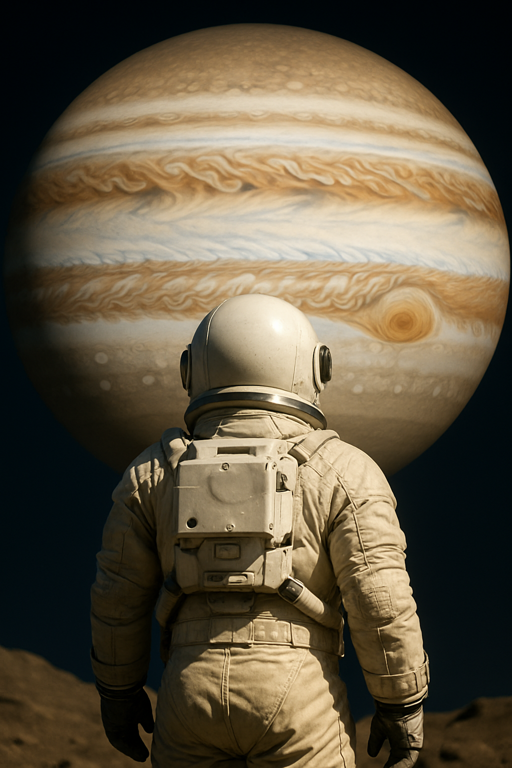
I couldn’t get 100% scientific accuracy with this one no matter how I kicked at it. Can any of our resident space experts spot the big glaring issue here?
I’m no space expert, but If he’s supposed to be standing on Europa or Ganymede — both inside Jupiter’s intense magnetosphere — then that standard-issue NASA space suit isn’t gonna cut it. He’d be cooked faster than a Hot Pocket in a microwave. And Jupiter would look more massive in the sky, not like our moon from Earth. Plus, the whole scene would be much dimmer — Jupiter is much further from the sun for that cinematic lighting. This may be a bit more accurate:
I honestly didn’t consider the radiation issue… good catch. But look at that backpack, it’s not some gigantic PLSS, obviously a much more advanced spacesuit, which would make sense given they’re standing on a Jovian moon at all. But one could remove the astronaut, pretend the pic is taken from an uncrewed lander. That’s not the issue I wasn’t able to solve through various iterations. The lighting issue, that’s just camera settings. Check out the New Horizon’s pics of Pluto. Quite adequately exposed.. And it would be fine for your naked eyes as well, even out at Pluto. In that ChatGPT pic Jupiter is HUGE compared to what our moon looks like from Earth. You’d need a telephoto lens setup and stand waaaay back from the figure in front to get the same effect with the moon on Earth.
Just expose it longer or use a higher (effective) ISO. I take pictures in dark auditorium theatres that look like they’ve been taken with the house lights blasting. Like I can barely see the figure I’m focusing on, it’s so dark, but high ISO and longer exposure and, bam, as long as there’s some light, you see it as if it were turned up. It can’t create light where there isn’t any, but it can amplify light as long as there’s something to amplify. The only difference there would be is the ratio of foreground to background light, but it seems they are both being illuminated by the same light source, so should be similar intensity. (And this isn’t confined to digital; analog film can do the same thing.)
No, but Tibby thought Jupiter wasn’t big enough in the image, as if it was appearing no bigger than the Moon does from Earth, and I was like, what? It looks huge, as it should.
So… the issue that jumped out at me, and was unable to correct, is that Jupiter wasn’t drawn with the correct orientation as it should be seen from a moon in equatorial orbit. I believe the only moons with significant inclinations are way further out, and regardless, I told it to draw Jupiter as it would appear from one of the inner moons. Tibby’s actually looks a bit closer to the correct orientation, but Jupiter is also drawn closer to the local horizon in that one, which I didn’t want in mine.
ETA: I suspect this all stems from image generators’ strong inclination to “properly” frame things in the image, regardless of what the user tries to tell them about framing.
Well, where’s the astronaut standing, on the moon? Any reason she couldn’t be near the pole? That would put Jupiter low in the sky, in a “horizontal” orientation.
Where the astronaut stands on the moon won’t affect which face Jupiter presents to the moon, and that’s the issue I’m seeing. I’m referring to the percentage of northern and southern hemispheres that should be seen, which when over Jupiter’s equator should be exactly equal, regardless of where on the moon the camera is situated.
It does look a little “low”. I.e, you’re seeing too much of Jupiter’s southern hemisphere given the very low inclination of the largest moons.
The size isn’t a problem, though. You can make a distant background object almost any size you want by changing the focal length. If you want Earth’s moon to look huge compared to a person, stand far away from the person and zoom in. You can do the same thing on a moon of Jupiter.
Took us three years to go from “This kind of looks like a person with one leg and nineteen fingers” to “The amount of Jupiter you can view from the inclination of its moon isn’t quite scientifically accurate”.
…Hm. Yeah, it looks like all four of the Galilean moons have inclinations of less than half a degree, and while that shot is close to the orbital plane, it’s not half a degree close. And being near the pole of whatever moon it is would probably mean that the inclination of the view of Jupiter, if any, would be in the opposite direction. So, yeah, it’s an error.
I still don’t think I’d call it a big glaring error, though.