I do not know what font you are using, but in my browser l and I are not identical, even in sans-serif. Topologically they are equivalent, but “l” is taller and narrower.
Font test:
0Oo
1Il
2Zz
5Ss
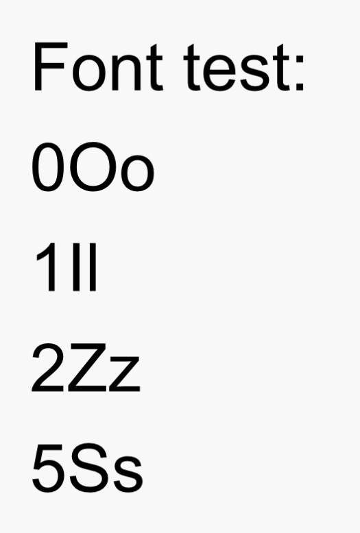
This is on iPhone Safari.
On my Android w Chrome the eye is slightly shorter than the ell but same stroke width. Gotta look real close to see the difference when they’re side by side. In mixed text, it’s very hard impossible to be sure.
On my Win11 tablet w Edge the eye is the exact same height as the ell, but the ell has a slightly narrower stroke width. Again gotta look real close to see the difference when they’re side by side. In mixed text, it’s very hard impossible to be sure.
I especially like that the smaller of the two is different between the two devices. Good luck keeping that straight in my increasingly feeble noggin.
I tried fiddling just now w Edge’s settings for default fonts. No help. Evidently my Discourse theme, Discourse-classic, specifies a particular font. I checked and there’s no Discourse preference setting for font as such. I suppose I/we could fiddle with the various themes on offer to find one with more distinctive fonts. But considering all the other UI stuff a Discourse theme controls I bet that would be a cure worse than the disease.
Thanks for the impetus to look into this more deeply.
One wonders if there are any computer fonts where they literally look the same. I can make them (in the default font, on a 96 dpi monitor) render exactly the same (one pixel wide, exact same height) by fiddling with the font size; perhaps that is inevitable in the limit. More importantly, one wonders why use a sans-serif font at a tiny size (telephone screen), or if one does need a low-res monospaced typeface for source code, why not a reasonable default— I tested e.g. Noto Sans Mono and there is no confusing I and l even at 7px — it takes 6px to make them look the same.
The two characters may not look identical if you’re looking carefully but mostly we’re not.
And it might be possible to peer closely at a letter, and compare it to other letters on the page, and usually guess accurately which is the letter in front of you. But that’s not how one usually reads.
Operative word “might”. Side by side I can see a difference. At e.g. the end of successive words? No way.
Even if I can see they’re different, which glyph represents which letter? No clue.
The real answer here is to never use the short form name “Al” in text. Use “Albert” or whatever. Call the person to their face whatever they prefer. But let’s kill the short form name in print. At least until there’s a different default term for artificial intelligence.
I expect that soon enough the artificial intelligences are going to tell us what we will be calling them, whether that’s Master or Sir or whatever.
There’ve been times where I ended up doing a copy-and-paste to a Word document in Times New Roman (my default font) to find out if something is an upper-case I-India or a lower-case L-Lima. And to make things even better, I’ve seen at least one font where 1 (the numeral one) didn’t have a serif either.
When I’m doing things like that, I’ll set the font to something like Courier.
Lucida Console is my fave for that purpose. Very high on legibility / distinguish-ability of letterforms.
The best font to me is Arial with style set one, (SS01). It’s how I have it set up. It’s literally Arial, but it specifically adds the serifs to I and a little tail to l, like used in t.
I honestly think it should be the default for Arial.
‘Your Highness’ will avoid any confusion as to which of the 17 genders a given A.I. adheres to at a given time, if any.
Not necessarily, it might depend on the font. To muddy the waters, so to speak, I will quote A.I. itself on the matter:
Speaking for myself (former advertising person), I consider crossbars on capital 'I’s (on sanserif fonts) an abomination.
I’m more an Andre Iguodala guy, myself.
Doesn’t the thread need to be modified into SI vs si (Super Intelligence vs. the Spanish word for “yes”)?