And…it’s the Housing and Urban Development building. Nice. ![]()
I don’t mind the look, really. Reminds me of Cabrini Green, though; efficient, no frills.
And…it’s the Housing and Urban Development building. Nice. ![]()
I don’t mind the look, really. Reminds me of Cabrini Green, though; efficient, no frills.
For those who like it, please tell us what you like about it.
I can see liking some aspects like the WYSIWYG sinks although I might quibble if this were extended to toilets. Might be called crutalisme for its rawness.
Why the taste for blocks, even protruding blocks?
What does it mean for a plan to have formal legibility?
Someone above mentioned cost. Did Brutalist buildings tend to cost less than similar buildings?
No effect, really. They take me back to a time before all that. I grew up and went to school in Ames, so they’re powerful symbols of home. I saw dozens (hundreds?) of concerts at Stephens, games at Hilton, and in fact, saw most of these buildings go up as a child in the 70s.
I much prefer the Brutalist buildings in these posts. The Gothic looks so overdone to me. I like the simple lines and directness of the Brutalist style. To each their own, I guess.
Interesting, as in “may you live in interesting times.”
That said, there’s some Brutalist architecture I’m partial to, but most of it is underground (as Mr. Excellent points out). The Montreal metro extensions in the 1970s were largely Brutalist, and some of them are quite beautiful – Radissonstation, for example.
They were thinking that concrete is inexpensive, easy to form, inexpensive, durable, inexpensive, low maintenance, and inexpensive.
When cost is the bottom line, brutalism comes into its own.
BTW, your first pic brings back memories of my time there thinking “Why the fuck does it have to be brutalist?”
Nobody has mentioned why builders like Brutalist Architecture-it’s cheap! Poured concrete and exposed beams-plus no decorative work. Because none of the people who designed these monstrosities actually had to live or work in them, they didn’t care.
One is comforted that the extreme cheapness of their construction will lead to their early demise-most of them were built with uncoated rebar, which is now rusting out and cracking the concrete. So the next decades will see a lot of them being razed.
What do you mean by humanity?
I wouldn’t consider that brutalism so much as phallicism. ![]()
For example, an interior shot of your first pic (Western’s brutalist Weldon), and an interior shot of U of T’s decidely non-brutalist Hart House. Which is more condusive to hemorrhoids? Which is more condusive to studying?
Brutalism is not about people. It is about saving a dollar. What is the least that needs to be spent to keep books dry? What is the least that can be spent on a chair? What is the least that can be spent on every aspect of the design? That’s what brutalism is about – not people.
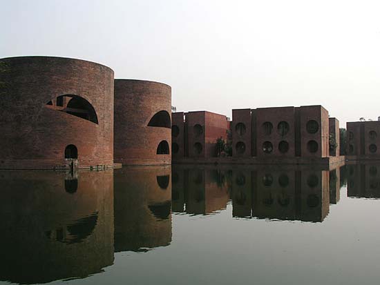
To me, Brutalism is an emotional and visceral architecture – there’s less heady intellectualism involved, less pretense, less prettiness, less “airs”. This thread is evidence enough that it brings out strong feeling. True, it’s mostly inelegant, but I see that as a virtue: it’s tough, but austere. Louis Kahn’s National Assembly Building in Dhaka is a good example of Brutalism’s strength; it reminds me of monumental ancient architecture.
I also love concrete as a material, especially when it’s worked and textured, like with Le Corbusier’s Unite d’Habitation – makes me want to rub my hands all over it. I appreciate its more elegant side too, like the technical wonder that is Marcel Breuer’s Church of St. Francis.
The “blockiness” of many Brutalist buildings comes from material use – it’s easier to make solid blocks with concrete than thin curves. But the blocks also add to the feelings of strength, heaviness, and solidity (especially when dangling over your head).
Formal legibility means that you can “read” the building easily, which can mean many different things. Maybe all of its structure is exposed so you can see how it stands up, or the utilities aren’t hidden, or it’s easy to find your way around inside, or you can predict what the next room looks like because of certain patterns.
Not sure about cost – “cheapness” was sometimes an aesthetic value, though.
I like it. If I strike gold or oil, I’ll build one like it and put a sign on all sides “STAY AWAY!”
Yes, no amount of explanation will make Boston City Hall not look hideous and stupid and … regrettably not out of place, most of downtown Boston seems to have been built when Brutalism was fashionable.
Perhaps this applies to some Brutalist buildings, but the same could be said of most contemporary building. With regard to Brutalism at its most pure, though, it’s absolutely false. The Smithsons believed their new movement was more humane than neo-classicism or the picturesque (stately styles of the time associated with wealth, Beauty, rules, academia, etc.) because it was the opposite: unpretentious, forthcoming, and easily read by anyone.
They’re even known for being some of the first modern architects to put people in their drawings – which was seen as unprofessional and unbecoming. (The people in the drawings were mostly celebrities and other popular figures.) Their ideas for public housing were all about creating community and human interaction.
The difference is that while the message of Brutalism is “We are living in the Future”, the message of Art Deco is “We are living in the Future, and it is AWESOME!”
De gustibus non est disputandum
OTOH, as much as I’d love to live in a Windsor McCay fantasy, not too far from Cabrini Green in Chicago I’ve seen the ruins of old tenements with lone, stark pipes in the back lots where the washouses used to be. The Beaux Arts era had slums just as evil as any other.
That’s odd, because in my experience brutalist buildings are often rather illegible. I’m reminded of a Bill Bryson quote about the sort of building so badly designed you could walk around it twice and still not find the entrance.
My own pet theory, which is probably total bollocks, is that the reason so many modern buildings look like total shit is that they’re designed to look good when viewed as models. From a distance, and/or from above – e.g as viewed as a model on a table, or more likely on a computer screen – they often look good and striking and you can kind of see what the architect was thinking. But for the poor shmucks who have to live with them and look at them from a height of six feet above the ground, there are no human-scale features to make them attractive.
There’s the occasional lovely brutalist building - Keeling House, a residential tower block near me, looks like it’s going I AM BIG AND STRONG AND WILL PROTECT YOU! Having the balconies face half-inwards is also a good idea - the area is noisy, and the higher storeys would be very windy. It also has a pretty and calming entrance way with a shallow reflecting pool.
None of the pictures I can find online are very good, though; maybe I should take my own.
The only bad thing about it is that it was originally a council block, social housing, and then was ‘condemned’ and sold to a development company for literally pennies, with the residents being evicted. Amazingly it turned out that the building was structurally sound after all, needed no major work doing on it at all, and was all extremely expensive private flats within months. :mad:
I misread that as the Tired Church of Christ and thought, yes, it is, isn’t it?
Agreed - older buildings are far easier to navigate. Having the rooms and corridors be ever so slightly different actually helps with that, not hinders. We are humans, not machines.
I was thinking more “\Deployment to Installation MARCOMSPACESECDEF Whisky Tango Foxtrot: COMPLETE”. Your examples are more “Welcome to the Ministry of Honor”.
At Deco is a future of gleaming spires, shiny Flash Gordon rocket-shaped space ships, goofy robots and Buck Rogers jumpsuits.
Brutalism is a future of Judge Dredd Megacities, brick-like gunmetal colored battlecruisers, cyborgs and Blade Runner megacorporations.
I’m inclined to agree with you. A few years before they finally demolished the Trinity Square Car Park, Gateshead Council had an exhibition about it, with the models and architect’s drawings and suchlike. The contrast with reality was stark to say the least - largely gleaming white rather than darkish grey for a start. The restaurant at the top looked like somewhere you’d genuinely have wanted to go. There’d have been a great view (notwithstanding the fact that you wouldn’t be able to see the car park). I have mixed feelings about it, as I could see what they were trying to do, but I positively hated Westgate House across the river in Newcastle, for me the quintessential “What were they thinking putting that there?!?” building
I think the problem is threefold - concrete takes a loooong time to soften in appearance, apparently the Barbican in London only fully cured in the last few years; so it looks at its worst for a few decades before improving a bit. Secondly, these buildings positively need bustle lest you have a dead shell that sucks the soul. The first doesn’t help the second. Finally, brutalism doesn’t live well with surrounding buildings. It looms over them. The grey of the concrete adds to the effect, as does the way it further darkens when wet. Situated away from other buildings, using a paler material and in a dryish climate they might have stood a chance at being not necessarily loved but at least not so hated.
I, too, hate brutalism with a passion. Especially the larghe-areas-of-exposed-reinforced-concrete type.
I do kinda like Boston City Hall (from the OP), although it has been roundly hated ever since before it was built by plenty of folks. My complsaint isn’t its appearance, but that, for all its size, it has very little actual useful space within, it sits on a barren windswept plain of bricks (which can’t even be properly plowed), and it has woefully inadequate parking. It’s as if they designed a building that wpouldn’t actually be used by human beings, but simply admired from a distance.