I like the Guardians, and think this is a change for the better. The bridge statues are close by Progressive Field, and are indeed iconic in the city and beyond. Here’s more on them:
Tom Hanks narrates the announcement blurb here:
I like the Guardians, and think this is a change for the better. The bridge statues are close by Progressive Field, and are indeed iconic in the city and beyond. Here’s more on them:
Tom Hanks narrates the announcement blurb here:
I would’ve totally bought Spiders merch. Guardians? Not so much.
There’s still time for them to create a cool logo and other artwork that will make for merchandisable souvenirs. That’s a huge consideration nowadays.
You can see the new logo and typeface at the end of the short film in my second link above. I suspect the new team merch is going to sell pretty well.
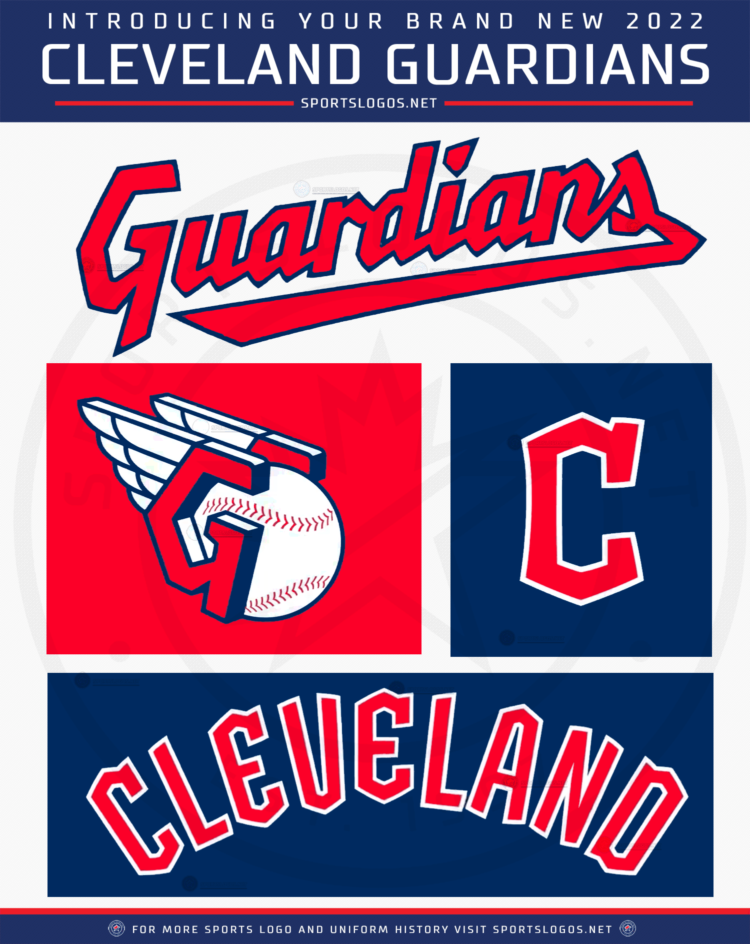
Some logos:
Here is a tweet from team owner Paul Dolan on the name:
Bleah.
x2.
,
I’ll point out that the new Guardians logo looks exactly like the Cubs logo except angular.

They could have at least changed one of the colors. At least the Cs are different enough.
The new Cleveland name is supposed to honor the Guardians of Traffic statues adorning entry to the Hope Memorial Bridge. From Wikipedia:
“Pairs of statues designed by sculptor Henry Hering and architect Frank Walker – officially named the “Guardians of Traffic”[3] – stand on pylons at each end of the viaduct, symbolizing progress in transportation.”
I’ll root until I die for a baseball team that symbolizes progress in transportation. Next up: the Yankees change their name to the N.Y. Subway Rats.
*there’s precedent involving one of their minor league teams:
![]()
I can only speculate, but I imagine the fact that “Guardians” is syllabically similar to “Indians” may have been a factor as well. That is, it rolls off the tongue in an identical way to the old name.
Yeah, I quoted the team owner saying that explicitly in a tweet.
Here’s more on the statues:
I stand corrected. Those logos are so obviously not Disney level of quality. I’m not too sure you could get a Disney job as Marketing Assistant 1 with that baseball monstrosity in your portfolio.
The baseball logo is kind of neat at least. The wings look very much like the ones on the Guardians of Traffic.


The others are as boring as most MLB logos.
Ahhh, thanks for that. I stand corrected.
(Still not a fan of it, though. Eh, maybe it’ll grow on me.)
I’m sure the merch will sell fine; I think Spiders merch would’ve sold better. (At the very least, the latter would have been one I’d purchase, but not the former.)
Oh, I clearly think that is part of the reason, and the design of the team name can echo the Cleveland Indians design pretty easily, as they both end in -dians.
The 3D-ish basball design – I’m not sure what to make of it; part of me wants to totally hate it (I hate 3D renderings in logos), but it’s kind of an Art Deco Steam Punk-ish vibe to it that I kind of enjoy.
The Guardians of Transportation are indeed iconic, in their appearance, and are often used as symbolic of Cleveland. But I’ll bet you that, at this moment, not one Clevelander in ten could tell you that that’s what they’re called.
Which is still a higher percentage than those who call the bridge they’re on the “Hope Memorial Bridge”. That bridge is “the Lorain-Carnegie Bridge”, from the names of the streets it’s on (the few streets in Cleveland that cross the river all change names when they do so), just like the one north of it is “the Detroit-Superior Bridge”, and the one south of it is “the Harvard-Denison Bridge”.
I like it for the same reason. Streamline Moderne doesn’t get nearly enough love and respect.
Stolen from Facebook, where it was stolen from Twitter:
MLB currently has two teams named after socks, so…