I can’t really see the effect here. I have that minor color-blindness that I heard something like 1 in 3 adult males have. I could never pick out the right numbers in those pastel fields that they tested us with in school. (Not being able to pick out any numbers is something altogether different.)
I believe its informally called ‘red-green’ color blindness. (Actually I just now found it on Wikipedia.)
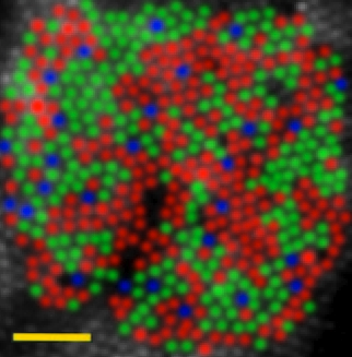
A (false color) image of a retina showing cone distributions to illustrate this. The rarity of blue is normal, while the R:G ratio varies between people but doesn’t seem to do much. NB: blue and yellow involve the blue (S) cone, and addition to being rarer, has a much coarser resolution.
Deuteranomaly? More like 5-8%, though. People with this do have 3 cones, but green sensitivity is shifted towards red so the overlap is bigger. Or R->G for protoanomaly, which is in most ways the same result (deuter is better to have though). With actual full colorblindess, you have 2 cones, and the deficit is more severe. Really, many people with -anolamies don’t realize they have a problem, or have only an inkling, as the deficit is mostly compensated for except on rarer occasions.
Something like that occurred to me, but I do not think it can be right. Red and green are on the same (opponent processing) channel, the other one being blue-yellow, and, as you say, it is blue that has low resolution because the blue sensitive S-cones are spread relatively wide apart, and do not occur at all in the highest resolution regions of the fovea. On the other hand, the L and M cones responsible for the red-green channel are both found, in about equal numbers (and distributed fairly randomly) in the highest resolution areas. There should not be the sorts of problems in resolving red and green that we get with blue and yellow.
I do not know what the actual answer it, but I think I do see the illusion (though it is not particularly strong), with the red lettering seeming more in front than the green.
Interesting (and the best answer the OP is likely to get I suppose), but I wonder why in this example I see the red as slightly behind the blue (teh red letters look slightly recessed to me) whereas in this one, the red is clearly in front (but not as strikingly so as the white).
Thankyou, thankyou, thankyou! I noticed this effect about 25 years ago and it has puzzled me ever since. Now I at least have a name for it. As I suspected, it does have to do with chromatic aberration, but it is very complicated. Part of the issue is that each eye has left right asymmetry, opposite in the two eyes. In reading the Wikipedia article, I was confused with their use of the word “temporally.” At first, I thought it referred to time, but now I understand it as an anatomical term, meaning in the direction of the temples, as opposed to “nasally,” in the direction of the nose. Thus, chromatic aberration moves the foveal image left or right, opposite in each eye. That is part of the explanation, but something called Stiles-Crawford effect is also involved. The hardest part to explain is why some people see the effect in exactly the opposite way.
I can sort of see it, although the wave is behind the white lines, when it is in reality drawn on top of them. It might be stronger if I weren’t distracted by “WTF is the context of this image?” feelings. I think it is missing a crucial variable: goatees.
Does anyone else perceive movement in the red/blue text box in Apollyon’s link? It’s not much when I look directly at it, but when reading the paragraph next to it, it really started wiggling on me. I remember a design teacher in college telling us never to put a text of an intense color on a background of intense color specifically because of this, and that the smaller the text or the more ornate it was, the worse the wiggling appeared.
I am not sure that that is actually the same effect. The illusions you link to are, I think, more to do with the shapes than with the colors. What phouka is seeing in this probably arises from the fact, mentioned upthread, that the eye is less accurate in localizing blue than in localizing red. I don’t clearly see movement in it myself, but I do see dark smudges within the red strokes of the red letters.
Probably one of the best username/post combos I’ve personally experienced, thelurkinghorror, and I think you’re definitely on to something. The wiggling I see with the red/blue combination is not as intense as in the illusions you posted, but then, the lettering doesn’t have the same repetition of shapes.
Of course, now my eyeballs are bleeding, and I have to sit in the corner to feel safe, but other than that . . .
This is from an illusion contest (seventh one down). It doesn’t really work for me, and unfortunately some of these might’ve worked much better on a big screen. I have not a clue if this is related.
I suspect one eye requires a stronger prescription. If so, my logic as to why you’re perceiving this illusion is thus:
Like red/cyan anaglyph 3D illusions, your eyes are receiving each color at slightly different positions relative to each other, because of the chromatic aberration of each lens.
So, when you’re eyes/brain merge the two inputs, it registers the parallax just as it would in real life. So you get one color that appears to float.
Take your glasses off, now you get the opposite effect.
One lens is most likely refracting the image a bit more than the other (let’s say the right eye for instance), causing the color green to appear shifted more than red relative to your left eye.
This discrepancy in shifting of particular colors over others, combined with one lens giving you a slightly different image than the other, creates the illusion of depth when your right eye merges the image from your left eye, depending on the particulars of the optics, your eyes, and the wavelengths involved.
Thank you for asking this question, you are not alone. http://31.media.tumblr.com/tumblr_m0w6mxhtPB1r4150xo1_400.png
For me, it is especially apparent on black backgrounds. I also observed it with old cell phones. The call, end, and numbers appear to float at different heights.
