Slightly off topic. Anyone else keep a phone # list on a piece of paper in your wallet/purse just in case you don’t have access to your digital repository? It’s come in handy a few times in my experience.
Not me. If my phone works at all, it works completely.
My contacts are local to the phone; I’ll have access to them in many failure or no-signal scenarios where I can’t make a call. Not vice versa.
Coming late to this thread, so apologies for going back to the analog clock. I didn’t see my first digital clock until my late teens, it was a mechanical digital clock that had a rolodex-like arrangement of little cards with numbers on them that got flipped into position with a satisfying click instead of a tick or a tock. Like others have mentioned, I prefer analog over digital for the extra information available at a glance, but then I have also had many decades of practice. One advantage not yet mentioned is that I can read the time on an analog clock from a distance at which I couldn’t discern the numbers on a similar sized digital one simply from the position of the hands.
I set myself a little project a few years back to learn how to use SVG in HTML/CSS/Javascript by creating an analog clock. I moved the hands by using the animate property to apply rotations to the hour and minute SVG elements. When the webpage first loaded, it got the computer’s local time, set the hand and minute hands to the correct angles, and then started the SVG animations.
In case you are still puzzled, yes the hands are linked. Defining 0 degrees as pointing up (12 0’clock), for a time of H:M the angle of the hour hand is 30 * (H + M/60) and the angle of the minute hand is 6 * M. Each hour on the clock spans 360 / 12 = 30 degrees and the M/60 adds the additional angle past the exact hour position that M minutes produces. If we’re not concerned with accounting for seconds, each minute spans 360 / 60 = 6 degrees so the minute hand angle is 6 * M.
What really confused me was the first time I saw a clock with -surprise- three hands.
So I asked my grandma, and she told me it was a second hand.
Huh?
It’s a third hand, gramma, how dumb are you?
Evidently this confuses several people.
Unrelated to the above ...
When I posted the above I realized I didn’t quite know in detail how my car displays analog speeds. ![]() I just knew it has an analog speedo. And that I pay far more attention to the abbreviated info on the HUD than I do to the interior displays. I’ve driven it for just over a year and about 10K miles. Anyhow yesterday I paid attention to how the gauges work.
I just knew it has an analog speedo. And that I pay far more attention to the abbreviated info on the HUD than I do to the interior displays. I’ve driven it for just over a year and about 10K miles. Anyhow yesterday I paid attention to how the gauges work.
The HUD shows a little US-style speed limit sign with the car’s opinion of the limit. Which it gets by reading roadside signs just like I do. With all the limitations that go with that. And it shows the current speed in large digits. When you first exceed the posted speed, the speed limit sign flashes for a few seconds then goes back to steady. The only color coding to the speed is whether you or the cruise control / ADAS is controlling.
Down on the main display screen there’s the same big white current speed digits front and center. And an analog arc scale in white starting with zero down near 7 o’çlock and increasing clockwise up to the max near 1 o’çlock. Numbers every 20mph, and large tickmarks at 10mph intervals with smaller tickmarks at 5mph. So far so typical dating back decades.
The scale shows a green tickmark at the speed limit and another of a different shape at the cruise control target speed. The speed pointer is a short red radial line that slides along the scale but extends nowhere near the center of the display. So real easy not to even notice amid the clutter. When the pointer is above the speed limit, a thin red arc replaces the white arc. So you end up with a thin band of red the length and angular extent of how much too fast you’re going.
But the whole thing is so small and subtle tucked into the perimeter of the display screen that it’s very easy to not even notice. Half the time it’s hidden behind the steering wheel.
Bottom line:
The engineers sorta implemented @Reply’s idea, but so subtly as to be almost wasted effort.
A minute is a “mynoote” division of an hour. A second is the second division of an hour.
like this, from a 1960’s Plymouth::
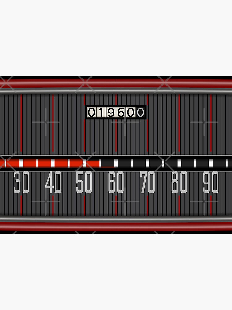
That’s awesome. Maybe in the next generation they will make it easier to read and more prominently displayed.
My parents had a 1963 Chrysler station wagon with that display. And a pushbutton auto-tranny. And big tailfins. Man, we were stylin’ there in the early Space Age.
IIRC the speed tape had two colors, where most of it was white (?) but red was exposed above some certain fixed speed, maybe 75 mph?
Be easy to do nowadays with the color change happening at the posted speed limit.
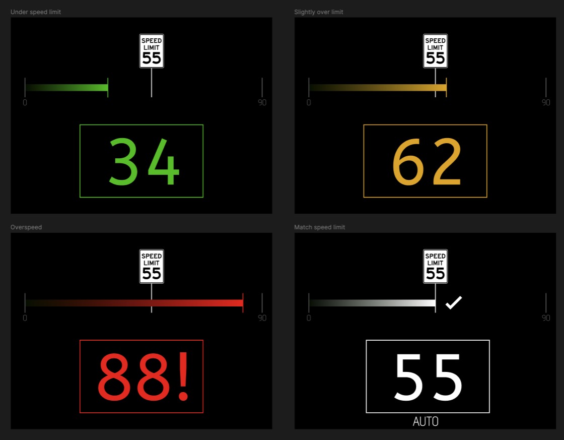
Sort of, but not necessarily the shape (horizontal vs gauge)… more that it would have context awareness and know how fast I’m going vs the current speed limit. Something like this:
This is interesting though:
![]()
The segments (red bars) are not equally tall. The one between 50 and 55 is like 90% full, whereas the one from 50-60 is only like 5% full.
Does the bar go bottom to top within each segment, and then move on to the next segment left to right?
Think of the red as a tape measure paying out from left to right. The tip of the red bar is the tip of the tape. As you go faster, it slides farther to the right.
The width of the tape, its vertical height, is constant.
That’s what I assumed at first too (like a normal “progress bar”), but looking closely at that image, that’s not what it shows. There are indeed different notch heights…
I couldn’t find a video of it in action (would be cool to see, especially since it’s a pre-digital bar!)
Well, but…
The advantage of a shorter hour hand and the longer minute hand is that I only quite approximately need to know where the hour hand is pointing to understand which of the 12 sectors it’s in. The minute hand being longer makes it easier to understand which of the 60 sectors it’s in. Both because the longer hand makes it easier to quickly see the angle, but also because the length of that hand means it terminates much closer to edge of the face, where the minute subdivisions may be.
Here’s a clip of a progress bar starting green then turning red.

That’s beautiful!
That’s an interesting idea, but
- I want the picture to be larger
- I want the “bar” to be more curved, perhaps with the speed limit at the top, so you can see at a glance whether the bar is approaching the speed limit or beyond it
- I want a better graphical indication of absolute speed, too, because in fact, i do want to know that, for a number of reasons.
Designing a better interface is an interesting puzzle.
Digitally Initiating Audio Link, of course.
You would normally say or think something like ‘It’s a minute or two before 4 o’clock.