If it’s just for me, it’s absolutely legible only to me, and even then just barely. Really more of a memory thing than actual writing of words. To anyone else, and even to me, it’s just scribbles, but I remember what I was trying to write. It works for me.
OTOH, if it’s for someone else, I give them all caps, block letters. I assume that will be easiest to read.
This is one of the advantages of my fountain pen hobby. It makes me want to write things by hand. I started journaling only because of fountain pens. As a result of constant practice and also because (in my opinion) fountain pens are easier to write with than ballpoints or gel pens, I think it’s better than it has been for years. I’m not winning any prizes, but I’ll bet you could read it. Something like @Lancia 's slowed down example above.
When I still used to write cursive, a fountain pen was my preferred choice, especially during school and college, but after I switched to printing, I have been using ball point pens.
I drew comics as a kid, and worked up a pretty coherent, simple Carolinian Miniscule. When I submitted it for schoolwork while the other kids were crab-handing cursive, I never heard one complaint.
My signature, as designed as a teen, was about as silly as you’d expect: no happy-face dot over the i, but a capital A drawn as a fucking five-point star! Later, inspired by Henry Kissinger’s, I went minimalistic.
I’m impressed. That’s orders of magnitude beyond what any of my typography students ever did…
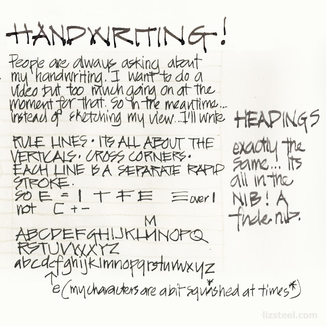
I first thought about handwriting when I saw the hand-lettering on an architect’s drawing. And I thought, bet I could do that. So I practiced and practiced and ended up with some kickass pen-person-ship.
That’s not mine, but it’s close. That’s from Liz’s architect. And here’s a video…
But, alas, it took too long for class notes. But for anything else, it’s fun to be able to do it when I want to (though I have to get practice by writing an alphabet first, in these days of keyboards…)
I do this too. Big capital letter for the first letter of a word/sentence, smaller capitals for the rest.
I did a lot of hand drafting set designs in school, yanno, back in the dark ages before computer drafting, so I had to develop a pretty good script. It’s definitely not as pretty as it once was, but it still gets the job done.
I seem to be in fairly good company. Put me in the “It’s bad and always was” category.
By that I mean cursive. I plateaued very early, so my 8th grade cursive looked just like my 3rd grade cursive. It was reasonably legible but just looked very forced and not very flowing, used it only in school, and I dropped it like a hot potato as soon as I graduated high school, save for my signature, which actually displays a bit of flair.
My job requires a fair degree of paperwork ( forms, log books, etc ) and I print quite well ( by printing, I mean lower case except when capitalizing the start of sentences ) and I’m told by others my printing is very neat.
Man, I’d hate to see the hard version. Congrats on that, it’s really nice.
I am no way inspired by anything Kissinger ever did, but that’s a bit what my signature looks like. Any lowercase letters are just a straight line. Kind of like this if I was him. H___y K_____g__
I used to have beautiful handwriting. But it has deteriorated from not having to use it every day. I use print for lists or notes but I refuse to do that in my journals. I look back at older journals and it’s sad how pathetic my handwriting is now. But it would feel like giving up so I keep at it. It’s readable but definitely not as good as it was.
My signature on paper is still good, though. But I’ve never managed to get anything close to it on electronic devices. It just looks like some humps and squiggles.
Yeah, those things are a joke. I haven’t even bothered to attempt to actually sign my name on those electronic devices for many years-- I just dash off a wavy line. Never been called out on it.
This is me, too. I find calligraphy beautiful, especially old-fashioned copperplate and Spencerian script. My fine motor control is not good enough to replicate those forms, but I like to come as close as I can; there’s something sensually, as well as aesthetically, pleasing about writing cursive with a good pen on good paper (my EDC pen is a Lamy Studio with a fine nib). Sometimes my handwriting is scrawl, but usually it’s legible, and has occasionally drawn admiration from cow-orkers impressed that I apparently practice an ancient art from the dawn of time.
2nd or 3rd grade (where we’d have to learn cursive writing) was one of the biggest dreads I had in my entire school career. Looking back now, it’s amazing how right I was.
I stopped writing in cursive when I entered middle school and my print handwriting has probably improved slightly ever since then. Nearly all of my jobs have required the production of handwritten notes for others so I developed a fairly legible if simple script.
I write my engineering notes at work in all-caps text as seems to be the convention in that profession. My all-caps script was pretty messy at first but it’s gotten pretty good too lately.
Looking at my handwriting now, the only possibly unusual thing about it is that the descender on my lower case ‘q’ has a cross through it. I was at a loss how to describe this in words so I intended to google an image to show here. Turns out wiki has an article on it called “Q with stroke.” My lower-case Qs look like the example they give.
Another in the “it was always shit” pile. However I did take notes in cursive through my early years of college. Almost indecipherable to anyone other than me and even I had to squint at my own writing from time to time. At some point I slowly transitioned to a hybrid cursive/print note taking style, in which printing came to predominate. However my printing is also sorta shit, though at least vaguely legible. I’ve just always had bad writing of any sort. Crappy small motor control I suppose (you do not want me to be the one performing an emergency tracheotomy on you) and it doesn’t help that I’m a “pushing lefty” prone to smearing with older pens and pencils.
Haven’t hand written anything longer than a grocery list in ages. But I do sign in cursive, writing out my entire name like old people are prone to do.
Interesting perspective: My mom’s beautiful handwriting is illegible to anyone under forty. My thirty-ish kids will open a card from her and immediately hand it to me: “Can you translate this?”
She uses old-school cursive (with an antique fountain pen yet). Even I have to work at it… “What’s this 2 doing here… oh, could it be a… Q? Why?”
One of my Typography students wrote, in tight cursive on the whiteboard, “Cursive: The Secret Code of Boomers.”
 .
.