Robin Williams and Why Funny People Kill Themselves | Cracked.com
You and I know a little about that, don’t we FXM?
Pull up a chair, brother, this might take the full million years.
But why cannot these climate change enthusiasts make better predictions. Last summer I ran across an article written in the late 1970’s lamenting the fact that people paid no attention to their prediction that the sea level would rise by 2 or 3 meters before the turn of the century. But if it was science wouldn’t it have been a bit more accurate. Never a word of apology from these false prophets when their visions didn’t come true.
Ahh, the world-renowned adjunct professor returns . . . did your community college give you a sabbatical?
Says the pudgy subnormal that lives in his mother’s basement.
How dare you take that attitude toward the esteemed journal, Rolling Stone?!
But seriously, Al Gore does make a good point that our NOAA-eschewing friends seem to be missing, namely that rising ocean temperatures are a significant indicator of global warming, and a driver of things like more powerful hurricanes. These friends of ours seem to want to omit this bit, as if some deft definitional engineering will just handwave away the entire issue of AGW.
I’ll quit posting awhile and watch for the argument that these things aren’t happening.
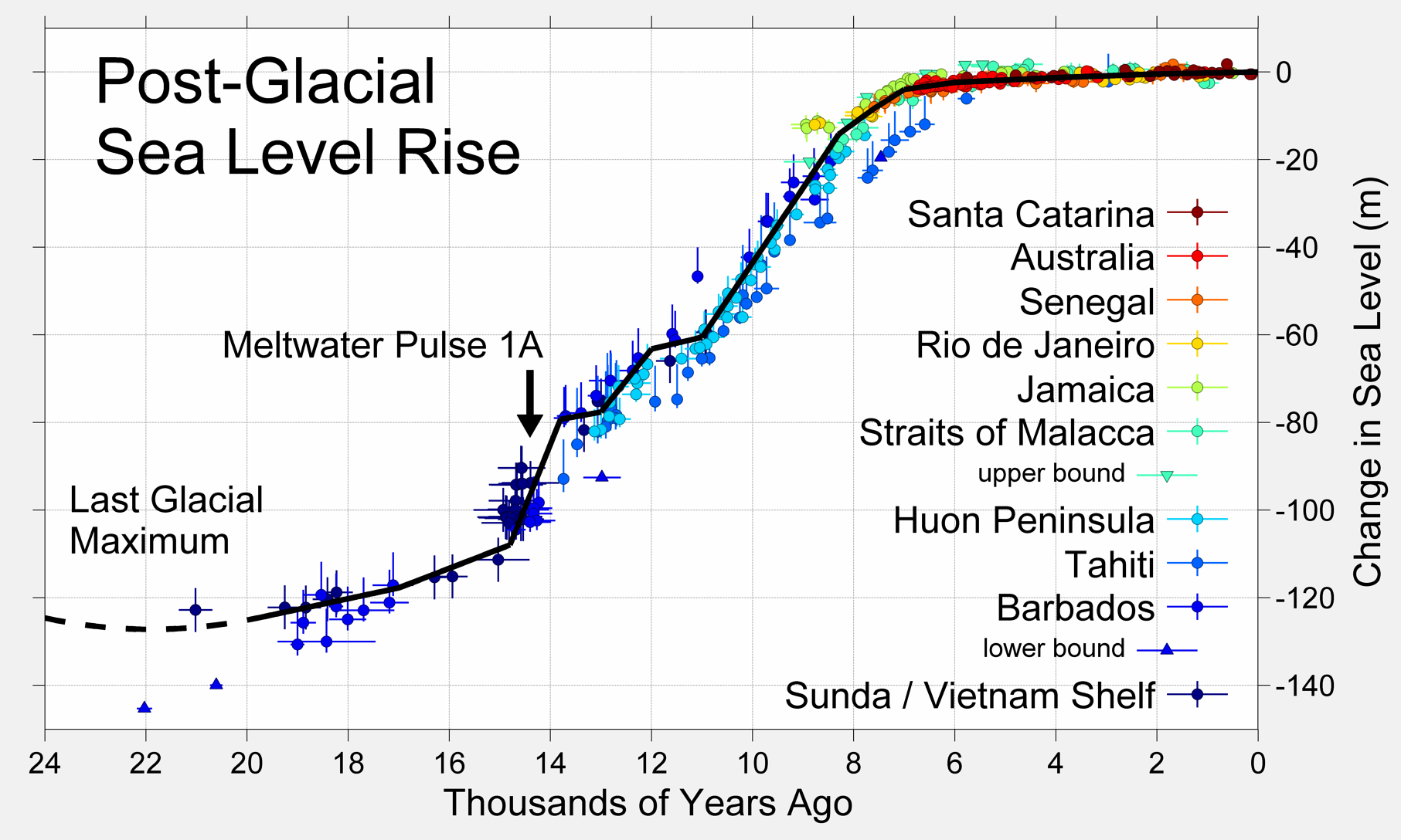
Here’s a graph of sea level change over 20,000 years, sorry no reference, but it looks sciency.
Ocean temperatures certainly hasn’t escaped my thinking, I’ve just been quiet about it until someone else thought of it. Glad to see the bestest Vice President this nation as ever seen in 25 years finally did. This is as good a bogie man as we’ve had since the asteroid scare a few decades ago, we’ll not see it coming …
What is the current average temperature of the oceans?
Here’s a map of NOAAs buoys, the site says about 1,200 total. That’s compared to around 2,000 land-based weather stations in the USA alone. I’d say it’s a fair guess that, world-wide, there’s well over 10,000 data points for air temperature and I think it fair to say 20,000 (and include the buoys, they measure air temperature as well). Whereas, it seems not all the buoys measure water temperature, but let’s assume they all do.
With the 20,000 or so air temperature data points, plus a comprehensive understanding of atmospheric circulation AND more than a few of these stations also releasing instrument packages into the atmospheric column to take reading up to the stratosphere … we can construct a computer model that “fills in” all the rest of the atmosphere. This is not difficult since the data is not changing at all, and we have days and weeks to let the computer run. This gives fairly accurate average temperatures as demonstrated the consistency of five different types of programming. The algorithm is the same and based on Naiver-Stokes.
Ocean temperature is not as easy. First, we only measure sea surface temperature (SST) in large volumes. These NOAA buoys only measure temperatures 60 cm below the surface. There’s no regular measuring of the temperatures down through the water column. Also, ocean circulation patterns are far from being well understood. The good news is that Naiver-Stokes still applies, but without input data, the output data is untrustworthy.
" … namely that rising ocean temperatures are a significant indicator of global warming."
They certainly could be, but right now they are not. NOAA is hard at work developing techniques and systems to do just this. However, we will have to await the results before any grand conclusion is drawn. This bogie man is sitting down there in the oceans hiding, and at four times the energy per degree (for a unit mass), there’s a fuck load of room to hide.
“If the thunder don’t get you, then the lightning will”
No, I’m not; “yes, you are”; No, I’m not; “yes, you are”; No, I’m not; “yes, you are”; No, I’m not; “yes, you are”; No, I’m not; “yes, you are”; No, I’m not; “yes, you are”; No, I’m not; “yes, you are”; … yes, I am; “no, you’re not”; yes, I am; “no, you’re not”; yes, I am; “no, you’re not”; yes, I am; “no, you’re not”; yes, I am; “no, you’re not”; …
It’s like a Bugs Bunny cartoon.
But with out the funny music.
Looney tunes indeed.
Sometimes one showing is worth a thousand tellings.

And here is the current NCDC US temperature data where you can check that shit out
And anatomically correct, to boot.
Global Warming is trying to get involved.
Just tell her nobody likes her and she’ll leave.
Lol, nice dodge. Now please answer my questions:
-
Given that you accept the graph I linked to, will you agree that if a simulation is a pretty good fit with one of the temperature indices, it will most likely be a pretty good fit with the others?
-
Please quote me where I stated or implied that every weather station in the whole world has FIVE separate thermometers with FIVE different schmucks taking FIVE different readings and reporting to FIVE different agencies.
Failing that, please admit that I stated or implied no such thing and apologize.
Okay:
QED
Please define “simulation”.
Interesting link, indeed. There are a number of erroneous predictions in it. Rowland (don’t know him, have to assume a climate scientist or someone like that) predicts
The quote is from 1986, so , according to Wikipedia’s Ozone depletion page he’s off on his prediction by about 30 years or so… they predict that
And then we have an interesting passage where they speak about the expected days with temperatures over 80 degrees in Washington D.C. Here, it seems, Rowland was overly optimistic. He is quoted as saying
According to this site, they actually had 110 days with temperatures over 80 degrees during last year.
So… you’re right, FX. This “showing” actually is worth a thousand “tellings”.
An unexpected bonus, since I didn’t even look at that “prediction”, which is completely and utterly bullshit. I know this because I checked the numbers a few seconds after reading your reply. Somebody had to screw up, either the reporting (most likely) or the prophet himself.
In either case, it’s so wrong it can’t be made right. Most likely it should have been days over 90, because then it makes sense at least. Days over 80 F in DC at the time of the prediction averaged well over a hundred. They still do of course.
Looking at days over 90 (which is what the article meant to say of course) actually allows us to check to see if anything close to what was predicted actually happened.
(the days over eighty shows no increase since 1986)
Which was actually very interesting. It seems the days over 90 F in DC have actually decreased, a lot. Starting after 1999. Since that prediction. The years with the least days over 90? 2000, 2001, 2003, 2004, and 2009. Which pretty much is the reason for no increase in the trend. Certainly the record holder is 2010, but the fact that 1980 is second … never mind. Clearly the warmer nineties show up using that metric. In DC
But the cooling after 2000 pretty much shows why the prediction was so far off. So completely wrong. As always, check for yourself, don’t just believe somebody who already checked.
There is the possibility he meant “days with an average temperature” over 80, which I also checked. It shows no increasing trend either.
It also shows 2000, 2001, 2003 and 2004 in the top lowest years, which would be expected.
2010 the winner for most days, but 1980 and 1943 being in the top ten sort of defeats the scare tactics of using that metric.
The more I think about it, the more I suspect he was using “daily average temperature”, not “daily maximum” for his predictions. It’s still quite wrong of course.
Omaha is a different story.
http://www.nws.noaa.gov/climate/xmacis.php?wfo=oax