Yes, more important. Sort of. I know my eyes go to caps sooner than lower case. I can’t say, objectively, whether I read those words any more slowly. It doesn’t seem so.
We’re talking about mechanical printing, right? Caps don’t seem harder to distinguish to me. Now if you’re talking about speed-reading techniques, where one doesn’t look at all the letters, or even all the words, I can’t speak to that. Except that I’m less likely I think, to skim words that are all caps.
Your eyes go to them sooner than lowercase because words in all caps have a distinct shape that’s different from words in lower case (I’m not talking about reading for content here–they just plain look different). And because of the way our visual perception system works, you’ll tend to notice stuff like that first.
Yep, we’re talking about mechanical printing. And while it may be true that you have less trouble reading all caps than other folks, chances are that it’s still slower for you.
I’m not argueing that reading caps isn’t slower, just questioning the proposed reasons why.
When reading a novel, I slow down for, and sometimes re-read the good stuff, and quickly skim through (but don’t skip) the boring stuff. Problem is, I tend to do the same for material I’m trying to learn. 
Good question, but you’re wrong wrong wrong. So nyaah.
In other words, any researchers worth their salt would control for factors like this. Bear in mind that this is a well-established field of study–I’ve seen cites about the capitalization issue going back at least sixty years.
From my Typography Workbook -
“Headlines in caps/lowercase are easier to read that those set in all caps BECAUSE THE ASCENDERS AND DESCENDERS HELP US TO READ WORDS BY THEIR SHAPES, RATHER THAN IDENTIFYING EVERY LETTER.”
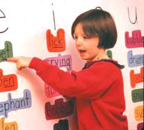
adirondack_mike. Well – in teaching reading on the primary level it’s true that shortly after we teach letter discrimination we also emphasize word shapes to young readers. Enter a kindergarten through second grade classroom, and it’s pretty typical to see word walls with words cut out in shapes like this. So I accept that typography book’s premise.
But – correct me if I’m wrong – typographers also tend to read upside down a lot on the job, because they print large sheets that need to be folded and cut, so they would find reading by shapes an assist in orienting them. But because most people don’t read upside down, I really have to question whether an experienced reader would find all caps lettering much of a hinderance in comprehension or reading speed. As someone who reads all caps lettering all the time, if there is a difference in reading speed in mixed letter and all caps words, I can’t say I’ve ever noticed. I must be outside the norm. But if I am, surely I’m not alone?
Yeah, yeah.
I asked a guy at work who knows a lot about trademarks and such (we work for a HUGE oil company) about this, without mentioning this discussion, and he said that business’ use mixed because so that they can use caps to draw attention to their corproate name. When people look at the name longer, they’re more likely to remember it. I think that backs up what you’re saying.
ChevronTexaco, for example. 
'Course, that’s one person’s opinion. But I was careful not to prompt him. Single blind, right?
We have grown, through tradition, to associate caps with certain things: the first word of a sentence or quotation, a name or title, an abbreviation or acronym (like NATO or the UN), the letter/word “I”. A paragraph in all caps (or for that matter, a passage in all lowercase) would be more difficult to read because it is harder to distinguish these things.
As I understand it, the problem is the ALL CAPS lacks the decenders (portions of the letter that are ‘below the line’) and so tend to look alike.
Russian has this problem (or so I am told) without ascenders and decenders, the letters all look the same. This slows you down.