Ack. When I said “I have a hunch that it’s modern,” I meant “contemporary,” of course, hence the passe comment.
Thanks for the link! I do like her work. And I really like that link OpalCat posted. It’s reminds me a bit of a couple different artists, but it’s very much original, not quite like anything I’ve seen before.
To go back to the OP though, I’ll explain in a non-mystical way what abstract art is about.
If you don’t know what Graphic Design is, then that’s the first thing you need to understand. The basic idea is that, depending on how you arrange shapes on a paper, or in a space, can look good, or it can look like crap. You can also “force” the eye to look at certain places so as to highlight certain things. If you want an example, just try comparing a crappy MySpace page to a professional webpage. The people who make professional webpages are, essentially, just people who know how to lay stuff out in a way that looks good (i.e. graphic designers.)
Abstract art is, essentially, just graphic design. The main difference being that you’re getting rid of the text and pictures, and just leaving the layout. You’re arranging colors and shapes in a way that, if you’re good, will still look good. It won’t look like anything to be sure, but if you look at a page in a magazine, that doesn’t look like anything either. So if you look at it expecting a naked woman or something, then you’re going to think “That sucks.” But if you simple accept that the whole goal is to arrange shapes and colors in a way that looks nice, then you can appreciate the picture.
You’ll notice that a lot of abstract art ends up in business lobbies. The reason for that is because they, by definition, look good. And they are guaranteed to not have anything offensive, political, or intrusive.
And I’ll just note that of the pictures listed in the OP, I’d vote for the Rothko as the best one. The first one I don’t like (and frankly think sucks), and the sculpture one really needs greener grass to bring out the red.
Personally, I wouldn’t buy abstract paintings though.
May I add that that Lynne Taetzsch painting, posted in the OP is phenomenal. No kid could do that. You could not do that. The degree of difficulty in doing that is off the charts. Look again at it and literally imagine cow much control those brush strokes required. They only look like they are flailing the brush at the paper randomly. What about the distribution of color? What about the blended background that the strokes are over?
I could hang that on my wall and stare at it for hours.
I think it’s worthwhile, when people get in a tizzy about modern (not Modern) art, to point out that before Picasso did this or this, as a kid, he did this and this.
Just so we can get past the arguments about what a kid can or can’t do, and as an illustration that sometimes people arrive at abstraction from realism because it works for them.
Yep. I love to point that out to people too. Picasso, IIRC, started that First Communion painting when he was only 14 years old and finished it less than a year later. People really seem to take Picasso’s subsequent work a lot more seriously once they realize he knew exactly what he was doing.
I’m certain that some “modern art” is created purely to show that “I’m an artist and therefore anything I do is art”.
The guy who cut an A4 sheet of white paper into 1cm squares and sold them as “art” for (IIRC) £100 each is a case in point. I can’t dig up a cite for that, but I read about it a few years ago.
Sorry, but if you could stare at that for hours, you could spend days looking at my garage floor after I’ve been decorating. :dubious:
The very simple abstracts, like the Rothko linked to in the OP, I can definitely see the appeal of - it’s all about the composition. But that Lynne Taetzsch is just dribble. Less is definitely more (IMHO of course).
I was thinking about this last night as my 3-yr-old twins dabbled w/my watercolors. I should post their artwork - it’s nothing like that of a Famous Adult Abstract Expressionist. The structure is extremely simple and the effects are random. There’s not enough there to hold your interest for more than a minute or two (unless you happen to be Grandma).
The Rothko Chapel is part of the legacy the De Menil family left Houston. It’s a center of spiritual & artistic activity. And the setting does work beautifully with the paintings. They were Rothko’s last works before his suicide.
Years ago, I saw a Rothko show at Houston’s Museum of Fine Arts (possibly funded by the De Menils–they worked with all our arts institutions). Starting with cheerfully Surreal works, he gradually developed the “window” shapes. The colors became darker–black & dried-blood brown. After seeing the last works, I considered just throwing myself down the marble staircase. Lunch at the tearoom & a quick tour of the Impressionists cured me.
I can’t say I like Rothko, but won’t deny his power.
The Menil is a real gem. I especially love the Surrealists. The collection ranges from Magdalenian art through the present day, with emphases on periods & places often neglected by “big” museums. Learning to read “spiritual” content helps me understand some of the more austere “modern” works as responses to the post-World Wars, post-Holocuast, post-Atomic world.
But, aren’t we post-post-Modern now? People might be surprised at some of the art being made today.
I highly recommend getting out to actually look at art. And look again. It increases your ability to appreciate difficult art–& sometimes come to love it. Or to say with confidence that you think certain pieces are pretentious crap.
My wife had a similar response a few years ago in the Rothko chapel. We walked in and the paintings staggered her, literally … in the sense that she actually had to flee outside and sit down. “My God,” she said, “It’s all about DEATH!”
(Personally I’ve always found the chapel soothing and meditative, but I could see where she was coming from. There’s a deep sadness there as well. Rothko is amazing.)
I’ll repeat what I’ve said in previous threads about non-representational art. All paintings have an underlying structure of color, shape and composition. The innovation of abstract art was the realization that a painting could be “about” pure structure without having to be “about” a particular real-world subject or scene.
The thing is, to appreciate non-representational art you have to be sensitive to what constitutes good and bad structure. Partially it comes from looking at lots of art and partially it comes from learning to look past the surface of a painting to its bones. I know it seems hard to believe if you don’t “get” abstract art, but there really, really is something there. We’re not just being pretentious.
Well, if your garage floor arranges itself in such perfect balance of shape, line, and color, then I probably could stare at it for days. Somehow, I doubt your garage floor will resemble a Taetsche painting. To give you an idea where I"m coming from this is from a series of my favorite paintings in the world. Less is not always more. They both have different effects on the viewer.
edit: Starving Artist–yep, that work is completely up my alley. I only wish I had a spare seven grand lying around.
Yeah, most of the artists I’ve been mentioning at least are not “modern” as in “contemporary,” but rather modern as in that break from realism and towards abstraction that started more or less with Cezanne and continued up until today. But most folks who profess not to like modern art generally mean (in my experience) pretty much all abstract or nonrepresentational created over the last 100 or so years. It’s much easiesr to intoduce and explain the painters at the forefront of this movement (like Picasso, Van Gogh, etc) and to progress chronologically forward than to start at the truly contemporary artists who even I don’t get much of the time.
I think successful abstract art is able to tap into a subconscious part of the brain that random kid art does not.
I read an article a while ago (can’t remember the specifics) about an artist that painted with a very unique color pallet. Scientists studying a part of the brain discovered that it processed those exact colors. So this artist was somehow able to tap into that part of the brain with his paintings.
That’s what I feel when I’m looking at some abstract art. It’s like it’s activating some part of my brain and I can’t fully comprehend it. That second link you had in the OP, A kid could do this has that effect on me. The layering of the colors, the blurring, and the shapes of the lines makes me want to look at it. It has a 3D aspect with motion.
Kid art is generally not like that. Kid art is some pretty colors on the page. I look at it, it looks nice, and then I move on. An abstract painting like the one above compels me to examine it. I think that’s because it’s activating areas in my brain in an unusual context and my brain is trying to understand that.
True enough. However, I also happen to be quite fascinated by children’s drawings. They’re mostly not that interesting, but there are a few that quite strike me because of a child’s intuitive sense of composition. I believe this observation is also made in Drawing From the Right Side of the Brain. As kids grow older, that “fill the frame” sort of composition becomes lost in an effort to more accurately depict reality. It’s really interesting to see how children seem to be born with a grasp of basic graphic design principles.
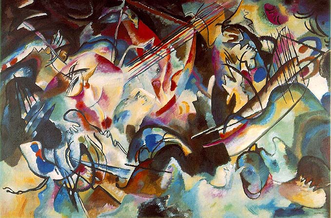
pulykammell, I also love the Kandinsky. But the picture linked to in the OP does nothing for me at all, and IMHO can’t be compared. The Kandinsky has form, the Taetzsch has none.
Having said that, I was not familiar with her work, so I Googled for some more examples. Some of these are pretty interesting, but the majority of the works in those 4 galleries leave me cold.
OK. I will agree with you that they’re certainly not as forceful or interesting as the Kadinskys, and my other objection with her work is that a lot of looks like it’s trying to represent what’s already been done about seventy or so years ago.
However, compared with the other Taetzsch painting, I actually like the one the OP linked to best. I’m not sure how you can argue the Taetzsch painting doesn’t have form–it’s a pretty straightfoward and clear composition–two brilliantly red arcs leading to the center of the frame, implied diagonals also drawing the eye towards the center, multicolored splashes of paint oscillating the eye around the painting, corners subtlely faded in with muted colors to contain the piece and contrast against the colors, the 3D effect of the layers of warm colors floating in front of the cool colors, and so on and so forth.
No, it’s not a Kandinsky, but it’s much easier to explain (IMHO) and clearly holds to classic graphic design principles. I’m not sure how you can blame the painting for having lack of form–form is it’s strongest point. Now, if it leaves you cold, I can understand. It’s almost too calculated a painting.
My view is that the “art” in “modern art” is a product of three things.
Consensus: Communities of people with shared expertise tend to rarefy themselves by adopting criteria for judgment that are difficult for non-community members to access. Then they apply those criteria to create dogma. I think, to a great degree, art is what the art community has decided is art, and that decision is informed by criteria that they’ve chosen. Had they picked different criteria to organize their club, we would have a different set of things called modern art.
Aesthetics: At the same time, things like composition and color are facts, and the art community’s consensus will overlap significantly with what happen to be aesthetically pleasing physical characteristics.
Conversation: The single most important thing I learned in my art history classes is that all art comments on other art. This commentary sometimes takes the form of simple “influence.” But it can be much more explicit. Modern art is in some ways a continuing conversation, with each new artist commenting on prior artists. These comments can be brilliant. As an analogy, imagine that two brilliant physicists are having a conversation. After hours of discussion, Physicist A says to Physicist B: “Ah, by your admission you have disproved Theory X.” Taken on its own, there is nothing brilliant in that comment, and it is comprised of words that a (smart) child could say. However, taken in the context of a continuing conversation, Physicist A’s statement might be an exceedingly brilliant leap. But you would have no way of knowing that without understanding the entire preceding conversation. Modern art is like that, to my mind. Much of it, at least, isn’t meant to be viewed in isolation. Rather, it is meant to viewed and considered by those who have been following the conversation.
A couple weeks ago, the Washington Post published a very interesting article about the following experiment: Take one of the preeminent violinists in the world, playing one of the finest violins ever made. Put him in a D.C. subway stop. Have him play one of the most difficult pieces for the violin ever written. See what happens. (Short answer: Almost no one noticed.) The article includes the following passage, in which a senior curator at the National Gallery discusses modern art.