Although it’ll never fit in a birthday card, the colorful Italian tenner trumps all.
Well, it might be me. I’ve been known to not stand behind quite a few people in my day.
As Mr. Blue Sky wrote it’s almost miraculous that these changes have been instituted. For years our bills were all the same size and color scheme. The only differences were the numbers and the picture.
If all our coins had been the same with just different numbers and images can you imagine the outrage?
Years and years ago a woman US Representative made the sensible suggestion that the black backs on the bills be replaced by different colors for the different denominations. She was laughed at by our elected Congressional leaders.
Maybe after we get our currency user friendly we can come way up into the 19th century and use the metric system for weights and measures.
Slap! Slap! Slap!
Good Lord, it looks like an illustration for a cheap elementary school history book with a tile like “The Story of Our Country with Pictures of Smooth Faced Dead Guys Looking the Way They Would Look in the Saturday Morning Cartoons.” The damned thing looks like it was designed by the Elderly Republican Ladies Of Dubuque Social Club. The problem isn’t that its different. The problem is that it isn’t different enough and is throughly pedestrian to boot.
Of course since all it will buy is a dollar’s worth of gas (1962 price) and a cup of coffee flavored swill it’s good enough.
Having lived almost my entire life in the US, I find that other countries’ colorful money looks kind of silly to me. I suppose growing up with our monochrome currency has made anything else seem kind of frivolous, while US Dollars strike me as more serious and dignified. Bills with lots of colors and designs always remind me a bit of Playskool toys; it’s interesting and all, but it doesn’t seem like real money.
Yes, I’m aware that this is just my acculturated view, and yes, I know how narrow it sounds, etc., etc. I’m just saying.
I think this is most Americans’ view of colorful bills - we used to call it “Monopoly money” when we were being provincial.
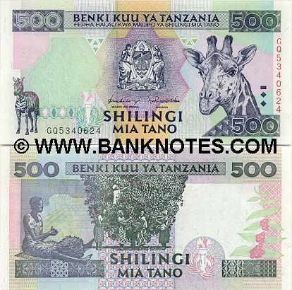
My donation to the colorful money debate: the Dutch Guilder
Are you sure that’s not a TV test pattern?

Yikes, that’s hideous! Guess this is why the Dutch aren’t the leaders of the fashion industry.
I think our money is so drab because we spend so much time thinking about it and so many people try and get us to spend it, if they made it all pretty we would spend way too much time looking at it and not spending it. 
Considering how the dollar has been doing against some of those colorful currencies lately, I’d tread gingerly on the phrase “real money”… 
It’s not rational, it’s sort of in the “if the ointment doesn’t sting it isn’t doing anything” genre.
As I was going up the stair,
I saw a man who wasn’t there.
He wasn’t there again today…
I think he’s with the CIA.

In the tradition of colourful money, my all-time fave: the Netherlands 50-guilder note.
I like yellow and sunflowers. What can I say…
Continuing in that line, here’s my favourite Canadian note: the back of the current twenty-dollar note. Yes, it has yellow. And Haida art. Haida art is inherently cool.
Just remember. We have oil and no federal deficit. Our dollar is going up.
That’s cool. But why’d ya put the dude from Midnight Oil on your money? :dubious:
On a serious note, I am assuming that your new Technicolor® bills now incorporate tactile and other devices to assist the sight-impaired. But your old ones didn’t (or if they did, I’ve never noticed them).
Without these new indications, how do the sight-impaired tell the difference between denominations of bills which are all exactly the same size and roughly the same combination of green & white? Guesswork? Smell? Or do they rely on the honesty of the bloke behind the counter?
Unfortunately, it still has that wanker Hamilton on the front.
Burr won the duel, why isn’t he on our money?
MY EYES! ZE GOGGLES! ZEY DO NOSSING!
Lessee…
On the one hand, we have bright colors.
On the other hand, we have the best currency in the world, but it’s drab.
Gimme drab. Lots of it!
Dude! Have you ever looked at the Dutch Guilder? I mean, *really *looked at the Dutch Guilder? Awesome, man…
cough, cough
um…what were we talking about?