You want better hats? Try this.
[QUOTE=mbh]
In the early 1800s, they changed to dark blue jacket and sky blue trousers. It’s been that way ever since. {/QUOTE]
The story is that the pants and the blouse (tunic) matched up until Civil War days. During the Indian Wars, the soldiers would only wear the wool tunic in the winter, preferring undershirts in hot weather. So the pants faded while the tunic did not. Even now, general officers wear dark blue on top and bottom.
Jesus H. Christ. Those Army pants with the stripe down the side, look like a fucking basketball player’s warm-up outfit. And it’s true that they don’t match the jacket. At all.
This is really absurd.
Are they trying to look like Marines or something? With the pants that don’t match the jacket? You fucked up, Army. You fucked up big time. You ought to be ashamed of yourselves.
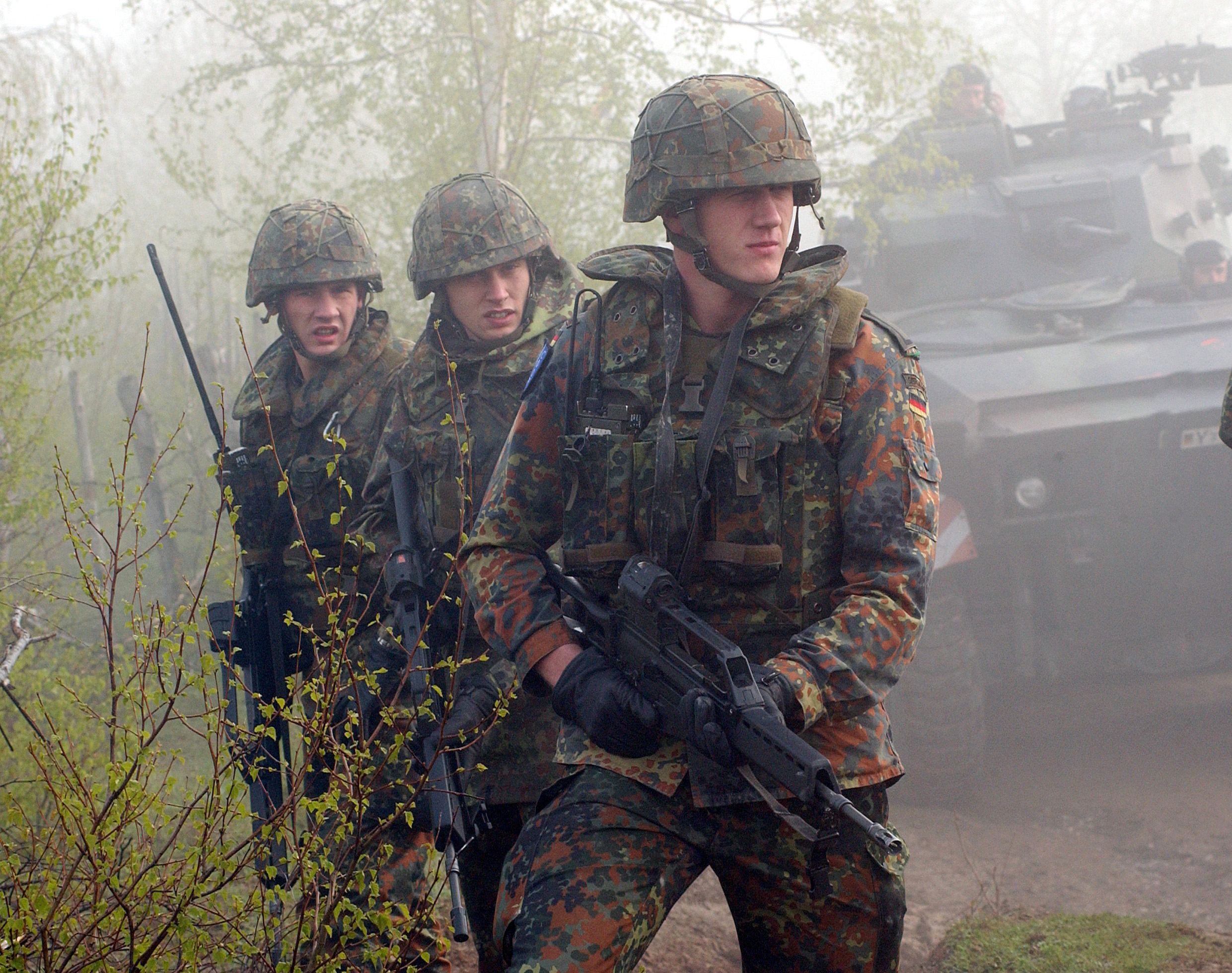
And when it comes to the combat uniform, Germany (as usual) and Denmark have us beaten to a pulp in terms of style. (I love that the Danish guy on the left is actually eating a Danish.) That Flecktarn pattern is way easier on the eyes than the digi-cam.
[QUOTE=Argent Towers]
Jesus H. Christ. Those Army pants with the stripe down the side, look like a fucking basketball player’s warm-up outfit. And it’s true that they don’t match the jacket. At all.
This is really absurd.
Are they trying to look like Marines or something? With the pants that don’t match the jacket? You fucked up, Army. You fucked up big time. You ought to be ashamed of yourselves.
[/QUOTE]
But there is NOTHING different in the colors of the pants OR jacket. NOTHING. The colors are the exact same that they’ve been for years and years. There is a slight difference in the material and superficial differences in the wearing of certain insignias and the addition of a CSIB which never really existed at all.
And of those, I’d bet 99% of civilians and even a large percent of Army personnel couldn’t even notice what’s different.
The differences aren’t big enough for you to notice. Everyone in here is acting like it’s some huge difference and “OMG??? BLUE???” Dark blue jacket, royal blue pants, yellow stripe… its been like that for YEARS on the dress uniform.
The Army has decided to do away with the Dress Blue as an optional enlisted uniform and replace ALL of the uniforms with this Dress Blue-like uniform their calling the Army Service Uniform. It takes the place of the Class A and Dress Blue. As well as several others and different variations of each.
The only real difference. The only change that anyone should really be disgusted with is the CLASS B version of the Army Service Uniform. Wearing just that white shirt with pins and ribbons on it looks… unappealing at best. Using the grey shirt for the B version would have looked much better. They’d still be better off keeping the white undershirt and coat as the dressier version, and allow for Class B version to be a gray shirt and those pants, and a Class A variant to be the gray shirt and jacket, and a standard necktie.
But anyway. Let’s make sure we’re all on the same page here. The picture of the soldier with the dark, dark blue jacket and royal blue pants doesn’t look anything at all different that what we’ve had for YEARS! Nothing is new or strange.
http://www.arlingtoncemetery.net/djdresky-funeral-service-photo-04.jpg
Yes, it is the Class B uniform that is an affront to the laws of God and Man.
I can’t help but think – Hall Monitor!
[QUOTE=Bear_Nenno]
But anyway. Let’s make sure we’re all on the same page here. The picture of the soldier with the dark, dark blue jacket and royal blue pants doesn’t look anything at all different that what we’ve had for YEARS! Nothing is new or strange.
http://www.arlingtoncemetery.net/djdresky-funeral-service-photo-04.jpg
[/QUOTE]
Yes, except only now, they’ve enraged Argent Towers! ![]()
[QUOTE=Argent Towers]
And when it comes to the combat uniform, Germany (as usual) and Denmark have us beaten to a pulp in terms of style. (I love that the Danish guy on the left is actually eating a Danish.) That Flecktarn pattern is way easier on the eyes than the digi-cam.
[/QUOTE]
Well, the goal isn’t so much for the combat fatigues to look good so much as that they should work well. I mean, if aesthetic attractiveness was the most important factor in a combat uniform, we’d all go into combat in pressed service dress uniforms with neckties and tastefully polished low quarters.
[QUOTE=Bear_Nenno]
Army Regulations regarding the Wear and Appearance of the Army Uniform (AR 670-1) does not apply to General Officers.
[/QUOTE]
This has got to be a great reason for making it to General… hmmm… perhaps the new uniform is intended as additional motivation for promotion. ![]()
Am I the only one connecting this and Bear_Nenno’s post and visualizing a General who looks like he escaped off the set of The Adventures of Priscilla, Queen of the Desert? ![]()
[QUOTE=Argent Towers]
And when it comes to the combat uniform, Germany (as usual) and Denmark have us beaten to a pulp in terms of style. (I love that the Danish guy on the left is actually eating a Danish.) That Flecktarn pattern is way easier on the eyes than the digi-cam.
[/QUOTE]
Oh, I don’t know… ACUs look pretty cool, I think, at least when the Joes are in full battle-rattle.
[QUOTE=Bear_Nenno]
But anyway. Let’s make sure we’re all on the same page here. The picture of the soldier with the dark, dark blue jacket and royal blue pants doesn’t look anything at all different that what we’ve had for YEARS! Nothing is new or strange.
http://www.arlingtoncemetery.net/djdresky-funeral-service-photo-04.jpg
[/QUOTE]
I’m going to have to take you at your word because you are, actually, you know, in the Army and have direct experience with these uniforms. But at least in the photos I’ve seen…that picture you linked to there looks very different from this one here. The blue of the pants looks much lighter and more vivid, and more different from the jacket. Is this just a difference in the lighting conditions of the two photographs?
ETA: It could be the settings of my monitor also…
[QUOTE=bump]
Oh, I don’t know… ACUs look pretty cool, I think, at least when the Joes are in full battle-rattle.
[/QUOTE]
See, that’s the thing. You don’t see them in full battle rattle. You see them at the public library, in their cammie jammies.
I might not have any dog in this fight because I’m not part of the military, but just in terms of aesthetics, I think if servicemen/women must go around among the civilian population wearing some kind of combat uniform, instead of a dress uniform, why can’t they wear something like the guy on the left in this picture? That guy is wearing camo pants and combat boots, but he also has a nice solid-color shirt, that’s tucked into his pants. He looks sharp. The guys I see wearing the digi-cams around town, they’ve got this really baggy, dumpy look going, with the long-cut field jacket that’s not tucked into the pants and just hanging down.
The Wørd, According to Tripler:
[Vitriol]
I’m sorry, but this whole damned fashion parade has gotten way out of hand, and is pretty much a pissing contest for “Nicest Uniforms” like levdrakon mentioned. It didn’t start out that way, but seems to be the hippest bandwagon for any General Officer to jump onto to “modernize” their component. :rolleyes:
IIRC, it actually all started with the Canadians, who developed the CADPAT, with which the US Marine Corps later said, “Hey, that actually works better’n the BDU. Also, we need to physically build a better uniform with pockets in more combat-ergonomic locations. We ought to redesign using something similar to the Canadians’ pattern, but with our own construction.” Thus, the Marines developed their new MARPAT, and added some pockets here and there, and made some other redesigns. I talked to a couple of Marines about ‘em, and they laid it on the table: their uniforms were designed to be worn under body armor, hence the slanted pockets and cargo pockets on the arms (which are sized for magazines). Some of this is anecdotal, but similar stories came from three guys I independently talked to, and honestly, it makes sense. Besides, the Marines’ aren’t known for change just for the sake of change. If it’s broke, then they’ll fix it. The old BDUs were obsolete. The Marines brought in their new stuff, and issued it in two patterns: woodland and desert.
So then the Army got wind of it, and said to themselves, “Hey, um, we need to modernize too! [sub] or something[/sub]. Plus, we can save on uniform costs if we make the pattern kinda sorta work everywhere! We’ll make a few pocket mods, but yeah, that will save us money!” Thus, the new ACU was developed as a tag-along to what the Marines were doing. The Army “benefit” was that one uniform for any location on the globe. I don’t think I have superpowers, but I can see a Soldier standing in the brush easily in a woodland environment as well as a desert environment in the new pattern. It just doesn’t work. Might as well baste 'em in some ‘hunter orange’ paint.
The Air Force, not to be left out, was all, “We need modern uniforms too! We’re doing demanding work! Our Airmen need better uniforms! [sub]everyone else is changing, so it has to be the way to go[/sub]” But, instead of going out and developing a pattern that actually works (like the Marines did), they basically plagiarized the Army colors and pattern, but tweaked it with a “tiger stripe” just enough to not be called a copycat. Plus, we did even less work with the damn thing: adding a few measley pen pockets on the wrists, and adding a few inner “coat pockets” which are too damn hot and everyone cuts out anyway. Just about the only thing the Air Force did right is kick out the mandated wear date to 2011 (and I’ll be watching the clock on 31 Dec 10).
Am I bitter? Yer damned frakkin’ tootin’. It’s just a pile-on from something that had been working for years (BDUs) which helped keep costs down in a McNamara-esque way of availability across all the branches. Now that the Air Force is freaking out about saving money for their new friggin’ F-22s, they’re kicking valuable Airmen out while redesigning the ABUs and the new Service Dress. It seems to me that certain General Officers have their craniums stuck where their stars don’t shine brightly, and have their priorities completely wrong.
And I understand that the Marines spent money to develop the uniforms. It’s interservice rivalry–I get it. Well, AFAIK, they built the thing right, so the Army, Navy, and Air Force ought to be able to strike a licensing deal with the USMC for a uniform that works. Meanwhile, the Air Force is pissing away millions of dollars on programs that just don’t need to be worried about. Fer crissakes, I know units that are having a hard time getting the money to maintain bulldozers, and yet their Airmen are having to go out and buy new friggin’ uniforms? C’mon.
It’s a bandwagon, and the music should have been stopped a long time ago.
[/Vitriol]
Thus is the Wørd. So let it be written. So let nothing be done.
Tripler
It’s called “standardization” for a reason.
[QUOTE=Argent Towers]
I might not have any dog in this fight because I’m not part of the military, but just in terms of aesthetics, I think if servicemen/women must go around among the civilian population wearing some kind of combat uniform, instead of a dress uniform, why can’t they wear something like the guy on the left in this picture? That guy is wearing camo pants and combat boots, but he also has a nice solid-color shirt, that’s tucked into his pants. He looks sharp. The guys I see wearing the digi-cams around town, they’ve got this really baggy, dumpy look going, with the long-cut field jacket that’s not tucked into the pants and just hanging down.
[/QUOTE]
Well, there is a uniform combination that, when I was in the ROTC, was called “C’s and T’s”, basically the BDU trousers and boots, and an undershirt. Depending on what the rules are where you are, the undershirt could be something other than the solid-colored undershirt (it’s pretty common to find squadron/company t-shirts designed to be worn under BDUs/ACUs, I’ve got three such shirts, plus a number of other military-themed t-shirts designed to not show under the uniform).
It’s kinda sad that the only good example I can find of this is from StarGate SG1
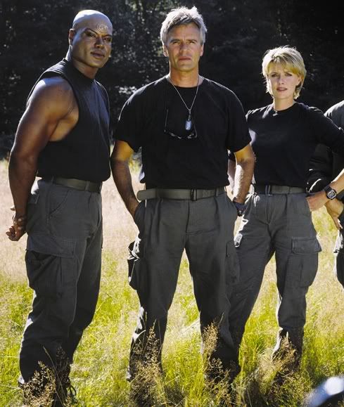
The rule of thumb, though, is that you have to have the overshirt on when you are not in your immediate work area.
When I was in college right before shipping out for the Air Force, I worked at a community college near a major Army base, and many of the soldiers were enrolled in classes there. Basically, there was an arrangement where they could take a few hours off from work to go to class, but they had to be in their work uniform for this, since they were still on the clock, so you had a fair number of ACUs wandering around campus, since they’d have to go straight back to work afterward.
On a sidebar, I was in a photography class with an Army sergeant. It was almost IMPOSSIBLE to see her when we were in the darkroom, and I basically had to learn to listen for her footsteps so as to stop plowing into her. Similarly, the Air Force ABUs (which are much sharper looking than the ACUs, and absolutely not authorized off post unless you are going to/from work or traveling on orders), turn completely invisible in morning fog, while BDUs and ABUs show up as shadows. Because of this, we’re required at my base to wear bright yellow reflective belts when it’s dark or foggy. We call them “Sexy Belts”.
There’s nothing new about slanted pockets. Why something as functional disappeared for thirty years I can only imagine, unless it’s a coincidence that we haven’t been in a major war in that many years, as well.
I also think the reason the Marines had to have their own digital cammo pattern, not just the same as the army’s with a “Where’s Waldo” Globe & Anchor hidden in it, is because they’re still pissed that Gen. Pershing wouldn’t waste cargo space to resupply them with their green uniform in 1918 and made them wear army brown.
[QUOTE=Argent Towers]
I’m going to have to take you at your word because you are, actually, you know, in the Army and have direct experience with these uniforms. But at least in the photos I’ve seen…that picture you linked to there looks very different from
[/QUOTE]
Never take someone’s word for it. I will look it up to make sure they didn’t change the shade of Blue even a couple hues or whatever.
But I believe the issue is a lighting effect. Look at the PDF here and you can see that some of the pants look brighter, some darker. But they’re all the same pants. I think its the lighting.
http://peosoldier.army.mil/factsheets/SEQ_CIE_ASU.pdf
That is a pamphlet from 2006. Notice the gray shirts–part of the original concept. I wish they would have ran with that. But look at the pants on the third and fourth dude (from left). The pants look dark and bright respectively.
I’m sure the Army has a letter/number designator for the exact shade of blue. I’ll see if I can look it up and confirm if its changed.
Looks like they are the exact same shade of light blue, #151. Belt loops and back pockets were added. Jacket is unchanged, with the exception of accounterments.
War of 1812, blue and white.
Mexican War, two-tone blue.
The story I heard was that blue was lower-maintenance than white. So, the trousers went from white to light blue, and the infantry’s branch color likewise switched from white to light blue.