I wouldn’t care if the coins were brown and depicted different kinds of turds, if they’d just adopt a sensible coin/bill policy. A policy that doesn’t relegate coins to rounding out transactions in ridiculously small increments, forcing people to carry around chunks of nigh-worthless metal until they can offload them into jars when they get home, eventually collecting enough to make it worthwhile to pay someone 10% of the value to count it for you.
Coins deserve to be money*, not just change**.
Money defined as something you use to conduct a financial transaction, in its entirety. Almost nobody makes an entire purchase with coins, the only things cheap enough to do so are newspapers, and no newspaper costs under 25 cents anyway.
** Change defined as something you use to balance out a transaction. Bills are used as both money and change, coins are just change.
It’s this year, and some of them are very nice. So is the nickel series. In the collector realm, the Silver Eagle and Gold Eagle continue to be two of the most collected bullion coins in the world.
What I notice whenever I’m Stateside is that they are not cohesive, design-wise. Sure, the state quarters have a theme within that one denomination, but between denominations there’s no thematic hook or branding, between the coins, and no real logic to the sizing.
This is why I say we ought to get rid of the nickle and penny. They are pretty worthless nowadays too. Also get rid of all bills below five dollars. We’d then add a two dollar coin along with a better one-dollar coin. Then we’d have a logcial progression of coins like most countries. A lot of places have a system where it goes up in size by “value” of the metal. Denmark, for example starts with copper then silver, then gold. Obviously these aren’t real metals, but they are what they are meant to be.
And no bitching from people that haven’t actually lived in a country where you can actually buy stuff with change, either. You guys simply have to experience it before you complain about how much you hate change. It sounds counter-intuitive, but it works.
Whoa, people actually like the new Jefferson portrait on the nickels? I thought they looked terrible when they came out, and haven’t changed my mind since.
The coolest coin I’ve seen, though, is the Italian version of the one euro. It’s got Leonardo’s sketch of the Vetruvian Man, with the interface between the gold and the silver being the big circle.
I was unaware of that, and I’m a subscriber to the series. I guess they’re making a buttload of money off of people like me and decided to continue it.
Yes. See at the bottom of the Wiki article. The Mint is profiting handsomely from people who collect the coins and don’t spend them.
As for the aesthetics of American coins today, I disagree with the OP. Other than the Sacagawea dollar and the presidential dollars (most of the portraits look only vaguely like their subjects, and the Statue of Liberty on the reverse looks cartoonish), I like the looks of 'em all. The quarter, the penny and the nickel (esp. the new Lewis & Clark nickels) are esp. handsome, IMHO. It’s a little confusing for schoolkids and some tourists that a bigger coin (nickel) is worth less than a smaller coin (dime), however.
OK, that is cool. But why the harp? It looks like the quarters of the arms represent England, Ireland, and Wales twice (I assume the lion is England and the dragons with the funky tails are Wales)… Shouldn’t they have Scotland instead?
I’ll admit that I’ve never given this issue a thought, but just having returned from a trip to Europe that involved 3 different types of currency and zero confusion as to their coin values, I have to agree 100%.
That’s not correct, the Royal coat of arms consists of: quarterly, first and fourth Gules three lions passant gardant in pale Or armed and langued Azure (for England), second quarter Or a lion rampant within a double tressure flory-counter-flory Gules (for Scotland), third quarter Azure a harp Or stringed Argent (for Ireland), the whole surrounded by the Garter; for a Crest, upon the Royal helm the imperial crown Proper, thereon a lion statant gardant Or imperially crowned Proper; Mantling Or and ermine; for Supporters, dexter a lion rampant gardant Or crowned as the Crest, sinister a unicorn Argent armed, crined and unguled Proper, gorged with a coronet Or composed of crosses patée and fleurs de lis a chain affixed thereto passing between the forelegs and reflexed over the back also Or. Motto ‘Dieu et mon Droit’ in the compartment below the shield, with the Union rose, shamrock and thistle engrafted on the same stem.
Hope that helps.
OK. No. the three dragons are actually lions, representing England - the solitary lion rampant represents Scotland, the harp is Ireland. Wales doesn’t get a mention.
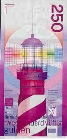
Ah, the guilder notes were lovely. The Swiss ones are very nice too, and cleverly designed.
Back on ugly coins, the generic faces of the Euro denominations are pretty horrible, and the coins kind of feel cheap. Some of the country-specific faces are good, though.
In the early 20th century, the U.S. had some of the most gorgeous coinage on the planet. The Indian Cent, the Buffalo Nickel, the “Mercury” Dime, the Standing Liberty Quarter, the Walking Liberty Half, the Morgan and Peace Dollars, the Indian Head gold pieces and the Saint-Gaudens Double Eagles.
I was actually able to follow the heraldric terminology, if I read it slow. I was just mistaken on what the critters passant gardant were, and which critter represented what. My main confusion was that only three of the four kingdoms were recognized, and I knew the harp was Ireland-- I would have expected Ireland to be the one most likely to be omitted, given that most of it isn’t part of the UK (and even when it was, the bond was somewhat more tenuous).