When the fashion police meet the State police, guess who wins. ![]()
No, you don’t. There is no rule in fashion restricting color combinations to analogous or complementary color schemes. Complementary color schemes are not even that common in fashion – they’re too high contrast. (They are favored by sports teams because they’re high contrast.) It’s a lot easier to pull off a combination of any two colors from a color triad. You’re not going to see many people dressed in blue and orange unless you’re at a Broncos game or something, and red and green is limited largely to Christmastime, but as you noted in your OP blue and red is a fairly common color combo.
Red, blue and yellow are the primary colours from which all other colours are created ( eg you mix red and blue to make purple, mix all three to get brown, etc). They are the strongest and the easiest to reproduce consistently. Yellow is less distinct against white, which leaves you with blue and red.
As a brand designer, when commissioned to design a new brand the first thing I do is a brand audit of all my client’s competitors. I can tell you now that, no matter what the industry, at least 60% of brands will major on blue and 20-30% on red. Why? Well, people are essentially conservative about colour and there’s few people who object to blue. And red? Well it’s strong, bright, confident, noticeable.
Flags are just brands. Countries want their brands to be powerful and universally appealing. Red and blue tick those boxes.
Colour is obviously also cultural, which is evident in both national flags and brands within countries. What the west feels about blue and red is by no means universal.
The primary colors (red, blue and yellow) form an extremely useful color scheme. Red, white, and blue is a primary color scheme without the yellow. White goes with any color so it isn’t part of the equation.
You don’t have to use all three primary colors for something to have a primary color scheme.
The secondary colors (green, purple, orange) also can make very useful color schemes. The particular shades of the color have to be considered. Not every green works with every orange for every application (formal clothing, sports clothing, logos, etc.) but an olive shirt with small orange-yellow accents can be quite attractive.
Well, in that case… Prepare for some unfathomably nerdy color theory… I’ll get the Vaseline… Brb!
I was almost too quick to correct you on rgb… clever. ![]()
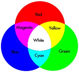
Nitpick: red, blue and yellow are the primary colours for light-absorbing objects, like paints. For light-emitting objects, like computer screens, the primaries are green, red, and blue.
For a light-absorbing object, consider what happens as you add more of the primaries to a colour mix. It becomes darker and darker, theoretically becoming black (if your primary pigments were perfect).
For a light-emitting object, consider what happens as you add more of the primaries to a colour mix. It becomes lighter and lighter, theoretically becoming white (if your primary light colours were perfect).
Light-absorbing and light-emitting colours are kind of the inverse of each other.
That would make a good thread. I’d love to read it. C’mon, you know you want to.
Why is this?
Is it related to the types of cone cells in the eye which are each best at perceiving green, red and blue?
If you use light emition, how do you get yellow? By mixing more green than red together?
The cones cells in the eye can only detect red, green, and blue. All the other colors are just combinations of those.
Think of subtractive pigments as filters. The red (or magenta) filters out blue and green. The yellow filters out red and green. If you put all three together, you block out all ranges and get black.
Kinda but not really. Think of the cones as seeing “reddish, greenish, bluish,” but these don’t look like what many of use would consider “pure” RGB. Our color perception is way more complex than just mixing three primaries. Our retinas and neural circuitry are made to perceive color, but the “color” was out there before the first animal could see color. Instead of a filter, the additive process recombines split light.
Monitors use three specific RGB coordinates because a) they are limited by the chemicals available to create the phosphors and b) the ones we use try to cover a wide range of the color gamut. The phosphors used do not match our cones’ peak sensitivities at all, and may vary by manufacturer.
Yes.
Puerto Rico’s flag is actually an direct copy of the Cuban flag with the red and blue swapped.
Oh no. I was hoping it wouldn’t have to come to this. Seatbelts.
So, yeh. As already mentioned, the physical nature of light has been thoroughly studied, and labeled “Subtractive” and “Additive”.
Both terms indicate what method is used to obtain the color white. Both systems, in a perfect universe would only need 3 primary colors.
Additive; red, green and blue. You get white light, if all three are mixed equally, in the form of light emission.
Subtractive; cyan, magenta, yellow. You get white light of the reflective nature, like the surface of a blank piece of paper, because you have to subtract these three colors to achieve white. Not too hard… but look at my user name. I’ll wait.
…
Okay, so you probably deduced what ‘cmy’ stands for, but ‘k’? Some people would argue it stands for ‘black’ using the last letter of the name, as not to be confused by the ‘b’ in blue. I prefer the argument that the ‘k’ in ‘cmyk’ comes from the term used by printers: Key Color (or Key Plate).
If additive and subtractive colors are both methods to achieve white, then the reverse should be true to achieve black. In reality, it’s not so easy. Printers found that when they used the 4-color printing method (aka Process Printing; cyan, magenta, yellow, black or key), their pigments weren’t perfect… let’s back track… White light from the sun is additive, but objects or pigments absorb certain wavelengths within this white light, and bounce or reflect back certain wavelengths. A red apple absorbs all the components of the incoming white light, and only bounces back the reddish part of the electromagnetic spectrum.
Okay, back to Process Printing. So, printers realized it was nigh impossible to obtain a perfectly cyan pigment; and so forth for the other two. There’s some other physical factors involved like the way these pigments mix, and are layered on top of one another, but all you need to know is the best they could to to reproduce a picture of a pirate ship flying the Jolly Roger, was a brownish, muddy field behind the skull & crossbones. Shit. So, they cheated by adding black pigment into the mix, a fourth color, to get nice, happy, crisp pictures. And thus the pirates Arrr’d, raised their bottles to their flag and drank their rum.
Which brings us back to flags. See how I did that? Yeh… I impress myself sometimes.
So, why red, blue and white?
Beats me.
I agree with San Vito. Red and Blue are colors that really appeal to people. Red is “hot” and the blue is “cool.” All you need is a neutral third selection to provide separation (at least, colorwise if not always spatially) between the main colors in the design. White is both neutral and bright.
Agreed as well, although it could be just a matter of indoctrination, like how were perceive pink as girly and light-blue as boyish. It used to be the other way around.
But you do have a point. The colors may not arise from a human aesthetic standpoint, but rather, what colors are found in nature and how we feel about them individually.
We do call colors on the red end of the spectrum “warm” colors, and the blue end of the spectrum “cool” colors, because of what we’re used to in nature. I can argue that for myself, temperature imparts an abstract notion of meaning.*
*I feel this way about lighting. Incandescent, warm, yellowish light feels good in a way that’s hard to describe, over cold, sterile fluorescent lighting.
Huh. I wasn’t familiar with the “subtract to make white” definition. I’d always assumed the names meant that additive colors got brighter as you increased them, and subtractive colors got dimmer (reflected less light). One added light, and one subtracted light.
But I trust your definition, since mine was just intuited.
As for why red, white and blue. The primary colors are bold, elemental and unalloyed: the Sacred Trinity of the color world. However, yellow is a problem because it’s too light to show up well… the Holy Ghost of the primary colors. It doesn’t darken cleanly, but is too potent to serve as a background.
So flags, beer cans, sports team and book covers use blue and/or red, and often add white for the background. (Or sometimes black, but it’s a lot more intense.) It’s a formula that provides primary potency and readability, without being overwhelming.