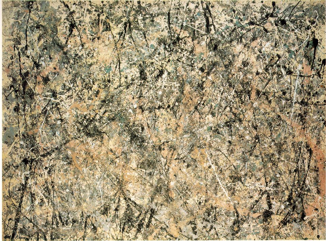
Why: As with all of Pollock’s work seeing the depth and texture in person is much more impressive than a picture could ever be. Make your browser full screen to see more clearly the different layers, it’s almost infinate how deep the motion flows. This particular piece is 7 feet 3 inches by 9 feet 10 inches. Astounding in it’s size and scope. I know many people don’t “get” this kind of art and feel that it’s just “spilling paint” but as the artist chooses the rhythm and composition. The placement of the colors it becomes art. Note how no one color dominates. How no one section is heavier than any other. It’s random and “sloppy” but it has a precision to it, a purpose.
Who: Wassily Kandinsky
Why: Kandinsky had an amazing color sense, in his earlier more representational work you see incredible color palletes used to portray not quite realistic landscapes. later, is work becomes more about the colors and the feel rather than the image as a whole. Black and Violet, dispire having nothing but shapes and colors, feels warm and inviting rather than cold and sterile.
I think I fixed the link (it didn’t work for me). If not, this one might work: Temple Expiatori de la Sagrada Familia. FTR: I don’t think it’s ugly from any distance.
This thread re-opened a painfull wound for me. There was an Impressionist exhibit at Atlanta’s High Museum back in 1999. In the exhibit were many pieces from Monet and Renoir, including a few pieces where the friends had painted the same landscape or corner of a forest at the same time. One of these pieces, by Monet, enthralled me on the spot and they just so happened to be selling a large poster of that particular piece in the gift shop. So I bought it, even though I was living in a dinky little shithole of an appartment at the time, and I had no place to put it. Somehow the tube I was storing the poster in got wet, and it was ruined. In the mean time, I’d also managed to forget what it was called. Not to fear, I thought, I can just find it online. Ha!
Over the past few years I have attempted to dig up this painting at least 3 times, to no avail. Hours of surfing and googling and getting crossed-eyes trying to find it on all of the (copious) sites that sell prints/posters of Monet’s work…all for naught…untill 30 seconds ago today
Why? - I swear I can smell, taste, and hear this painting. I would so very much enjoy being able to spread out a blanket, munch on an apple, and then take a nap at that very spot. How amazing a day it must have been to set up easles with a friend and both paint there. I don’t remember much about Renoir’s piece from that day, and I (go figure) can’t seem to find it online, but both artists’ presence there together at that spot certainly bolsters my appreciation of The Bodmer Oak.
Where: Museum of Fine Arts, Boston. They don’t have an image of it “yet” online but you can see it here
Why: I hate winter. Really really hate it. But this painting makes winter beautiful. This being so made it one of the only two prints I’ve ever gone out of my way to buy (the other being Nighthawks by Edward Hopper). Anything that can make something as ugly and terrible as winter beautiful is worth looking at every day.
Let me start by complimenting the OP, great topic, some very interesting responses.
I’m not a regular gallery tourist, I own precisely one ‘art’ print, this one:
Who: Piet Mondrian
What: Trafalgar Square (that link does nothing for the work, it’s important to see it full sized)
When: 1939-1943
Where: Museum of Modern Art, NYC
Why: It’s difficult to say why this piece, with no seeming intrinsic beauty and such a simple structure can hold my attention the way it does. Whilst intricate landscapes and portraits of renaissance nobility hold little interest for me and much modern art seems to me to be unintelligible these few lines and blocks of colour have been the subject of much thought. I suppose it’s because I know it’s a landscape painting, I know the area it’s a painting of but I can see no relationship between the canvas and these things. It’s a constant battle for understanding, me versus the artist, every day (a print hangs in my study, I’m looking at it now). One day I may understand, and it may no longer be my favourite work of art. 17 black lines, 11 blocks of colour, art as puzzle for the viewer?
Who: Walton Ford
What: Malu
When: 1998
Where: Not in my living room, dammit.
Why: His paintings of animals are full of colour, movement and emotion.
Who: ?
What: Chauvet
When: 31,000 years ago (date is in dispute)
Where: Ardèche Gorges, in south-eastern France
Why: I get chills when I see the photos from this cave. It’s wondrous that this art survived for so long. Yeah, I like rhinos.
why: The reproduction (as usual) doesn’t do this painting justice. It is an utterly beautiful altarpiece, and probably Giovanni Bellini’s masterpiece (though I’m also quite partial to his San Giobbe altarpiece). The atmosphere is almost palpable as it envelopes the majestic figures of the Madonna and saints, who seem to move with effortless grace and beauty through an illusionistic space. Indeed, when you stand before the painting in the church, it feels like the painting’s space is a continuation of your own space (notice how the columns or pilasters at the edge of the painting are real, stone pilasters from the altarpiece’s frame; their style and shape are continued by the illustionistic architecture within the painting itself). It feels as though you could step through the canvas and directly into the Madonna’s court.
The tones of the painting are stunning, ranging from the clear light that bathes St. Lucy’s face (the female saint on the right) to the deep shadows that engulf St. Jerome and St. Peter. I’m particularly fond of St. Jerome (in the righthand foreground)–his deep red vestments, his face almost lost in shadow, and his book (his own Vulgate translation of the Bible) with its crisply rendered pages.
I will now resist the urge to post my second, third, fourth, fifth (etc.) favorite artworks. . . . though I would love to have mentioned Rossetti’s Beata Beatrix . . . OK, I’ll just stop right there.
Why: I love the way he turns something hideous into something so beautiful. I can stare at the detail and get lost in it. There’s a sadness about it. The dark colors create the feeling that’s hard to describe. It’s almost an odor. I dunno. It’s just one of my favorites.
The Deposition, by Rogier Van der Weyden. When I saw it, I thought, Gee, that’s a nice piece of polychrome sculpture… until I realized it was flat. My gods, that man could shade.
The Family of Charles IV, by Goya. This picture is incredibly funny if you know the back story (Charles IV was an ineffectual king who was being thoroughly manipulated by his queen, Maria Luisa, whom Goya loathed, and her lover Manuel de Godoy), and it’s also funny because of how the figures are depicted (the frightened children, the harpy-like relatives and hangers on, and the bloated, vulgar king and queen). You imagine that they were so impressed by how Goya drew their uniforms and finery that they didn’t grasp what he had inflicted on them.
Why? - I swear I can smell, taste, and hear this painting. I would so very much enjoy being able to spread out a blanket, munch on an apple, and then take a nap at that very spot. How amazing a day it must have been to set up easles with a friend and both paint there. I don’t remember much about Renoir’s piece from that day, and I (go figure) can’t seem to find it online, but both artists’ presence there together at that spot certainly bolsters my appreciation of The Bodmer Oak.
 In the mean time, I’d also managed to forget what it was called. Not to fear, I thought, I can just find it online. Ha!