Could be. Been awhile since I saw ‘The Trouble With Tribbles’. That’s why they multiply so fast, I suppose.
I love all the archaic ones, but the Duck and Leaf icon icon in Microsoft Word just makes no sense.
A lot of “configure” icons include a cog.
Which is both anacronistic and never made sense.
But again, once people are familiar enough with an association, it works.
So the OP is harder to answer than first seems. I guess we’d need an icon used by just one popular piece of software. Then it can both be well-known enough to be a candidate for “most needs”, yet not well known enough for everyone to be familiar with the associated meaning.
Think “config-gear”.
That one kind of has to make no sense, because it’s the icon for icons. If you had picked out a couple of icons out of the collection that did make sense, then it’d look like the button was doing what those icons represented.
I had to do that just the other day when the save icon was a thumb drive rather like the one below except, being tiny, not having the squares and circle. I had to study it a moment but you’re right, “now I know.”
https://www.creativefabrica.com/wp-content/uploads/2019/02/Flash-Drive-Icon-by-arus-580x386.jpg
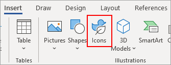
What is it? The icon for a designing icons menu?
ETA: Ok, I just found it. Never noticed it before. I guess it brings up all the available icons that you can insert in your document.
So I guess the thought process behind it is that a duck and a leaf are things that might plausibly be icons, but are not actual icons (or at least are rarely used icons).
If you click it you’re taken to a very broad selection of hundreds or thousands of “icons” defined about as broadly as the Wingings font characters – the handicapped symbol, financial symbols, arrows, fuzzy animals, baseball caps… like a clip art library, I guess, but rendered down to icon resolution more or less.
ETA:
So I guess the thought process behind it is that a duck and a leaf are things that might plausibly be icons, but are not actual icons (or at least are rarely used icons).
Right, this is why I find it weird. Sure, a duck icon is an icon, at a stretch, but it is representative of all icons?
In other words…

This is a great illustration of my point.
In your case, the ‘save’ icon had been updated to look like a USB thumb drive, presumably because the old floppy-disc icon was out of date.
Upon first encountering it, was this change easier or harder to understand? Did it save time or waste time?
Upon encountering it subsequent times, is it easier to use this button, or harder, or no effect?
Are there other devices that have the same form factor as a USB drive, possibly causing confusion here?
I would maintain that the floppy icon shouldn’t ever be changed. People are accustomed to it, there’s no obvious replacement, and there’s no danger of it being misinterpreted. It doesn’t matter that it’s “old”. Ditto for most other icons.
Getting back to the OP, here are some icons that should be permanently retired: ![]()
![]()
![]()
![]()
They are so used/abused that they have virtually no durable meaning in the computer context. A designer could do just as well with ![]()
![]()
![]()
Note that rabbit ears are not passé tech. A lot of them are still sold. More now than 20 years ago. Lot of cord cutters out there.
Our old remote support system used a life ring. So the support person would tell the person to, “click on the life ring to connect remotely”.
The new system uses an icon which is a headset with a microphone.
I’m not sure what the globe means absent a context, but do the other three mean anything other than “nonlocal storage”, “charging”, and “connected wirelessly”?
Maybe they are Kurzgesagt fans.
They still make nib fountain pens. The ones I have were made in the last 5 years or so. I don’t think anyone still makes floppy disks. So the fountain pen you may see someone use is quite likely a lot more recent than a floppy.
I’ve used some platforms that used the life ring as an icon for the help menu.
TLDR: I totally agree.
Your example is a physical object, but the same applies to many on-screen icons. When I’m at my PC in Windows, and I see an icon that I don’t understand, I can often - but not always - put my cursor over it, and I’ll get an an explanation right there on the screen. But this never happens on my phone, because there is no cursor that can sit somewhere harmlessly. So a lot of my icons go unused because I am afraid to touch them.
I do understand that words use a lot more space than icons do, and space is very tight on small devices, but still, I wish there was a Help screen to offer these tips. (Similarly, I hate moving something off-screen via swipe-right or swipe-left; I have no idea where it is going.)
Were you and I on the same slack channel last week?
I have an Android photo app that uses an icon of an SD card for saving to internal memory and an icon of a drive array for saving to the (micro) SD card.
