[QUOTE=Alex_Dubinsky]
Why do people keep asking about the X axis? There’s no markers that suggest that an X axis exists.
[/QUOTE]
Well, if there’s no X axis, then that’s a downside to this presentation: it suggests that the X position of the items is somehow significant. You can’t help but wonder what the significance is, which is an unnecessary distraction if the answer is “none.”
BTW, put me on the “word clouds are bs” petition. They’re kind of neat when used purely as a decoration, but they’ve been overused even for that lately.
It occurred to me that one way to improve the chart would be to come up with a meaningful X axis. Maybe if the X axis represented a ranking of recommendations the approach would make more sense. The size of the words/bubbles would then serve a purpose, playing the role of a Z axis.
I don’t equate this chart with a word cloud. A word cloud, AFAICT, has no axes. It represents random interrelationships of ideas, reflecting their magnitude or prominence. On the LOLCat site, a word cloud works for me. For anything more serious than that, I have my doubts about their usefulness.
[QUOTE=Harriet the Spry]
I don’t equate this chart with a word cloud.
[/quote]
It’s not, but there’s an obvious connection in that word clouds and the OP’s chart both (apparently) vary the font size in order to roughly convey a piece of data. It’s possible (although maybe not advisable) to make a three-axis chart without using a 3-D effect by using the font size as the third axis.
I disagree with this, depending on how literally you want to take the word “axis”. A word cloud is basically the same as a histogram, presented in a way that’s less readable and more “fun.” The font size is an axis, just visualized in a different way.
[QUOTE=ntucker]
I disagree with this, depending on how literally you want to take the word “axis”.
[/QUOTE]
Put me down for “darn literally.” If font size can be an axis, then where will we stop: color, texture, scent? Bah! I will give you font size as a dimension, but not an axis.
[QUOTE=Patty O’Furniture]
Most charts and graphs present data without much insight. I guess I’m going for the reverse here - provide insight into some relationships without requiring the raw data to back it up . . .
Some executives need to be kept away from the ability to “drill down” when presented with a graphical analysis, lest they attempt to formulate incorrect conclusions based on a misunderstanding of the source data.
[/QUOTE]
Sounds to me as if you want to do all you can to avoid being challenged–get the executives to swallow your conclusions without requiring you to defend them.
I’m being asked to provide a high altitude analysis that is digestable by executives of all stripes - CTO, CFO, Chiefs of staff, General Counsel and who knows who else. I just don’t know the aptitude of the potential audience well enough to feel confortable with providing raw data.
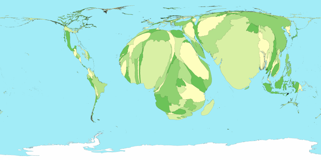
Would you find this cartogram just as confusing? Cartograms have no real data available in them for the observer to extract, but they do tell a definite story.
(Bolding mine)
The actual chart I’ve developed shows the business impact analysis resulting from various types if IT-related service outages. Business impact is not easy to represent as a simple point on a graph. Thus I am forced to read over incident reports and do an impact assessment on each one, based on many factors such as number of end users impacted, importance of the user community, were any VIP’s impacted, was any data lost, did the event happen during business hours, how long did it take to become 50/90/100% resolved, and so on. Thus I have decided to use a logarithmic Richer scale with the font size as the indicator.
As you can see, this report will be highly dependant on my interpretation of the business impact associated with each event, and my interpretation is exactly what I’ve been asked to deliver. Based on this report, further decisions will be made by the powers that be on how best to allocate funds toward ensuring continuity of business operations. It will be left to successive report analysts to cull and present the finer details that will be needed to formulate the actual statements of work.
I think the chart would be clearer if you stacked all of the words in one vertical line. The way they are spread out is confusing because it seems like it should mean something, but it doesn’t.
[QUOTE=Patty O’Furniture]
Would you find this cartogram just as confusing? Cartograms have no real data available in them for the observer to extract, but they do tell a definite story.
[/QUOTE]
I don’t find it confusing, any more than the example in your OP. What I do find both of them to be is meaningless obfuscatory fluff masquerading as analysis.
I mean, if you want to simply state your findings (for whatever topic) then I’m of the school that believes in stating your findings and leaving it at that.
But if it’s a matter of trying to persuade C-level officers to take a certain course of action, you might as well accompany your presentation with a selection of show tunes or interpretive dance.
Would you find this cartogram just as confusing?
[/QUOTE]
My lord that hurts my eyes. I think a lot of people would be a bit put off by that type of representation of data, but that’s just my guess. I’d prefer a normal map projection with a more familiar plotting with colors on the red side of the spectrum representing high values and colors on the blue/violet side representing low values. You know, like a weather map that we’re all familiar with looking at. I would think that would be easier to digest.
[QUOTE=Harriet the Spry]
If font size can be an axis, then where will we stop: color, texture, scent? Bah! I will give you font size as a dimension, but not an axis.
[/QUOTE]
Perhaps this comes from my work, where we regularly refer to an additional parameter as an “axis.” I think it’s pretty natural once you get above 3 or 4 dimensions to start using other methods of visualizing axes than the traditional ones you’d find on a chart. But you’re right that “dimension” would probably be a more apt term that everyone can agree on. Doesn’t make much difference to me.