[QUOTE=MEBuckner]
This…thing…though. Good God. It looks like the army needs to call in artillery and air strikes quick, before it can spawn. I would not rule out nuclear weapons as an option.
[/QUOTE]
It’s the only way to be sure.
[QUOTE=MEBuckner]
This…thing…though. Good God. It looks like the army needs to call in artillery and air strikes quick, before it can spawn. I would not rule out nuclear weapons as an option.
[/QUOTE]
It’s the only way to be sure.
[QUOTE=Muffin]
For example, just up the street from Robarts a brutalist design was used for Rochdale – a free hippie college at U of T. There’s no way anyone can convince me that user values were taken into consideration when designing that place, other than cost of construction. The aesthetic values of the architects, yes, but the aesthetic values of the hippes, not a chance. The same can be said for the brutalist Tartu co-op residence that U of T built in the same neighbourhood a couple of years after Rochdale.
[/QUOTE]
U of T did not have a great track record of building in the 1960s. Oh it did plenty of it, but it was all that “Robartsian” cast concrete stuff. If you ever saw the U of T’s Scarborough College (designed IIRC by Raymond Moriyama and opened in the 60s), you’d realize that during the 1960s, the U of T felt modern = good. The examples Muffin lists, and Robarts, and Scarborough–and let’s throw in Medical Sciences for good measure; and the Athletic Centre on Spadina, though opened in the 1980s, belongs in the list too. The latter was known as “The Hangar” when it first opened; though fully equipped, it was soulless and empty inside.
Then look at something the U of T did right: the Bookstore, at the corner of St. George and College Streets. The former Toronto Reference Library, it had stone carvings, grand sweeping staircases, and all kinds of beautiful details in the architecture. I look forward to a visit to the U of T Bookstore when I’m in Toronto (as well as to Hart House, a beautiful Collegiate Gothic building where I spent many happy times during my undergrad), but in the 25 years since I graduated, I haven’t set foot in Robarts, Scarborough, Med Sci, or the Hangar. (Well, to be truthful, I did attend a lecture once in Med Sci’s auditorium.) I simply haven’t wanted to revisit these buildings; they’re not welcoming places.
[QUOTE=Captain Lance Murdoch]
But enough. People here have made it clear what they hate. Let’s see some examples of what you guys think architecture should look like.
[/QUOTE]
A couple of homes a few blocks away from my office in the north-west of Ontario:


A couple of reconstructions between my home and my office:
http://www.ontarioarchitecture.com/Logfw.jpg
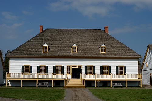
The GO Train station down in Hamilton:

From near my sister’s place north of Hamilton:


A couple from the south-west farm country of the province:


And a few from urban areas in the south-west of the province:


From near where my cousins grew up west of Toronto:

A house that my dad moved across downtown Toronto:
http://www.campbellhousemuseum.ca/themove.htm
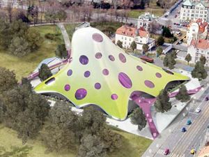
Note that there is not a glob of infected snot (Czech National Library) in the lot. As you will note from some of the above buildings, it is not curves that I oppose. It is infected snot that I do not like.
[QUOTE=Captain Lance Murdoch]
and the people stand fourteen feet tall so those vaulted ceilings come in handy. . . .
People have repeatedly stressed that they hate the boxiness of modern architecture (but they shot the sharpest arrows at the un-boxy Prague Library). I ask, what is the shape of your house? What shape are the rooms? The doors? The windows? Unless you’re Bilbo Baggins I’m guessing “rectangles” is your answer. How can you stand that if you hate boxiness?
[/QUOTE]
Actually, my dining room chair is eleven feet high (a chairlift – I live in a chalet in the woods by a couple of ski hills), and my Christmas tree (which I should take down soon) is twelve feet high, so yes, having a fifteen foot high ceiling does come in handy. It’s also nice to have a loft that looks over the room, for it brings a sense of spaciousness both laterally and vertically (the basic room is 250 sq ft, but the loft extends it back that much again). Vaulted ceilings can do a lot to break the living area of a house out of the squat horizontal dimension that the homes you presented suffer from (not to mention the austere and disfunctional furnishings). Don’t confuse right angles and straight walls, or even proportional rooms, with boxiness. When a box is well designed, it brings a sense of proportion. When a box is not designed properly, it may simply look squat and confining.
[QUOTE=MEBuckner]
Regarding the fortress-like appearance of this building (yet another library, the Robarts at U of T): I wonder if the gun-slit windows actually have some utilitarian purpose? Maybe to preserve the collections in the stacks by minimizing direct exposure to sunlight? (Or maybe the architect just secretly yearned to be a designer of maximum-security prisons.)
[/QUOTE]
Those slit windows provide light to the cells that ring all but the lower floors of the building. At the central core on all but the lower floors is an atrium and elevators. Ringing the central core are the stacks. Ringing the stacks are the cells that form the outer edges of the building. Each cell has a tiny little slit window.
Initially, the building was built as a graduate library. It took a student riot (police, violence, the whole nine yards) to persuade the powers that be to admit all undergrads. As a graduate library, it tried to provide small offices (barely big enough for a small desk – really just closets) for as many grad students as possible. Thus the cells. Quite monkish.
Well, there you go then. The library windows were designed so that the grad students would have a defensible position from which to fight off the hordes of rampaging undergrads.
Since the cells blocked daylight from the stacks, Toan could have easily increased the size of the windows without affecting the holdings, but he chose not to do so – as per the brutalist trend. One would think that given the choice of either daylight and a view, or just a gunslit, the architect would have given consideraton to the working conditions of the grad students in these tiny cells, but he obviously didn’t. That’s the primary problem I have with brutalism. It ignores the needs of people, be it the lack of daylight, or the hollow soundscape, or the lack of visual warmth, or the dull grey monotony, or the monolithic lack of life – I have been in rooms burrowed out of hard rock (Science North Cavern, Sudbury) that are more alive than most brutalist buildings.
[QUOTE=MEBuckner]
Well, there you go then. The library windows were designed so that the grad students would have a defensible position from which to fight off the hordes of rampaging undergrads.
[/QUOTE]
Except that the poor bastards in the cells were not able to open the windows, or control the temperature or ventilation, in the cells. Basically, the cells were brutal – but then that was what brutalist architecture was all about.
[QUOTE=Muffin]
Vaulted ceilings can do a lot to break the living area of a house out of the squat horizontal dimension that the homes you presented suffer from (not to mention the austere and disfunctional furnishings). Don’t confuse right angles and straight walls, or even proportional rooms, with boxiness. When a box is well designed, it brings a sense of proportion. When a box is not designed properly, it may simply look squat and confining.
[/QUOTE]
Part of the problem with Modern designs is that they’re clearly made to be photographed, not lived in, and the proportions that make for good photography are often not those most pleasing to the actual eye, or especially the habits of habitat. For instance, to cite examples from earlier in the thread such as Neutra, The Schindler House, or this Delta Shelter, sure, they print well (although I think the Neutra example looks like someone fixed up the garage with a large plate glass window) but they don’t look very habitable. Neutra has a chair blocking the fire, and you can’t see the televisor from the sofa without saving up for a chiropractor. And you have to “cut across” the square of the living area (presumably vaulting the cushions thrown on the floor in lieu of another awkwardly placed chair) in order to pass through the room. Or look at the Schindler House; the way it is built, with the fireplace in the corner, precludes an arrangement of furniture around a central point even though the room appears to be some kind of living or community room. The couch, in order to sort-of face the fireplace is back-on to the expansive window. Overall, the room has the appearance of being long and narrow, not a comfortable place for a gathering of people. I’m not even convinced it would be all that comfortable for a single person. And I can’t even begin to understand how the Delta Shelter makes any kind of sense: the multiple decks (are you going to host several deck parties at once?), the small floor area (better look for some multi-function furniture), and the large heat-leaking windows and flat roof (in a temperate, snowy climate?) all speak to a designer who is more interested in dramatic light than comfortable habitat.
I’m no advocate of the generic American split-level ranch or faux-Colonial tract housing–personally, I think it all started going downhill with attached garages, and adding space for more and more vehicles simply compounds the problem–but they generally carry through a number of ideas that are good for regular habitation. “Modern” residence design seems to start off eschewing all that came before it–good, bad or indifferent–and looks to catch a spread in Architectural Digest over being a functional or pleasant place to live.
As for the claim that if we just were not all so ignorant about the history, values, intentions, et cetera of the architect, we’d understand and appreciate it all, I find that to be disingeneous at best; I understand where 'Eighties Europop came from and how it developed, which doesn’t make me like it any more. Similarly, I have at least a passing knowledge of the history of architecture, and also of practical carpentry and construction, and knowing where “Modern” comes from and what the architects had to say about it (which is mostly frothy, meaningless spew) doesn’t cause me to revise my opinion that a harsh, narrow, ill-conceived box is a suitable habitat, nor that discordant, badly engineered postModern designs are a great idea for public spaces. Frank Gehry can talk his talk about “non-linear designs influenced by advanced mathematics and computer blah-blah” but in the end, he’s still shat out hideously offensive buildings like the Strata Center and the Weisman, and even his more photogenic designs like the previously mentioned Disney Hall and the Guggenheim Bilbao have had serious functional problems. From all I can tell (and from repeated conflicts with his neighbors in Santa Monica) what his architecture says to me is that Frank Gehry hates humanity and wants to build structures that like like they’re ready to jump out and slice up pedestrians into mince meat.
Stranger
[QUOTE=MichaelQReilly]
Lets look at it this way. Say one a surgeon came out and loudly and vociferously claimed that he had a great new surgical technique and brusquely dismissed the accumulated knowledge of centuries of medical learning. Subsequently in applying his new techniques, he manages to kill, injure, or maim 98 out of 100 patients that he operates on; saving the other two by sheer luck and likely in spite of his new techniques.
Now, if I were to super-critically and brutally condemn him as a hack and a fraud, while others steadfastly and condescendingly supported him despite all evidence to the contrary, would I be the arrogant one?
[/quote]
This is an entirely meritless example, of course. Art is a matter of opinion. Medicine is a matter of science. What “evidence” do you have that any building is ugly?
Yes, every period has good and bad examples including the contemporary one.
I guarantee you most architects take great interest in human interaction with their structures.
To claim that Libeskind is trying to make the ugliest buildings he can is nothing short of extraordinary.
Is this the ugliest thing he could conjure? Look at the brown building next to his. This is generally what we are being treated to these days. In fact, there is a building near my house that looks exactly the same as that one. I’ll bet that building has spawned few discussions on the subject of architectural beauty. This is the difference between art and shelter.
Says who? Take Libeskind again. He created his design for theFreedom Tower to acknowledge and salute the Statue of Liberty by replicating its form in his building. A committee stepped in and wrecked the design so we will never see his vision come to fruition, however.
The architect who jumps to my mind as overtly rejecting influences from the past is Frank Lloyd Wright and that was in the nineteenth century. He was famously full of himself, however, and just because he refuted influences doesn’t mean he had none.
[Here’s a good link for what’s going on these days in architecture.](Honor Awards: Architecture) Go to the link called Honor Awards: Architecture. It’s the American Institute of Architects award winners for 2007. Maybe some of you will actually like some of them.
All the same, I’ll be waiting for those examples of what architecture should look like from those who hate contemporary architecture so much.
At least with Gehry, you don’t have to worry about an earthquake disturbing the lines of the building – it’s not that they are earthquake proof, it’s just that no matter how the quake might re-arrange the building, it wouldn’t make much of a difference.
[QUOTE=Captain Lance Murdoch]
What “evidence” do you have that any building is ugly?
[/QUOTE]
Certainly the attractiveness of infected snot will vary between individuals. I wouldn’t be surprised if somewhere out in the big wide world there is someone who has a fetish for infected snot. I, however, am one of those poor souls who would much rather go through life without encountering a building designed to appear to be infected snot, for in my humble opinion, infected snot is ugly. Honking ugly. Snot honking ugly
Since the public must enjoy, or suffer as may be, the results of the architect’s efforts, it behooves the architect to be considerate to the public, in particular by not horking a multi-story loogie. Don’t talk with food in your mouth. Don’t ut in line. Don’t fart in an elevator. Don’t design a blob of infeted snot. It’s all just basic consideration.
[QUOTE=Muffin]
A couple from the south-west farm country of the province:
[/QUOTE]
Oh, cool! I remember houses like this from the time I visited a friend in Walkerton, Ontario. Lots of houses in the area like that, a downtown that was a real functioning (if small) downtown with nary a mega-chain in sight – what a charming place that was.
[QUOTE=Captain Lance Murdoch]
What we’re not talking about here is modern vs. classical architecture. Everything going up now is modern. It’s a matter of the styles being used. “I don’t know much about art, but I know what I like” is a common expression. I think it could be better expressed as “I like what I know.” People know and are comfortable with the old styles so that is what sells. So we see endless use of classical elements in contemporary design made for the masses to consume. It’s bizarre and (in my opinion) hugely ugly but it is in demand.
This stuff
is everywhere
This is
is better
I dare say.
[/QUOTE]
I rather like the first one. It has kind of a grown-up backyard clubhouse feel to it. Dunno if I’d want to live there full-time though.
[QUOTE=MEBuckner]
its arrogant disregard for its surroundings is pretty breathtaking–a major part of what’s wrong with this thing as well.
[/QUOTE]
This is part of the point I was trying to make with Lauinger Library. Too many modern architects (though certainly not all) absolutely ignore the context in which their work is to be placed. I mean, in the photo you linked to, the juxtaposition of the older neoclassical building on the right and the modern concrete hulk on the left can only be regarded as laughable. I really don’t see how anyone can defend it.
City Hall isn’t that bad to look at (although some liken it to “an Aztec Tomb”), but I think it’s a miserable place to live and work. For all the space it takes up, an awful lot of it is actually outdoors, or pointess tunnels through the building, all of which are functionally useless, make it hard to heat efficiently, and more prone to leaking. There are large useless areas in the building, and lighting is often pretty poor. People have been talking about tearing it down and replacing it with something more attractive and useful ever since it went up.
Worse than City hall itself if the Plaza it’s on. It’s paved with bricks, so you can’t really plow it well (they’re afraid of breaking the bricks up). In the winter it’s a featureless wind tunnel. In the summer, it’s an Easy-Bake Oven. There’s no grass and a very few trees (none of them large) to break the monotony (and the wind) and to provide shade. When they were putting in the bricks, they mixed in a few dark bricks for variety. The architect caught one of the bricklayers weaving the bricks into large-scale patterns and made him stop, which is too bad. Today it’s a challenge to ggo through the plaza and find the patterns he managed to hide from the Nazi randomizer.
[QUOTE=Captain Lance Murdoch]
Death! Wow, what a critique!
It strikes me as odd how several people in this thread have expressed disdain for modern architecture in the most garish, super-critical and entirely brutal terms and yet have the nerve to call the architects arrogant. Invest in mirrors people!
[/quote]
What? That doesn’t even make sense. I’m not even certain what line of logic you’re attempting to follow here. It’s arrogant for people to react strongly to the design of a building, when presumably half the designs portrayed in this thread only exist to gain a reaction?
Architecture may be described as art, but there’s several important differences between a building and a painting.
For one, buildings serve a practical purpose - if a design is so bizarre that it’s impossible to maintain, or impossible to use, then the design has failed in a spectacular sense. For two, buildings are public entities - I cannot help but see e.g. the Scottish Parliament everytime I walk down the Royal Mile, yet I find it unspeakably ugly, a cancer on the city of Edinburgh, and this isn’t true for most paintings, where I have a choice whether I view them or not. Finally, context is way more important in architecture than in other forms of art. More often than not, a painting stands or falls on its own merits. A building has to fit into a cityscape.
How? Seriously? How is the proposed design for the Prague National Library the best design for a library? Let’s face it - the design won because it is provocative, intended to get a reaction and be talked about, not because it is practical, fits into the context of the surrounding area or even nice looking. And that’s the problem - we have public buildings being designed by people with the attitude of an adolescent.
What’s the relevance? The buildings that you posted that were designed by architects are still pieces of shit.
[QUOTE=BrainGlutton]
Well, that’s just it. They’re of recent design, but they’re not modern in style, they’re revivals of pre-modern styles.
[/QUOTE]
Thanks. Tho I am interested in architecture, I’m unstudied in its terms, distinctions, and such.
In terms of single family homes, it seems that most homes I see are in the mini-mansion mold. Either brick monstrosities vaguely reminiscent of an estate home, or huge versions of farmhouses - with or without nods to Prairie/craftsman styles. These strike me as almost cartoon versions of older homes.
Or there are the cheap, sided boxes in subdivisions. Seems a stretch to even call them architecture.
But the homes I linked impress me more as a modern reworking of older styles. Not just a caricature to impress, but an adaptation designed for liveability. There is a good deal of this architecture to be found, but at times it seems as tho one must search to find it. It seems far more often someone going “modern” erects something monolithic - all flat planes and sharp corners.
[QUOTE=Muffin]
You’ll never guess what the architect of Robarts is up to now: http://query.nytimes.com/gst/fullpage.html?res=9C00E3D8113FF936A35757C0A962958260&sec=&spon=&pagewanted=all
Nice to know he learned his lesson. Too bad for Toronto that he did not learn it a few decades earlier.
[/QUOTE]
Makes me want to go there and apply siding to his house in the middle of the night. :mad:
[QUOTE=Malthus]
Makes me want to go there and apply siding to his house in the middle of the night. :mad:
[/QUOTE]
Brilliant! ![]()
[QUOTE=MichaelQReilly]
My own person nomination for the ugliest building in the history of mankind: Boston City Hall. Pictures don’t actually do its sheer hideousness justice.
[/QUOTE]
Ah, yes. The City Hall designed with the post-apocalyptic skateboarder in mind.
And nobody else.