Exactly. I mean, there are plenty of buildings that are both ugly and uninteresting - take the Tel Aviv City Hall, for instance, one of the few buildings in the world that could actually be improved by the addition of a giant duck.
Since the building in question is in PORTLAND, OREGON rather than Seattle WASHINGTON, what’s in our face?
The fact the article rated the Portland building uglier than that EMP building. I’m not sure if that’s true. Although the Portland building looks like a Bill Cosby sweater, the Experience Music Project is a hideous monstrosity. People have been known to get sunburnt from the reflections coming off of it. I mean come on people! We live in the Pacific Northwest. Sunlight is a foreign concept up here.
I can’t believe they put the MI5 HQ in London on the list.
Central London’s ugliest building is New Zealand House, no question about it.
Another image, for context. As if the building itself wasn’t ugly enough, they also kitted it out with horrible grey window blinds that don’t hang straight.
The list in the OP is completely off. As someone up thread mentioned Eastern Europe etc. There’s also the average '60s built brutalist office block or block of flats in British and Irish cities. Fugly beyond belief.
Reading this thread has taught me a new word: Brutalist. Suddenly, the architecture building at our university makes sense. Here is a picture of the interior, though it’s far crazier than the photo suggests. The entrance is on level 2 on one side and level 3 on the other, only one of the three main staircases goes down to level 1, and none of them go to level 5 (there are landings, but they don’t connect to any of the walkways and the stairs skip straight past to level 6), which is actually something of a mezzanine. To get to level 5 you need to take one of the main staircases up to level 4, then switch to one of two other staircases, which aren’t accessible from level 3 but will take you to level 7, which the main staircases can’t. It used to be that level 5 and level 7 used to have two separate halves and if you wanted to go somewhere you’d have to take the right stairs, because your couldn’t access the other half of the level from the level you were on, but last year they put in some new walkways and connected them. Oh, and did I mention that every floor above level 3 was really just a collection of rooms connected by walkways? You could stand on level 7 and look down onto level 3. A couple of years ago the architect who designed the building came by to give a talk. Sadly, I didn’t manage to catch it. I’m going to miss that building.
He’s kind of hit-and-miss. He’s done some really wonderful projects, but it’s the ugly ones that people tend to remember.
I happen to think the Gehry-designed expansion of the Art Gallery of Ontario is absolutely gorgeous, as a matter of fact. He took a dark and claustrophobic building that looked more like a goverment building than an art gallery, and opened it up into an airy space filled with light and warm wood accents and soft organic curves. It’s marvellous.
If we were talking about Daniel Libeskind instead, I might agree. Now there’s a guy who should never have been given an architecture degree. Ugh. Look at the monstrosity he wants to prop on top of our beloved Sony Centre (or rather, the O’Keefe as most of us still call it).
As for the article, only a couple of the buildings qualify for truly “ugly” status… the rest range from a little weird-looking to downright cool, IMO. I’ve seen MUCH uglier than most of the buildings on that list.
I think a better name for those buildings would have been “The World’s Oddest Buildings”. The problem is that really ugly buildings are both ordinary and dreary, and not worth writing about in a travel magazine, because no one would ever travel to see them. Perhaps a building like this one (which is particularly ugly because it’s part of a gaol).
Yeah, but Wurster is like that on purpose for architecture students. I don’t claim that makes it beautiful, but IMO Tolman is worse.
Huh. I could’ve sworn that was PG&E. Ugly ugly ugly.
I like most of the buildings on the Texas Tech campus, but somehow, the ugliest one happens to be the Architecture building. Looks like a high-rise prison. The funniest part is: look at the very top section of wall. See the bit that’s a little lighter than the rest, doesn’t quite match? Word is that that part of the building collapsed sometime in the 1970s. Yep, the only building on campus that ever suffered a partial collapse was the architecture building.
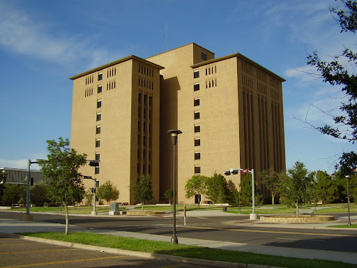
Regardless of structural problems, that’s an awfully ugly building for an architecture building. What you want in such a building is something that will inspire the students, and that would just inspire them to put up boxes with too few windows.
They didn’t even pick Gehry’s weirdest building, the Stata Center. The EMP has nothing on that.
I agree that the Folsom Library is ugly. It’s apparently an example of Brutalist architecture, as is the Boston City Hall and others listed at the Wikipedia article. I haven’t been back to campus in years, but the new EMPAC building looks cool. (And like the computing center, it’s also right next to that ugly-ass library.)
Hideous university library: McGill’s McLennan Library.
Modern but non-hideous university libraries: Concordia’s McConnell Library, UQAM’s Pavillon Hubert-Aquin.
Beautiful university library: McGill’s Schulich Library, and its Islamic Studies Library, considered one of the most beautiful buildings on campus.
Here’s the problem: part of being a serious artist is the willingness to try to do things differently; not to just churn out one cookie-cutter repro after another. The downside of being a serious artist and an architect, is that you can’t stick your failed experiments–and failed experiments are an essential part of any artist’s growth–in a drawer and forget about them. Once it’s built, it’s built, until it’s unbuilt, which can be as big a project as building it.
That said, I have to disagree with one of the points of consensus of this thread: I’ve thought the Harold Washington Library an abomination since day one. What a downright silly glomeration of injoke oneliners. It was dated before the first brick was laid.
I went to high school in Dresden, OH, “home of Longaberger baskets.” Basket mania really got started right around the time I started high school there. What had previously been a somewhat interesting little local business suddenly went insane, with busloads of tourists being brought in to view the basket factory, the town getting a pastel makeover a la Main Street USA in Disney World, etc.
Dave Longaberger gave a lot of money to our high school, though, so I can’t really complain. It was just weird.
I always tough London’s ugliest building was the Lloyds of London building. Whoever though an office building that looks like an oil refinery was a good idea should be taken out in an alley and shot.
Okay, seriously, what is the POINT of designing the interior of a building in this fashion? This layout simply guarantees that the only people who can actually find their way around in it are people who’ve been working there for a long time, and that everyone else will just be in a pissed-off mood all the time while they’re wandering around lost.
To add to the collection: Jerome Library at my alma mater, BGSU.
Blech.
Not only is it ugly, when I attended school there you couldn’t go up two of the sets of steps surrounding the building because they were falling apart.