So, you’re stating that style is always more important than function?
That is truly a terrible typeface/font. Just effing unreadable. Whether it’s the worst, I don’t know. There are some more terrible ones out there, but it’s pretty low, in my opinion.
The heading looks to be in a hip-Hop/graffiti tagging style script.
Do you mean text typefaces as opposed to display or decorative typefaces?
Barf Bold is worst. I think it was described in National Lampoon.
You got me. Barf Bold is indeed worse. Much worse. But I don’t think it is intended as a serious font.
Dennis
See, those don’t seem as bad to me, partly because they’re emulating a specific historical style. They’re unreadable mostly because the content itself is band names and other oddly-spelled phrases that would be unreadable in Helvetica, not because the font itself is obscuring them much.
In other words, ugly and dysfunctional. I think you’re nitpicking over the meaning of “worst.” I’ll grant this would be a very good font if to use if you are trying to convey the collapse of civilization and descent into illiteracy. But otherwise not.![]()
Quibbling over an offhand joke doesn’t really contribute much to support your argument.
They are perfectly readable if you are on acid.![]()
More seriously, I don’t object at all to fonts like that that are trying to convey an aesthetic or sensibility. Those fonts convey the free-flowing and psychedelic nature of the rock scene at that time. Immediate legibility isn’t important, because those seeing the poster will know it is about rock concerts and will take the trouble to work out what it says.
jackdavinci is in error in thinking my only objection to the font is its legibility. I just fail to see what aesthetic it is trying to convey (unless, as I said, you are trying to depict dysfunctionality). The main letters might work as some sort of graffiti font, but the drop shadow appears to me to be utterly pointless. That’s not just bad from a legibility point of view, that’s bad aesthetic design. It’s a tacky affectation added by someone who had no idea what they were trying to achieve with the font. It’s doesn’t work either as a text or a decorative font. It’s not even as good as Barf Bold, since at least I can tell what that is trying to convey.
Anyway, I thought this was great when I saw it on Facebook. There is a use for ugly fonts…
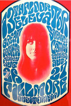
This is a very strange reply. Firstly, I’m almost positive the type on the linked posters (promoting shows at the Fillmore Auditorium) is not emulating an historical style, but is rather declaring for its own time and place.
And I’m completely befuddled by the contention that certain band names would be unreadable in an common sans serif typeface, such as Helvetica.
Great Society.
13th Floor Elevators.
Sopwith Camel.
Now that symbol Prince used for awhile, I can see that not working with most commercial fonts.
As for the font in the OP, it seemed graffiti-based, and probably could be used effectively in a different context. But used with a drop shadow on that website? It made me think the designer was incompetent. I might not be the target audience for his site, but my guess is his target audience wasn’t thrilled with it either.
No kidding. This is a *much *more illegible Asian-style font, for example.
The definitive Asian-style font was created by Xu Bing.
Not a font, per se, but a really horrible typesetting example.
Watch The Favourite last night. They did full justification of text … including the spacing within words.
So if “IF” was on a line by itself, the “I” was on the left and the “F” was on the right. And they really did do this particular example.
Bad enough for the chapter headings, but when the closing credits came they were unreadable.
The “old timey” font wasn’t helping.
I think the aesthetic he was going for is “I have access to a font generator and I know how to use it”
Definitely bad, bad, bad design choices. Still not as bad as a number of fonts you can get on dafont.com
Here’s an amusing illustration of why font choice matters sometimes more than others. Definitely requires a second look, doesn’t it?
Square Word (which I know and love) isn’t quite a font so much as a hand, though.
I mean it’s fine, but definitely not legible.
Actually just “I have access to a font generator.”![]()