Hey, Thank you **Hodge **
another fan of Magritte here.
Hey, Thank you **Hodge **
another fan of Magritte here.
Dignan, I meant it is a cliche insofar as I see a lot of people who have it hanging in their homes. It seems to be a popular one for lithographs and poster stores and whatnot–understandably, as it has a beautiful pastoral feel to it. Learning the inspiration for Wyeth’s creating it makes one appreciate it that much more.
I like The Scream too.
I also like Dali’s work just because it is so bizarre, but I don’t know it well enough to name a favourite.
Bosch’s stuff is also great, but I don’t know if I’d want it hanging on the wall in my house!
Im not very sophisticated so I don’t know much about paintings. But the one I like the best is the on eof the guy standing with his hand on the Vietnam memorial and you can see the reflection of his buddies in the field in the marble. One of the few paintings that can elicit an emotional response from me.
Don’t even know what it is called otherwise I would link to it. Its pretty popular though so you have all probably seen it.
I have always been partial to Starry Night, as the quite village sleeps below, the titanic and majestic cosmos swirls above.
For me, Pallas and the Centaur Free art print of Pallas/Camilla and the Centaur by Alessandro Botticelli. C. 1482-1483. Tempera on canvas. Galleria degli Uffizi, Florence, Italy. | FreeArt | fan15407343 . A print of which hangs not three feet away from me. It’s one of he few paintings that seems to give me hope. After that, Picasso’s Guernica Pablo Picasso. Guernica., and Triumph of Death http://cf.geocities.com/ppollefeys/triomphe_bruegel.jpg, which always cheers me up, when I’m in a bad mood…or at least, lets me enjoy the bad mood more. 
Then, in a distant forth place, Norman Rockwell’s “Prom Dress” http://www.lewisbond.com/rckwellpgs/psters/prom_dress.html. I don’t know why.
Ranchoth
There’s this part of the National Art Gallery that has these four paintings by Thomas Cole that deal with the circle of life. I like those the best. Why? Because I made out with a girl in that room of course.
I nominate Valentin Serov’s Girl with Peaches - the portrait of the young Vera Mamontova. It is hard to get a good version on the net - but this one is not bad - http://www.abcgallery.com/S/serov/serov17.html
When I saw it “live” in the Tretyakov Gallery in Moscow, it enchanted me. By the way, see the Tretyakov if you can - a huge collection of good stuff.
Intertesting that everything mentioned here (except for the Kandinsky painting, and Rothko and Mondrian in general) is a figurative painting.
No lovers of abstract art? Is The Straight Dope Community the Moldy Figs of the art world?
I’ll throw out Paul Klee’s Highway and Byways as my favorite piece of non-representational art.
Wow—what a great bunch a paintin’s! I’m pleased to see so many pre-Raphaelites chosen (and Ike, you are such a sick little bastard, no wonder I cotton to you!).
I’m not moch on nonrepresentational art, though Jackson Pollack and Jean Miro DID make great jigsaw puzzles. Besides Titian, I like some of the other great classical and impressionist portrait painters:
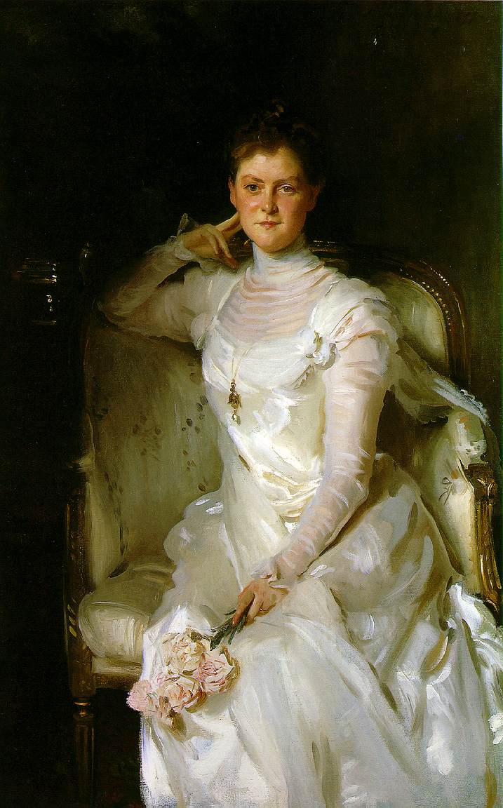
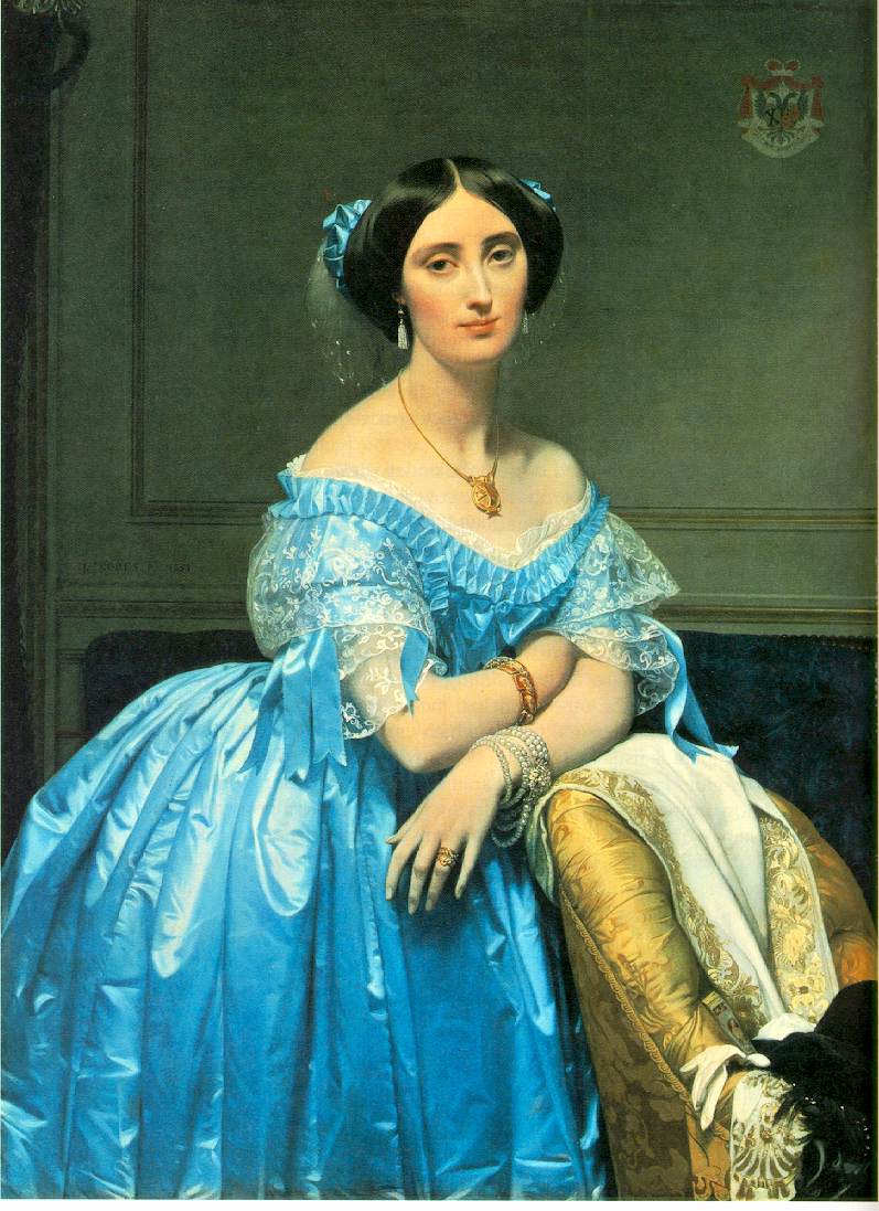
John Singer Sargent, Hans Holbein, Jean-Auguste-Dominique Ingres, Giovanni Boldini.
Wow–I just watched Sister Wendy last night and this morning I get to look at a bunch more good stuff.
My sentimental favorite is Picasso’s The Lovers. My parents had a print in their bedroom when I was young and now I have a print in mine too. Sorry–no one’s dying or being disembowled in this one–some of y’all are kinda death-obsessed, no?
I seem less picky about paintings/prints than literature or music–there is something I can like about almost everything posted.
The last time that I was there was before I realized how good Vermeer was, so I haven’t.
Oooh… field trip…
I saw these in the company of some friends several years back. One was an English guy with a quiet but wicked sense of humor.
The paintings are large, and depict life as a journey on a river. Childhood shows a baby in a brand-new boat, on a quiet stream in springtime. Youth shows a kid in the same boat, going through a summer landscape and looking up at an eastern-looking structure in the air (idealism and Castles in the Clouds in one). But Middle Age shows the boat careening down a dangerous mountain stream while the middle-aged guy has his hands crossed in panic and prayer.
“Looks about right,” opined the Englishman.
Old Age showed a white-bearded exhausted figure being helped off the broken-down boat (even the figurehead is busted off) to his Eternal Reward.
Interesting series, but the symbolism is as nuanced as a sledgehammer.
Making out in the room sounds a lot better.
This is my favorite:
http://www.orientalist-art.org.uk/renoir.html
This site calls it “Woman of Algiers”, I thought it was called “Odalisque”. It is at the National Gallery of Art in D.C.
It is an amzing work.
I went to the Met to see a Tiepolo show with my best friend, David. (Just as a tip-off: everyone who knows us tells us, “You guys SO remind me of Jack and Karen from ‘Will and Grace!’”). Tiepolo was a baroque painter who used a lot of those floaty baby-heads in his work (aka “putti”). David and I found this hilarious.
Me: “When you wash your robes, you gotta be careful to shake those floaty baby-heads out first, or they’ll knock the washing machine off-kilter.”
David: “I hear floaty baby-heads became extinct, because the Gods used 'em to play baseball with.”
Me: “Nah, We still got 'em in New Jersey. I hang No-Pest Strips from the ceiling to catch 'em.”
By this time we are laughing so hard the guard suggests we leave . . .
—Eve (who’s been t’rown outta better joints dan DAT!)
Well, if just mentioning Mondrian isn’t enough for you, lemme give you some links:
Lozenge Composition with Yellow, Black, Blue, Red, and Gray
Lozenge Composition with Red, Black, Blue, and Yellow
Rhythm of Black Lines
I use reductions of those “Lozenge” images as user pictures in my LiveJournal.
If y’all want a central location to find good images of some of your favorites for linking, you might want to try The Artchive, from which all of the above links come. The site doesn’t have everything, but it does have quite a lot, and the JPEGs are nice.
[sacrilege] I do like that Klee piece, but my first thought when seeing it was that it would make a jim-dandy area rug![/sacrilege]
(Well it would!)
Oh, I can do better than THAT, sacrilege-wise!
Didja know that the Howard Johnson roadside restaurant chain picked out their color scheme based on Klee’s “Highway and Byways” ?
Egon Schiele’s Woman Sitting With Left Leg Drawn Up (1917) [although I’ve also seen it with variations on that title].
Roy Lichtenstein’s Whaam! (1963)
Gak! Inspiration gone horribly, horribly wrong.