I really like Mercedes Lackey’s Reserved For The Cat.
And on a lighter note, Uncle John’s Unsinkable Bathroom Reader.
I really like Mercedes Lackey’s Reserved For The Cat.
And on a lighter note, Uncle John’s Unsinkable Bathroom Reader.
Way back in my youth, a paperback with a stunning image of a masked rider on a golden horse compelled me to buy it. It was The Blue Sword and it was the first of many titles by Robin McKinley that I eventually read. I like to think that I don’t judge a book by its cover, but if I’d first seen it with the boring art it got later, I might never have picked up this book.
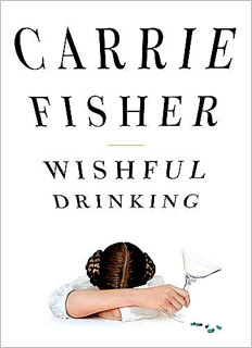
Carrie Fisher, Wishful Drinking
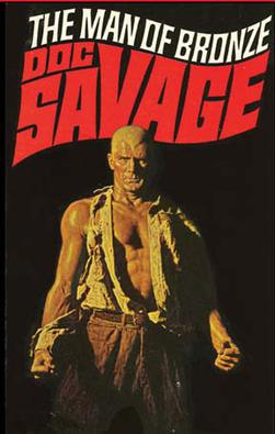
I don’t know if I’d call them my favorites, but in the late 1960’s two moribund pulp franchises were brought back to life, primarily due to effective paperback cover art.
Conan the Barbarian, illustrated by Frank Frazetta
Doc Savage, illustrated by James Bama
Any of the original covers for Pterry’s Discworld novels, the ones from the first British editions.
This cover hooked me when I was in high school, and it’s been a favorite book of mine ever since. I’ve always wanted to get a poster of it: http://www.fantasticfiction.co.uk/images/n10/n53491.jpg
Likewise but more recently this cover: http://www.fantasticfiction.co.uk/images/c0/c498.jpg
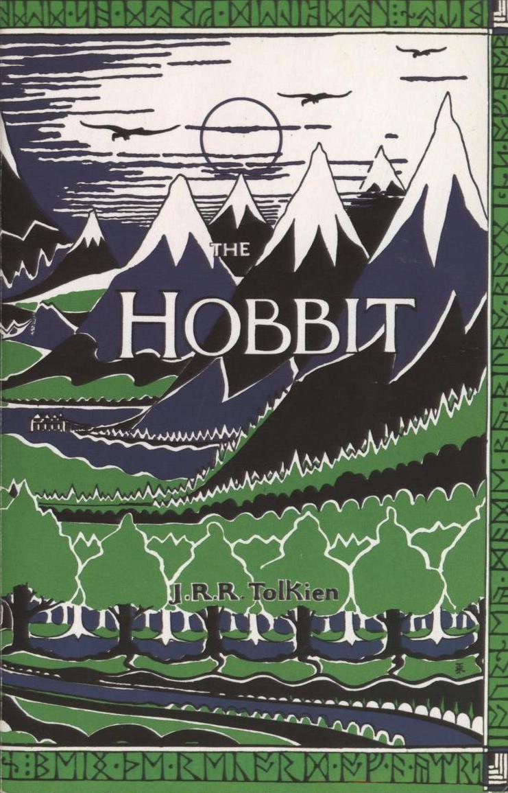
Tolkien did this cover for his own book: http://artofmanliness.com/wp-content/uploads/2008/05/hobbit_cover1.jpg
…but I actually prefer this one by Alan Lee: http://edubuzz.org/blogs/campiep7b/files/2008/04/illustrated_hobbit.jpg
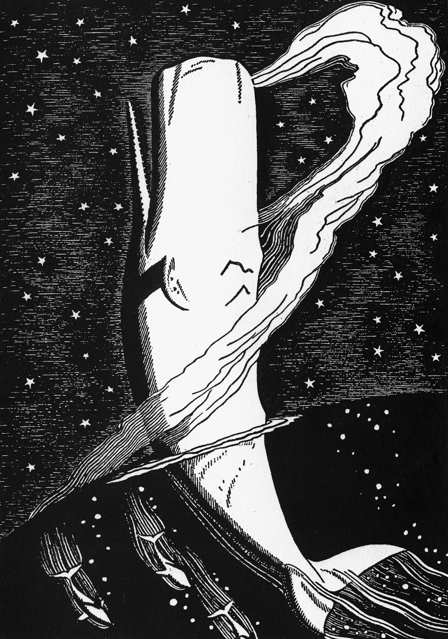
Rockwell Kent did some very striking illustrations for a 1930s edition of Melville’s Moby Dick: http://farm3.static.flickr.com/2368/2257942579_07469b0799_o.jpg
…one of which even made it to a recent postage stamp: http://giam.typepad.com/100_years_of_illustration/images/kent.jpg
There are several versions of Roger Shattuck’s Forbidden Knowledge out. They each employ elements the same painting and it I do adore.
The paperback of Bradbury’s Dandelion Wine from the late 80’s or early 90’s. Blurry yellows and greens with a boy.
I’ve always wanted a poster of it.
The title typography is kinda boring, but other than that, it’s a sweet cover.
I love this thread. Feels so naughty to be judging books by their covers.
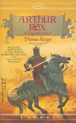
I’ve always loved this image:
I also like the simplicity of Malcolm Gladwell’s book covers:
The painting by Julian Scott on this cover is perfect for the subject, and the elegant Times Roman font matches it well:
I spend more time than I should thinking about book covers. Right now I’m on a dystopian fiction kick, so let me throw out a few of those that I particularly enjoy.
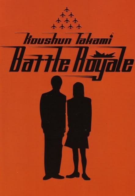
The cover of the English translation of Battle Royale really struck me when I picked it up. I like the subtle details of the bombs and the gun between the girl and boy. http://img.photobucket.com/albums/v618/pbarmy/battleroyalecover.jpg
Here’s my favorite edition of Lord of the Flies. A friend of mine glanced at it from across the room and asked, “Is that a fetus?” which I thought was very appropriate.

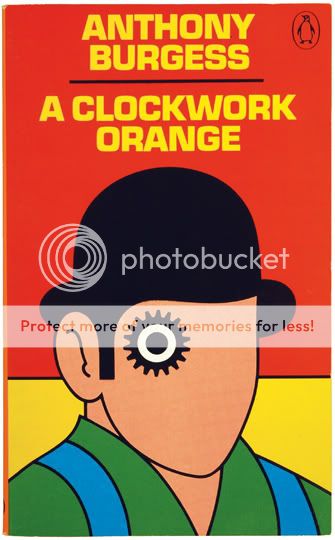
I dig the clean, pop art colors on this edition of A Clockwork Orange.
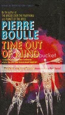
And, lastly, this book of short stories by Pierre Boulle (author of Planet of the Apes) grabbed my attention as soon as I saw it. The strange figures, the general air of menace - works for me.
If you like cover art and the design skills behind it, I have to suggest the Caustic Cover Critic blog.
The first one that comes to mind is Sabella, or The Blood Stone; A Science Fiction Vampire Novel, by the great Tanith Lee.
And it’s a pretty good book, too…
Another good Martin cover, to Fevre Dream. If you look closely you can see a vampire’s face reflected beneath the steamboat. Creepy and evocative: http://upload.wikimedia.org/wikipedia/en/c/c0/Fevre_dream.jpg
Well lookie that… there is a gun in there. Just had the same :smack: moment as when someone pointed out the arrow in the FedEx logo a while back.
I don’t know exactly why I like it, but the cover for The Yiddish Policemen’s Union really grabbed my attention. It’s simple, but there’s something about the colour combination and the mixture of typefaces that I love.
Yeah, except it always bugged me that a stern wheeler is pictured. The Fevre Dream was a side wheeler. Looked more like this (the Natchez)
Good point. Cap’n Marsh even makes a disparaging remark about sternwheelers in the book.
Hmmm - where to begin? As a collector (unfortunately not as active as I’d like) of first editions, I have a few I love:
Brave New World- gorgeous, kinda Deco
Ulysses, first American edition. This photo doesn’t do it justice - it’s a big brick of a book and this spare design with a rough-textured paper - it just looks cool.
Catch-22 is iconic
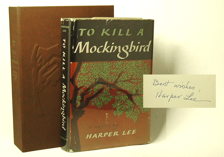
To Kill a Mockingbird- I don’t particularly love it as standalone art, but it is iconic because it is my favorite novel…
The Rebel Angelsby Robertson Davies - a favorite book and this first US Edition began a series of books by him with the same cover designer…very cool.
1st Edition, Starship Troopers
http://upload.wikimedia.org/wikipedia/en/thumb/f/ff/St59.jpg/200px-St59.jpg
Harvard Lampoon’s Bored of the Rings cover:
It’s a parody of the then-current Ballantine edition covers, which were made by cutting the Lord of the Rings poster into thirds:
I like the original cover for Larry Viven’s Protector:
.jpg)