I’ve seen good cover art on dust jackets, pictures that let you know the artist had a halfway decent idea of what was going on inside the book.
But more often I’ve seen cover art that, to put it baldly, sucks.
For example, whoever did, or at least passed on, the pictures that grace the covers of S.M.Stirling’s books that start with Dies the Fire, obviously had not clue as to how that characters in the book really looked.
I once heard Anne McCaffrey(RIP) say that the covers of her Pern books often were poorly thought out. I mean, a dragon rider like Lessa would not be wearing a filmy white gown, would she? McCaffrey did say that the cover of The White Dragon seemed to be fairly accurate as to the gear a rider would wear. White Dragon (disambiguation) - Wikipedia
Do you have any examples of cover art that really bugs you?
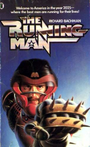
That guy is supposed to be wearing a massive suit of armor and have fire engine red hair down past his shoulders. Also, there’s no deserted plane anywhere in the story.
– covers aren’t supposed to illustrate the book; they’re supposed to get people interested enough to pick it up.
The DIES THE FIRE series covers aren’t illustrations – the figure looks nothing like any of the heroes, for instance.
But it does get across the “fallen modern world” thing by putting swords and rusted cars together.
And it has seriously succeeded in getting people to pick up the books.
Once you’ve got a successful series, of course, it’s overwhelmingly important to have -continuity- in the covers; people have to be reminded of the last book.
I’ve begun reading Jack Campbell’s Lost Fleet series. It’s space navy stuff in the vein of Honor Harrington. I’ve finished Dauntless and am now reading Fearless, and I have the next three books thanks to some 50%-off coupons and a plethora of Half Price Books locations within driving distance.
There are Space Marines in the books - a small contingent, really - but Captain Geary, the hero, does not lead, speak, or meet with them at all except through their highest-ranking officer, Colonel Caraballi.
Yet, if you look at the artwork, it looks like Geary is loaded up and ready to provide heavy fire support himself!
Funny you bring up awful cover art; Darrell K. Sweet just died a couple of weeks ago. I’ve always detested his artwork for the Wheel of Time series. He couldn’t draw figures for crap, all his people ended up either looking like dwarves or deformed in some way. In fact, that cover of The White Dragon linked in the OP looks like one of his.
ETA: I take that back, it says it’s Michael Whelan.
The other 2 are not nearly so goofy, but the 1960s paperback cover of The Fellowship of the Ring must have left at least a few people skipping the series entirely, thinking it was about frogs and psychedelic eggplant.
Speaking as someone who has some experience designing books, book covers can do both. That said, the appearance of a book jacket is going to come down to a mixture of author preferences, publisher’s marketing plans and creative ability of the designer and/or illustrator — a deficiency in any one of those areas can make for a horrible cover.
Robert Jordan’s *Wheel of Time *books have a history of laughably terrible covers. This wrap-around is one of the better ones. Ignoring, of course, the fact that no one looks like the book describes them, that’s standard for fantasy books. Ignore the terrible layout. (A row of the main characters! Vanishing into the distance! Down a hill! BRILLIANT!) Something is horribly wrong with everyone’s proportions. (Where is Lan’s groin? Halfway through his horses back, that’s where) I also assume they wanted to show Moraine riding sidesaddle (she dosn’t, but never mind that) Drew in her legs, then realized after the fact that that would leave us with a completely breast-free cover. Then, in an act that Liefeld would approve of, just re-drew her upper body.
C’mon, you say. It was the first book, and no one knew they would make horrific scads of cash. The new ones must be better, right?
Course, neither of those showed trollocs, the half-human, half animal orc-stand-ins as black guys in silly helmets. So I suppose we should be greatful.
Walter Jon William’s Hardwired originally hadthis cover. I know, I know, over 80’s, but not really that terrible. But it’s decades-later re-release will age-better, right? Of course it will. Ok, maybe the 2011 re-release will do better . . . as long as they don’t accidentally swap the cover art from a different book. Serioiusly, no one wears anything like that in the entire book, nor do I think that symbol is ever used.
–
There are buildings in the book, though. So they got that right. Random floating hexagons, I’m less sure of.
I once complained to an author about her using Darrell K Sweet for her cover artist (it wasn’t her decision, of course) but she defended his cover where he painted characters with the wrong hair colour, stupid candy-coloured clothing, and including one character in a key location they importantly didn’t appear in. Original. Re-release.
Clearly he paints before the book is finished. Or doesn’t read them at all. That is no excuse.
My favorite (as in inaccurate vs. of artistically dubious quality) are the various covers for Philip Jose Farmer’s Riverworld series. The problem, for those who actually read the books (unlike, say, the artists in question) is that men were unable to grow beards, yet just abouteverysinglecovershowing human males has at least one of them with facial hair. As an added bonus: one which shows dinosaurs.
Like B. Serum said, they can do both. And if they don’t illustrate the book, they should at least not be “incorrect.” There’s a significant percentage of the population that gets actively pissed off at cover artists who don’t represent the contents accurately. This thread is my cite.
Pissed off book buyers are going to feel antipathy when looking at the follow-up. If they loved the previous book it won’t matter, but if they just thought it was okay, then a charming, accurate cover can turn the tide.
Better an excellent cover than a bad one, but better an excellent, accurate cover than an excellent, inaccurate one.
I think that a lot of people who are supposed to choose covers simply keep a file of artwork, and when they have to choose a cover, they just look in the file, say “That’s close enough”, and have done with it. I remember being aggravated at one of Barbara Hambly’s books which showed a Generic Fantasy Hero with a Fancy Sword being Menaced By A Fantasy Monster. This was particularly bad because the first two books in the series (Windrose chronicles) actually had relevant, well-done covers.
Lord of the Hissy-fit cracked me right up. But they’re all good.
I hate it. As far as I can tell, all of Hodgell’s other fans hate it. Hodgell hates it, but tries to be diplomatic about it for getting-published reasons. The problem is that it gets close, then screws up every detail. Everything in the picture is in the book, but none matches the descriptions.
The protagonist is flat-chested and (when traveling) wears a tight-fitting black outfit. (She is a thief, after all).
The fat lynx-thing is supposed to be small enough that she can pick him up (with difficulty) and have white eyes. (He was born blind.)
The mask is supposed to cover her whole face, because it’s supposed to be covering a nasty wound on one cheek that is a major plot point.
The poncy unicorn in the background is the most vicious predator on the planet. At least they got his color right…which means they got his eyes wrong, because he’s an albino.
The knife is more nitpicky, but it’s supposed to be all one piece of ivory, with faces on the pommel.
Someone went to the trouble to collect enough details for all those elements to be present, and the artist appears to be technically competent, and it’s still screwed up. I wouldn’t sweat most of them, honestly, if it weren’t for #1. It’s such an egregiously wrong depiction of a character I’ve been reading about for years that I hate it. I suppose I should be grateful that she’s shown wearing gloves and with long black hair. Those are the only details they actually got right in the whole picture.
Now that the big rant is out of my system…Jody Lee, who does the cover art for most of Mercedes Lackey’s books, really needs to have her purple pigments taken away until she learns not to abuse them. It’s not that the art is bad…it’s just too purple, too often. When the title of a book is The Silver Gryphon and the gryphon in question is faintly lilac-colored on the cover, it’s time to admit you have a problem. (And that’s not even getting into the purplish pastel indignities she’s inflicted on various so-white-they-can’t-even-be-dyed Companions.)