Also, keep in mind that authors below the George R.R. Martin level have a degree of influence on cover art which is either:
a) very little, or alternatively
b) _*&&ing zip.
Until I hit the big leagues (last 5 years or so), they generally didn’t even show me or ask me about it; I didn’t get to see the flats until everything was set.
Cover art is less likely to be actively wince-inducing than it used to be. In the 1980’s, every female on the cover had Wisconsin Dairy Board udders, whatever she looked like in the book.
A publisher at the time told me that a fantasy or SF cover had to have certain elements; someone with a sword, someone getting hit with a sword, a semi-nude female with big breasts, and a generalized blue-green background.
And they -meant- it. They economized on mine that time by having a semi-nude, big-breasted female getting hit by a big-breasted female carrying a sword, against a generalized blue-green background. As a bonus, the female with the sword was wearing plastic armor with breast-cups and a navel.
I was also told that there was going to be an asteroid on the cover of an SF book I was doing a little later. I said OK – not that I had any choice – and then they told me they were not satisfied with the original asteroid and were going to make it, I quote, “more sexy”.
Sure enough, it was a mighty, tubular, -thrusting- asteroid.
Basically the editors regard you as an ignorant dolt to be ignored or humored as far as cover design goes.
I do wonder if cover design is going to matter so much with the increasing popularity of e-books. I think the focus will shift to book trailers instead.
Frankly, the commentary shows that people writing have no notion of art, nor cover art, and play the tired old “let’s take things literally to the max” that should by law be allowed only to the Onion. Too many are “Someone tried to do something artistic instead of a literal representation; let’s mock him unmercifully.”
Several years ago I copyedited a novel that was part of an established series. One of the main characters had a dog of a certain breed that featured prominently in the story, and the breed was frequently mentioned. While I was working on the book, I popped over to Amazon to see if the book had been announced yet. It had . . . and the cover art was already done. With the dog smack in the middle. A dog of a completely different breed. :smack:
I notified the publisher, but I’m guessing it was too late to change the art, because the book was ultimately published with that goofy cover. I giggle a little whenever I see it in a bookstore.
We had a thread recently about Enid Blyton books. The dog in the Famous Five, who is number of said five so not a minor character, is frequently referred to as a Collie. The early book covers just had ‘a dog’ which happened never to be any breed of Collie.
There’s one book cover I remember from the eighties - ‘This Time of Darkness’ - purely because it was the only one where things like hair colour matched the story. Every other book back then got it wrong. Usually it was so wrong that I was glad I never actually judged a book by its cover (I basically bought out all the charity shops of anything that wasn’t Mills and Boon).
I don’t think ‘drawing people in to read the book’ is an excuse for that sort of mistake.
A question for S.M. Stirling. Do you lurk on this board on a regular basis and only post when you’re the subject of a thread? Or do you have some service that notifies you when your name comes up in a message board like this? I’m curious because you’re not the only person who has appeared a la Beetlejuice when their name is mentioned and I’m wondering how it works.
being a huge horse lover, I am drawn to any book that has a horse prominantly on the cover, especially if it doesn’t just look like part of the ‘scenery’. Two books that drew me in that way were Lwgend of the Lake and Riding Lessons.
Legend of the Lake came first; the cover was the horse alone, a beautiful black Friesian galloping thru a lake. The back cover hinted that Legend of the Lake was the horse’s name, and it was a love story between his owner and his trainer…sounded good to me! I bought it and eagerly began reading.
Yes, Legend of the Lake was the horse, but he was not a Friesian but a Thoroughbred race horse. Compare the 2:
Now… really, the only thing these animals have in common is 4 legs, a mane & tail… and the Friesian has WAY more of that. To add insult to injury, the horse was barely mentioned in the book beyond being a way to get the trainer there to screw the owner’s brains out at every whipstitch.
The second, Riding Lessons. had a prancing bay Arabian on the cover. I was in a hurry so didn’t bother reading the back cover. It has a horse on it and is called Riding Lessons… HAS to have a horse in it prominantly, right? Well, yeah, it did… but not an Arabian at all, but a Hanoverian show jumper. Not an activity Arabs are known for…
Anyway, in this b ook, at least, the mistake was not the author’s fault, she KNOWS her horses, and the screw up was the publisher’s. This is actually one of my very favorite books of all time and I am very glad I didn’t let the breed error throw me off.
Hey! I liked those LOTR covers (and the similar one for The Hobbit)
If you want bad 1960s paperback covers for LOTR, look no further than the Ace editions. I did a thread about them a couple of years back, which I’m not going to search for now. The Fellowship of the Ring:
It’s Emperor Palpatine, ciomplete with lightning bolts, except that he’s been Leela-ized. I guess that’s supposed to be a metaphorical Sauron standing behind Barad-Dur. He’s opposed by Gandalf the Green and four others. I guess that’s Gimli with his axe on the right. It’s been suggested that the guy in the goofy Goose helmet is Aragorn, wearing his crown more than a little early (and if that is supposed to be the Crown of Gondor, it’s the dumbest interpretation of it I’ve seen). The guy between hi and axe-man really isn’t short – he’s clearly standing on a different level, below the rise helmet-guy is on, so it’s not really a hobbit. Only the guy next to the pointy-hatted wizard (whose hat lacks abrim!) seems as if he might actually be a hobbit.
I was introduced to Spacepaw through Barlowe’s Guide To Extraterrestrials. The aliens in Spacepaw look a great deal like earth bears. Barlowe’s Guide has a great illustration of this. The cover of my copy of Spacepaw has a gorilla on it.
My copy of Hiero’s Journey has a generic post apocalyptic cover on it. Some people are menaced by a dinosaur that, despite being painted and not photographed, still looks like an iguana in make up. It’s obviously a pre-existing illustration that the publisher had on hand. Apparently, the book did well because the sequel Unforsaken Hiero has a cover illustration that faithfully reproduces a scene from the book.
Meh. Those comments aren’t particularly annoying - those covers can be argued to fall into the general category of ‘non-indicative’.
It’s the ones where they’re calling a technically proficient cover that illustrated perfectly well the contents of the book inside ‘bad’ simply because the content of the book features anthropomorphic animals, aliens that vaguely resemble humanoid animals (whether they particularly resemble any particular species or not), or a particularly intelligent (or intelligent looking) creature that can be argued to resemble a feline. Multiple Channur and Man-Kzin Wars books are listed, as is at least one Redwall - the major criticism being ‘cat people!’ or ‘weasel in a dress!’ (the character in question is an otter and looks it, by the way). None of the Man-Kzin War covers are particularly inspiring, nor is the Redwall one*, and one of the Channur covers is actually pretty dreadful, but the Redwall/MKW books get only a token mention of the fact that they’re pretty generic - it’s mostly ‘LOL, furries!’ dressed up as artistic criticism. And while that one Channur cover did get torn up pretty good for its actual lacks, it was still mostly ‘aah, cat-people!’
Redwall covers are pretty generic, in general - with a handful of exceptions any cover from the series could be used for any book from the series.
[ETA: Yes, particular and its various derivations have lost all meaning for me, too…]
There once was an author at our bookstore signing his books. On the cover was a picture of a man riding a galloping horse. I asked him if there was even a horse in the book, :p. He said yes, briefly. I told him it is ridiculous that publishers put a horse on the cover to attract buyers. I did buy the book because it was a local author and he wrote of our area and places I know but I can’t get into it at all. I’ll have to give it another go.
I’m actually collecting a series of fantasy novels with bad cover art on purpose. It’s Evangeline Walton’s Mabinogion series. They’re excellent stories and very close to the source material, but the cover art…let me just show you.
I wish I could find a wraparound cover of this. It’s even worse on the back. I firmly believe that the artist took a lot of acid before painting this. When I found this book, this was the only version at the store. It’s a hard series to find, too, so I grabbed it and ran (paying first, of course). Then a few years later I find the second book in another used bookstore. Two editions of it, actually. One had a generic fantasy-novel cover and the other was as trippy as the first.
In its defense, I will say this scene actually does happen in the book. I think Bran (the giant guy) was clothed at the time, though.
Now I just need to find the trippy-covered Prince of Annwn and Song of Rhiannon. This version of SoR will not find its way to my shelves. Way too tame. The series has to match. (It causes me no end of irritation that my copy of *Dragondrums *does not match the first two books I own in the Harper Hall trilogy.)
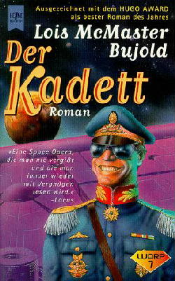
Lois McMaster Bujold’s Vorkosigan books often get very unusual covers, such as this legendarily bad German cover for “Warrior’s Apprentice” http://www.dendarii.co.uk/Covers/German/twa_de.jpg - yes that’s supposed to be Miles.
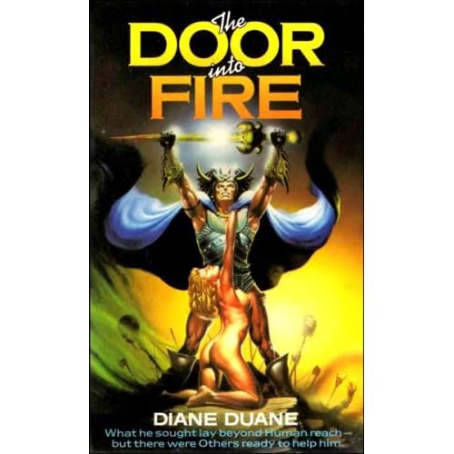
One edition of Diane Duane’s The Door Into Fire had an embarrassingly bad cover that looked more like something for an erotic Conan rip-off. Badly represents the book; I’ll post a link in a spoiler box to satisfy the two-click rule for NSFW links.
I see that some of Glen Cook’s Black Company novel’s cover art is coming in for some (IMO justified) criticism.
Some of the cover art on Ringo’s Empire of Man series is so bad I think that it has to be a deliberate shout-out to cheesy '50s serial-pulp covers.
On the flip-side of bad, I’ve always liked James Gurney’s work, both on covers and just general look/tone. It’s like Norman Rockwell meets Douglas Adams, and they team up and head for the Land of the Lost together.
I’ve wondered for years who it was who did all those ugly cover paintings for fantasy novels. I thought of him as the “too much yellow” artist. I first noticed his work on the Xanth books, but he also did some of the US Discworld covers and I regularly recognize his style on books I see at the library.
I’m not sure if this is true, but I’ve heard that cover art generally has to be done before the book is finished and that the artist usually just gets a paragraph or two to work from. This would explain why things like hair color are so often wrong.