John Coleman is a former weatherman and the founder of the Weather Channel. I just saw him on Penn & Teller’s show, Bullshit!
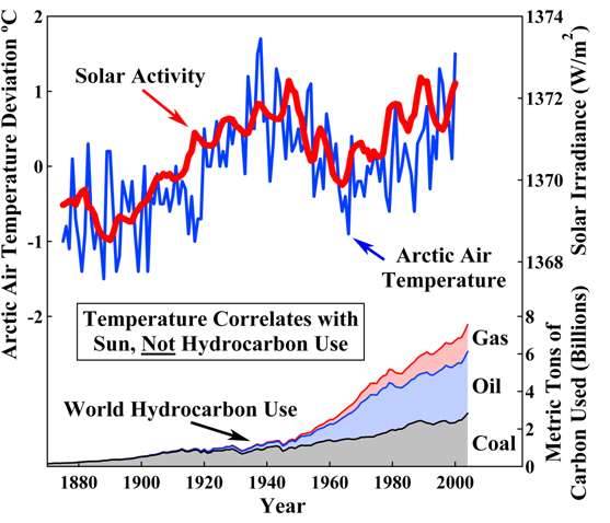
But so he’s hyping this graph, to show the lack of a link between temperature and hydrocarbon use.
Now as the saying goes, numbers don’t lie, liars figure. Well this graph is the poster of that.
Firstly, why in a discussion of Global Warming, is the temperature that he gives not the average global temperature? Why choose the Arctic? Could it be because the North and South poles aren’t as protected by the ozone from the sun’s irradiance? Hmm…
Well so over the same timeframe as displayed in the above graph, here is the average global temperature.
Now, further, there’s this graph (last 500 years) and this one (last 400 years), showing reconstructions of solar irradiation. These come from two separate studies (A and B), with more being listed here. Here’s the last 1200 years according to Bard and Yang. Bard’s 1200 year reconstruction is included on the NCDC page.
Now compare those graphs to the global temperature records of the last 1000 and 2000 years.
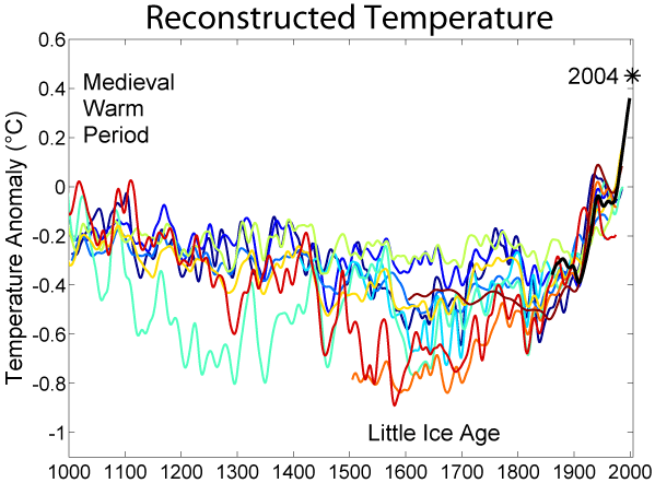
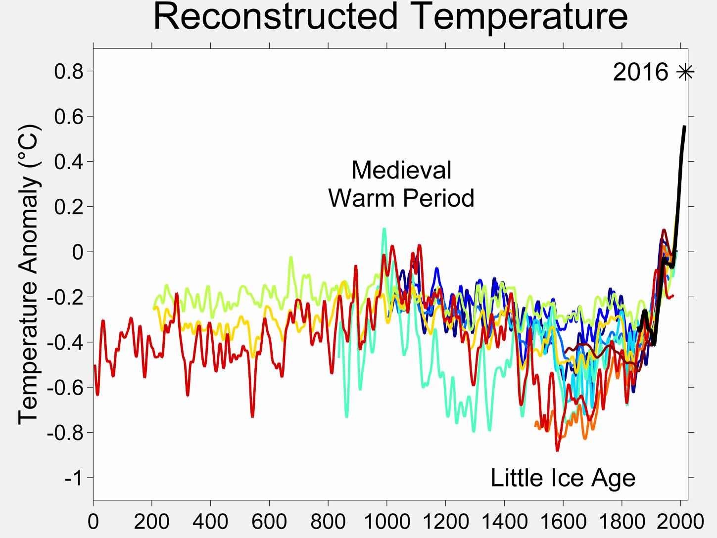
From 1640-1700 about, there’s a massive dip in solar irradiance. If you think of the red line and the pale green lines as the lower and upper bounds, it looks like things may have indeed dipped some starting around 1500 and coming back to merge around 1800, but there’s no obvious, major 50 year dip there. And looking at the longer scale, really there’s no obvious pattern to the solar irradiance. Possibly you could say that it’s been on the climb since 1443, but the average global temperature was on the decline all the way from ~1000 to 1800.
Now I can see using old data, but to use the Arctic temperature as being representative of the entire globe is patently creating false data. So Mr. John Coleman, you sir are a slimey scumball.