Modern Life is Rubbish by Blur. Partly because I just like the title.
I guess I go for “enigmatic” more than “packed with detail”.
Like Zeppelin’s Physical Graffiti, my choice of the Stone’s Some Girls was a standing invitation to slide the sleeve back and forth within the cover to create unusual combinations.
I nominate Devo’s Q: Are We Not Men? A: We Are Devo!.
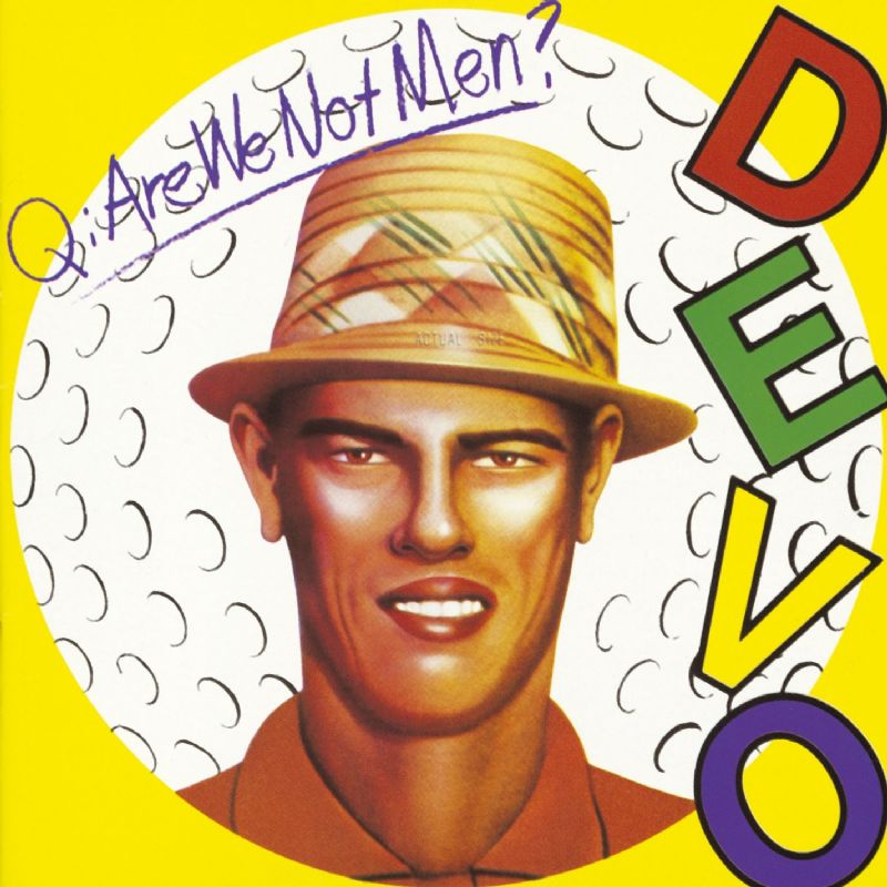
Also: This is fun!
Not exactly rock n roll, but Miles Davis’ Bitches Brew is pretty cool:

All right – I’ll mention the most notorious album cover ever: Mom’s Apple Pie.
http://friends.s5.net/mazzini/plosce/pie.html (scroll down)
For an actual great cover, though, I’ll add It’s a Beautiful Day.
The greatest album cover of all time:

Spinal Tap’s Smell the Glove.
I think Rage Against The Machine’s “Evil Empire” is another good one: http://en.wikipedia.org/wiki/File:RATMEvilEmpire.jpg
I dunno about “most notorious”, though I’m sure it’s in the running. Even edgier, I think, is The Scorpions’ Virgin Killer (broken link, because of NSFWness: en. wikipedia .org/wiki/Virgin_Killer ).
One I liked: Tool’s Aenima. A picture doesn’t really do it justice; the cover was a lenticular image that changed as you rotated it.
Ah, but the images inside the CD case and on the disc were ah…interesting!
![]()
My favorite Tool record by a mile, too.
Staying with the funky, picking on Traffic Shoot out at the Fantasy Factory
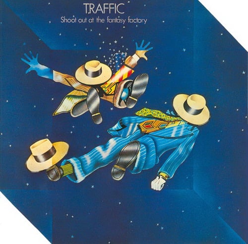
Sort of fried out from a hot day, so I’ll try listing these later.
Virgin Killer is much more notorious in that it’s a real photograph of a naked prepubescent girl, not just some salacious artwork.
Another notorious cover, which preceded Virgin Killer, was that of Blind Faith:
link broken (NSFW):
http://en. Wikipedia, the free encyclopedia Blind_Faith_(album)
My choice for today:
Kansas Point of Know Return
PS, I love album art. When we went to CD’s, we lost a truly unique art form.
Someone mention Scorpions and left out Virgin Killer? [Link possibly NSFW]
I think it was deliberate. I seem to recall that on the original fold-out vinyl album cover the separated colours hit another prism and are reconstituted into the single white beam of light that hits the prism on the front cover. If the light bent in the right direction this wouldn’t have worked.
One of my favourites, by an awful band that I don’t like, is Nickelback’s All the Right Reasons. Just a great photo.
But is it Great? Notoriety isn’t really enough… Oh what the hell. Everyone in, nobody out.
Wow. Things moving faster than I keep track of, but I’ll try: (up through yesterday)
- Diamond Dogs – incredible bit of artwork, and there are apparently versions with the dog dong blacked out. Hysterical! Censor that doggie’s doodle!
- Breakfast in America – opening up a world of possibilities in model city making.
- Bat out of Hell - hard not to admire for a variety of reasons.
4)Evil Empire - yeah, this always made me wonder. Of course evil is YOUTH… - Are we not men? - a fine line.
- Shoot out at the fantasy factory - which was also shaped with cut corners.
- Axis:bold as love - more fun psychedelic stuff.
- Modern life is rubbish - a fine line indeed.
- Discipline - well, I’d certainly call it a Celtic Knot.
- Live Dead - brightly colored
- It’s a Beautiful Day – almost an ad for laundry soap, but there’s than meets the eye.
- Point of Know Return – Always fun seeing a ship going over the edge.
- ABBA Live - Possibly ranked lower than necessary because I hated ABBA.
- Smell the Glove – the Black Album! Haha! It goes up to 11… okay. Fine.
- Lovedrive – her nipple is chewing gum? I don’t get it.
Some “left out” because: 1) stated in post it was not picked for cover, 2) stated in post it was not rock 'n roll 3) more than one cover picked 4) link broken or 5) my utter failure in listing powers.
Here’s one that I kinda dig, but that a lot of people really don’t: Freeze Frame, by the J. Geils Band. It positively screams “eighties” to me.
Not to mention liner notes and other assorted doodads. And since music is now being remastered to fit on ipods, the sound quality is going down too:
ROBERT LEVINE, ROLLING STONE- David Bendeth, a producer who works with rock bands like Hawthorne Heights and Paramore, knows that the albums he makes are often played through tiny computer speakers by fans who are busy surfing the Internet. So he’s not surprised when record labels ask the mastering engineers who work on his CDs to crank up the sound levels so high that even the soft parts sound loud.
Over the past decade and a half, a revolution in recording technology has changed the way albums are produced, mixed and mastered — almost always for the worse. “They make it loud to get [listeners’] attention,” Bendeth says. Engineers do that by applying dynamic range compression, which reduces the difference between the loudest and softest sounds in a song. Like many of his peers, Bendeth believes that relying too much on this effect can obscure sonic detail, rob music of its emotional power and leave listeners with what engineers call ear fatigue. “I think most everything is mastered a little too loud,” Bendeth says. “The industry decided that it’s a volume contest.”
Producers and engineers call this “the loudness war,” and it has changed the way almost every new pop and rock album sounds. But volume isn’t the only issue. Computer programs like Pro Tools, which let audio engineers manipulate sound the way a word processor edits text, make musicians sound unnaturally perfect. And today’s listeners consume an increasing amount of music on MP3, which eliminates much of the data from the original CD file and can leave music sounding tinny or hollow. “With all the technical innovation, music sounds worse,” says Steely Dan’s Donald Fagen, who has made what are considered some of the best-sounding records of all time. “God is in the details. But there are no details anymore.”. .
Anyway, today I will go for Roger Dean and artwork he produced for YES Fragile