You know, I was giving thought to replying in the original thread, but I think this is a perfect illustration of the issues addressed in this thread. Decisions, decisions.
Anyway, this has been bugging me since it happened, so here goes.
Sam posted the following (you do not need to click, this is just documentary. Keep reading):
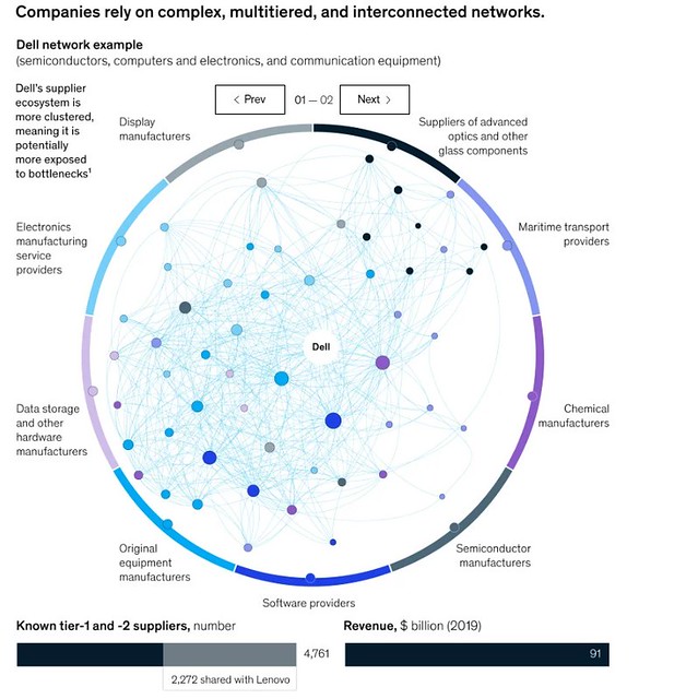
In that post, is this graphic, which Sam calls a Supply Chain chart.
Sam talked about how every line created information and value, that this was a miracle of modern freedom, that central planners couldn’t create such a thing, etc.
But the chart is a fake. Rather, it’s a dumbed-down version of a McKinsey report Risk, Resiliance, and Rebalancing in Global Value Chains which contains the same graphic - but without the colors and the fake labels:
(For example, there is no “maritime” classification in the McKinsey chart.)
Now, the issue isn’t that Sam grabbed the wrong cite when a better one was available - we’ve all done that. The internet is a big place, after all.
It was in the following exchange, when I, well, parodied Sam’s post with a picture taken from The Devil’s Derivatives showing a CDO-cubed derivative. Using 95% of the same wording, I talked about how every line created information and value, that this was a miracle of modern freedom, that central planners couldn’t create such a thing, etc.
(Again, you don’t have to read):
The graphic:
The above graphic shows the supply chain of actual derivatives, with the derivative in the center being the one under review. Every node you see within the circle is another CDO-cubed deal, some (the thick one above the middle node) thicker than others (that small CDO at about 7pm of the central node, halfway to the edge). In addition, all the dots at the edge of the circle represent additional CDO’s and their related investments. And each of the dots are invested in hundreds, thousands of mortgage bonds representing tens of thousands of American homes, these mortgage bonds not shown due to simplicity.
So what did Sam do? Did he recognize the parody? Did he argue against his own words (which would have been delicious)? No…
Oh, wait. That’s exactly what he did (you can read this one if you wish):
Which left me so gobsmacked I had to let him know what’s what:
Sam hits back with the of course I knew that! defense which worked so well after the 400 well-intentioned words cited above in post 145.
But here’s the thing. I actually brought a supply chain graph. Sam brought a fake one. Sam then denied the reality of my cited (it’s right there in the bottom-left corner of the graphic) supply chain… and why?
… because it’s a “circle of things” which “a central planner would make”. There’s a literal description in my graphic explaining that it is a core product of one of the Titans of American Capitlalism and Sam here is denying its reality because the artist decided to use straight lines and actual CDO’s rather than McKinsey’s more general, curvy, representation of what’s happening with Dell.
And to Sam, that made my citation fake news. Because it lacked curved lines.
To deny my own citation by presenting fake evidence while simultaneously arguing against his own words…
Sometimes, team, I literally cannot believe that this site is free, as the entertainment value can be damn near infinite.


