My father, on a recent trip to the States, accidentally had his new digital camera set to some bizarre blue-filter setting, meaning that we now have a significant number of digital images with a very strong blue cast to them which somewhat hinders our ability to enjoy them.
I know there should (and indeed, is) a way to correct this in Photoshop, but I’ll be damned if I can figure it out. So - any Photoshop gurus (and i’m positive there are some on this board) know how to do this?
Incidentally, I’m only using Photoshop 6, if that has any bearing on things.
Well, if the blue cast is bad enough it will have knocked out the details in the other color ranges so that adjusting may not help, but you can give it a go anyway.
I believe the easiest way for a non-guru to do this is the Variations option. I’m pretty sure that was in version 6. On my menu it’s Image -> Adjustments -> Variations. Then you pick midtone and move it away from blue, or just pick the one that looks better on the list of options. You can also switch to change the shadow seetings and so forth and do the same.
You might want to give Google’s Picasa 2.0 a try. It’s designed for tasks like that and is a lot easier to use than Photoshop. It’s completely free, too.
In Photoshop, go to Image > Adjustments > Levels (or hit Ctrl-L). You should get an RGB histogram of your photo. See the three eyedroppers on the right? There’s a black one, a gray one, and a white one. Click on the middle (gray) one. Find what should be, in your estimation, a neutral gray tone in your photo. It could be a light gray, a medium gray, a dark gray–it doesn’t matter. Click the eyedropper on that spot. Photoshop will recalibrate the colors so the spot you clicked on has equal values of red, green, and blue (i.e. neutral gray).
Now, this may take a little bit of trial and error and perhaps some fine-tuning. You’re not always going to have a perfectly neutral zone in your picture. But this is the quickest and easiest way I know of getting into the ballpark.
Another possibility, in at least Adobe Photoshop CS, is to try Image > Adjustments > Photo Filter and try the 85 warming filter at various densities. I’ve never really used this (I didn’t even know it existed until a few days ago), but in theory that should also work, provided you find the right density. It sounds like your dad has taken photos with the tungsten setting turned on. This will render daylight photos blue. An 85 filter should balance it out.
If you want, you can send me a sample photo to check out and color correct. Email is in my profile.
I tried that method, pulykamell, and it seemed to work somewhat - the photos aren’t entirely blue anymore. I think, though, that they might be beyond being completely fixed - however, I’ll keep at it. Thanks for the info.
Here I used Curves to create a genuine grey point. It allows you to choose any point that should be grey, and then adjust each channel so that they level out to grey. Then I chose saturation, and desaturated the blues a tad to make it look a bit better.
But as you can see, it still looks wrong, and there appears to be no red at all in the image.
Why wouldn’t using Color Balance on each photo work? It is just a matter of finding the right… um, color balance. If they all have a blue cast, it’s simple. See my example above.
The problem is, I think, that the blue is replacing other colour shades, and they are therefore eliminated if you try to take the blue out. Replacing only some parts of the blue with the correct colour is almost impossible.
I got pretty good results, with no detail loss. It is difficult to correct a bad photo 100%.
I really think it is just a bluish cast. Did you look at my “fixed” photo ? I think it looks pretty accurate. All I did was a simple Color Balance, nothing else. The color information was obviously there somewhere. Only Gerome can tell us how accurate the colors are, I guess.
I got similar results to you, with a little more contrast, by using levels and selecting the following values:
R 0, 1.44, 255
G 0, 1.92, 255
B 0, 0.41, 255
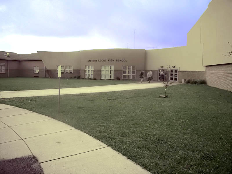
I’m not exactly sure what the heck is up with that photo. Using the grey point technique (which, admittedly, does not work well on this image), the best sampling area I found with the post of the street sign.
The colors are so out of wack on this one that it’ll take a little investment in time to get it right. I made my photo look a little better by going into Hue/Saturation and desaturing the colors a little bit (-20).
I get the impression it’ll be well-nigh impossible to restore the original colours - still, you guys made it actually look decent as opposed to completely blue and whatnot. I do like robotic_panda’s work though.
Thanks for all your help guys, I doubt I would have been able to figure it out myself - this board proves its infinite usefulness once again. I’ll just have to make sure we’re more careful with the camera in the future. Why it has a blue setting to begin with is beyond me.
Or see how this strikes your fancy. The colors are a little less saturated, but the color balance is closer to neutral, especially on the pesky building. I did that with a combination of the Photo Filter set to a custom dark green and 100% and some tweaking of levels. Sky was corrected separately to the rest of the photo. It still ain’t perfect. If I had more time, I’d go in and brighten up the grass a little bit and add some more saturation to it, as well as tweak some other problem spots.
 If they all have a blue cast, it’s simple. See my example above.
