Yes, yes; I know. 'Johnny L.A. is starting yet another airplane thread. :rolleyes: ’
Since I can’t afford an airplane, I like to look at them. You all know that most of my fixed-wing experience is in a 1970 Cessna 172K, an interesting model for several reasons. The main competitor to the Skyhawk was the Piper PA-28 Cherokee. Let me try to describe where I’m coming from in this thread.
Prior to WWI, most General Aviation (GA) airplanes (‘little airplanes’) were constructed of steel tubing covered with fabric, and the wings were often made of fabric-covered wood. Postwar, more airplanes were made of sheet aluminum. Cessna had their conventional gear (‘taildragger’) 120 and 140 models, introduced in 1946 and with metal-skinned wings in 1949. Piper was still making their J-3 Cub and other conventionally-geared, tube-and-fabric airplanes. Aeronca did the same. The Cessnas seemed pretty modern at the time.
In the mid-'50s Cessna developed the tricycle-gear (nosewheel) Model 150 (1958-1977; Model 152, 1977-1985). Trikes are easier to land and to maneuver on the ground, and were more modern in appearance. The Model 170 was produced from 1948 to 1956. This airplane looked a lot like the 140, but larger. It had four seats and a more powerful engine. It still had the conventional gear and rounded tail. In 1956 Cessna brought out the 172. The 172 was (and is) essentially a 170 with tricycle landing gear and a square tail. The 172A (1960), 172B (1961), and 172C (1962) had a stylish swept tail that gave the Skyhawk styling appropriate for the Space Age.
In 1960 Piper introduced the PA-28 Cherokee. This was quite a departure from the PA-22 Tri-Pacer, which was basically a PA-20 Pacer fitted with a nose wheel, and looked like a flying milk stool. The Cherokee was (and is) an all-metal, low-wing airplane. In my opinion, Cessna developed existing designs and Piper came up with something new. Both the 172 and PA-28 are still in production. The Cessna gained its ‘Omni-View’ rear window with the 172D in 1963, and took on its current configuration (wide-stance main gear with tubular legs, elongated extension to the vertical stabiliser) in the 172L in 1971. (The 172M, 1972 - 1976, introduced the ‘camber lift’ wing with a drooped leading edge on the wings.) The Cherokee gained extra windows on the side, but otherwise still looks the same to me. Oh, and in 1974 Piper switched from the ‘Hershey bar’ wing to one that resembles the Cessna’s planform. (Full disclosure: I’ve only flown a PA-28-235 once.)
Airplane makers are a conservative bunch. It’s very expensive to certify a new design, and older companies find it more cost-effective to refine older designs than to start with a clean sheet of paper. Both the Skyhawk and the Cherokee are mature designs that are pretty much fixed.
So there’s some background. Now about the styling…
In looking at old airplanes, ISTM that Piper was quicker to supply updated panel layouts. Nowadays, there is a standard arrangement of instruments. ‘Back in the day’, instruments were put where they fit. Looking at panels from the mid-to-late '60s, the Piper’s panel looks better to me. OTOH, the 172F got electric flaps in 1965, while the Cherokees have stuck with the Johnson bar on the floor to operate the flaps.
Half a century on, the Cherokee no longer looks more ‘modern’ than the Skyhawk to me. As I mentioned, a low-wing, all-metal trike was quite different from the high-wing, tube-and-fabric taildraggers. I’m guessing that the low wing made the Cherokee look more modern than the Skyhawk, which retained the high wing. Today, the styling looks similar; the choice being whether you like the wing above you, or the wing below you.
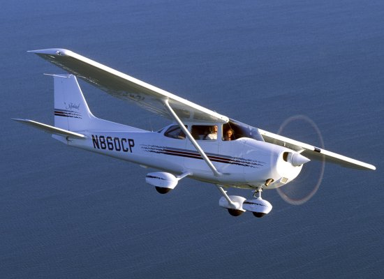
So how do you keep a 50-year-old design fresh? Bold New Graphics, of course! Check out this 1970 Cessna 172K. It has two-tone paint, with some pinstripes you can’t see in this photo. A newer 172S looks like a flying Winnebago. I mean seriously, doesn’t that design look like it belongs on an RV? This photo, shown in a January, 2012 Flying article looks better. It’s a little ‘retro’.
Anyway, just something I wanted to get out.
