Android 4.2

I just got a Nexus 4. This is not a stealth brag or something; my last phone was a T-Mobile MyTouch Slide 3G that was already a two year old design when I got it. The old phone came with Android 2.1, which was by far the best operating system I’d ever used on any device. It was nice to look at, brilliantly intuitive (for example, holding your finger down on things generally gave you a context menu). It did crash a lot as the phone got older, but I assume that was because I was using newer apps that weren’t really designed for it.

My wife got a Samsung Galaxy something-or-other 4G a few months ago and it has Android 4.something on it. I’ve found it completely mistifying the two or three times I’ve tried to use it (though that might be because she’s a total Luddite and still has the tutorial widgets cluttering the home screen).

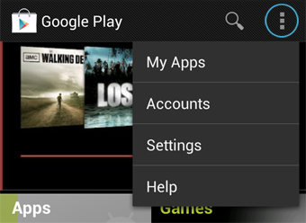
The Nexus 4 comes with Android 4.2, which looks more or less the same as the OS in her phone, though a bit prettier. After 8 hours of fooling around with the phone, I’m not a fan. It looks nice and hasn’t crashed, but it’s not intuitive at all. Finding a menu is totally hit-or-miss; sometimes there’s a softkey at the bottom of the screen, sometimes there’s a button in the program itself, and sometimes there’s no menu at all. Features from 2.x seem to have been changed or removed just because; the “remove icon from homescreen” function used to make you drag it to the bottom of the screen. Now, for no apparent reason, you drag it to the top - where occasionally the phone will forget you are dragging an icon and open the status bar.

Same thing with widgets. Before, if you wanted to place a widget on the home screen, you held your finger on the spot where you wanted it. You’d get - you guessed it - a menu asking you why you were doing that. If you do that now, it just lets you change the wallpaper. You have to activate the programs list and drag and drop a widget/program icon from there. Why? This is not an easier task.

Anyone else tried it? Anyone else think there is way too much change for the sake of change?

I love the phone, for what it’s worth, but then I don’t have much to compare it to.

I have a Nexus 7 with Android 4.2 and I love the OS. Everything seems fairly intuitive to me and I can move around and do what I want without having to go through the manual or anything. This is my first experience with Android though so I don’t have any pre-learned habits.

I have the Sprint Galaxy Nexus, a model behind the Nexus 4. I honestly didn’t notice too much of a change, but that’s because I had 4.1.1 so 4.2 didn’t seem like too big a change. I’ve only had 4.2 on my phone for a couple weeks and I do have one complaint, which is that it drains my battery fast. I mean, I don’t use my phone for 5 minutes, and the thing drops 5%. The Sprint Galaxy Nexus already has a somewhat poor battery life. I didn’t exactly like it with android 4.1, but 4.2 really made it worse. And keep in mind, this is with Juice Defender, a battery saving app. The only solution is to upgrade to 2100 mAh battery, since the Galaxy Nexus does have a removable battery. But that’s only 250 mAh higher than the stock battery you get, so that won’t be too much of an improvement.

[SIGH]

I agree with you on those things. The widgets thing sounds like a pain, especially if you are into customizing. Of course the hardcore customizers would be running a custom launcher like GoLauncher or ADW Launcher, which would largely isolate you from many of the changes that come with a new version of Android.

But otherwise those sort of changes unfortunately are typical. Like in Windows, the transition from XP to Vista required relearning the location of many things. Some things got better, some things got worse.

This has been my experience as well. The only thing I wish I had was an easy way to switch between languages.

That’s interesting that you cite that function as intuitive. Long-presses, while nice, are typically “advanced” functions, similar to how keyboard shortcuts work. When looking at the UI, you’d never intuitively guess that a context menu would appear at any given point, much less what it would have in it. Interestingly enough, this was part of the reason they got rid of the menu button, and added the action bar (three dots which appear, if there is additional content).

Again, for the reasons above, this is very interesting. The “menu” buttons are dependent on the application, and only appear if there is an actual menu. Interestingly enough, while 4.2 isn’t completely consistent, 2.x had a rather large bunch of inconsistencies and inconsistent behavior, which was largely improved upon in 4.0+.

I miss that menu, myself. However, for an uninitiated user, it makes sense to see a sample of the widget you’re about to place on your home-screen, which you couldn’t under the older system. You’d have to place, remove, try another, etc, and you couldn’t natively resize. Granted, they could have still kept both methods, but it does explain the latter move.

I do have my share of complaints and areas that still need improvement (lock-screen widgets, I’m looking at you), but in all honesty, I’d have to say it blows any previous version out of the water. For every inconsistency which still exists, many more have been addressed, while it’s more unified than ever before. Even though I’m more of a power user, and liked/dealt with previous versions, the current one has been the first where I’ve recommended it, as well as purchased tablets running the OS, as gifts.

For me the update to 4.2.2 solved the battery drain issue. I’m on a Nexus 4.

I want to know why I need to constantly use Dolphin Companion to reclaim my memory, even with nothing going on :frowning:

You don’t need to. Android’s memory manager is quite capable of handling RAM allocation, and happens to do so by letting RAM fill up entirely and then free up space as needed. So it will always look like you’re out of RAM if you check, but it’s not an issue. Just ignore your memory status.

It’s intuitive because there’s not really any other way you might bring up a menu. There’s no “right click”. The problem with the action bar is that the three buttons tend to be “back”, “home”, and “something else”. If there’s a menu, it’s usually stuffed into a gap on the right of the third action bar softkey and so small you could miss it entirely (in fact, I did at first).

So mod your phone to give you a persistent 4th soft key for ‘menu’. It’s a Nexus, you’re allowed to do that sort of thing, though you’ll have to root it.

My knowledge of software modification is pretty much limited to writing two line programs in BASIC.

This is more like installing an app, but since you’re actually replacing a system app with a modified version, the process of getting to where you can do that might be a bit more than you’d care to undergo. I’ve flashed so many custom roms on my Galaxy Nexus that this sort of thing doesn’t phase me anymore.

I highly recommend trying custom roms, 3rd party launchers, and the like. Might really improve your experience!

I think you’re getting a bit confused. “Intuitive”, in terms of UI design, would be something like a consistent home button. Upon looking at or pressing it, the casual user can predict, with pretty good certainty, what it will do. Random long presses anywhere in the UI, on the other hand, represent a crap-shoot-- in some cases it will allow you to close images, while in others, it serves as a right-click. It’s about as intuitive as pressing Control-V on your keyboard-- it’s an advance paste function, but no casual user would be able to tell by looking at it. That’s not consistent or good design.

Here is what the action bar is. It specifically appears and better accomodates the functions of the app. It’s intuitive because the user has a better idea as to what each button does, when they press it.

This is the action overflow button, which serves as a “menu”, in absence of an actual menu button. Considering some apps are ported from other OS’s, don’t offer long-press functionality, or simply have “settings” as an option, a “menu” button isn’t always necessary. Instead of forcing the user to guess when pressing a fixed menu button, it’s better to have this action overflow button appear, *if *there are additional menu settings. Better developers use them.

The Back, Home, and Recents buttons, represent the Navigation bar. Sometimes the action overflow button can appear here, but off the top of my head, I can’t remember specific examples. However, it’s one of the inconsistencies which still exist.

There’s a lot of reason they moved in the direction they did, while such a design approach is a first for Android. You can read all about it, here, if you’re really interested. Prior to this direction, though, it was pretty much…a loose mess with no real design criteria for developers. Something like what is documented in the link above, never even existed.

The good thing is that they’re still working on it and gradually improving, so maybe they’ll address some of the other issues.:slight_smile:

I think it’s only there on apps that haven’t been “optimized” for Android 4.X. In Android 1.X/2.X, there were typically 3 or 4 buttons. Not on the screen, but either hard buttons on the device, or soft-touch capacitive buttons. The buttons were Home, Back, Menu, and sometimes Search.

Starting with Honeycomb (3.0/3.1,) Google experimented with persistent “on-screen” buttons, and this carried over into 4.X. They got rid of the menu and search buttons, and made a “recent apps” button. As you said, they wanted all apps to be more consistent and have very similar “Action Bars” so that no matter what app you were in, you knew that all of your “options” will be in the top right corner.

But apps that aren’t coded properly for 4.X are still expecting there to be a dedicated “menu” button on the phone, so they don’t have in in the Action Bar, or don’t have an Action Bar at all. In that case, the OS inserts the overflow button into the Navigation Bar.

There we go. Thanks for that addition, bouv. I remember the HTC devices having an even greater issue with that.

Maybe this is a function of the fact that I didn’t use a large number of apps on my last phone, but IME a long press almost invariably performed the “menu” or “action overflow” function almost anywhere in 2.1.

Okay, so I might have been wrong. A month in, I’m as comfortable with it as I was with 2.1. It wasn’t the OS, it was Android’s native apps. However, I have now replaced just about all of them with third party versions, which is the point, and I’m very happy.

Huh…well, personal choice and all, but I prefer Google’s native apps 90% of the time. They look better, for one (so many third-party app developers still make their apps look like the shitty 2.X theme,) and there are more likely to be coded properly and make use of the Action Bar, etc…
But hey, do what you like! That’s one of the reasons I think Android is the better mobile OS, it has so much customization that it’s almost impossible for someone to not find an app/method that works for them.