Dear hubby and I have another simple disagreement: Whenever we buy art to hang on the wall at home, he insists that it needs to be matted. I think it depends on the piece, but I don’t have any particular rules. I just look at the piece and decide if it looks better with a mat or not. He has some (in my opinion rigid and arbitrary) rules about things, like that you can’t eat pancakes for dinner. I think this matting artwork rule is one of them. So I’d like opinions from someone with more art expertise than us.
You can play with the framing/matting options a little. Does it look better with the mat or not? In my opinion the matting detracts. I’m leaning toward the canvas or wood mounting instead of a frame even. Is there some rule about when you should mat something?
Yeah, if you’re buying a real art piece on flat paper, then it’ll need to be matted as a matter of course. It keeps the glass from sticking straight to the artwork, because this could damage it. Even photographs can be damaged in this way.
Paintings on stretched canvas don’t need to be mounted - they don’t even necessarily need to be framed.
What you’re buying in this particular example is low-grade mass-produced commercial stuff that provides an option to have it printed on a a stretched canvas. In which case it doesn’t need to be framed more than the options they already provide, and it would not be matted regardless. Even if you go for a flat print, it really doesn’t matter what you do with it because it’s so cheap that even if it gets damaged, replacement is simple. It would be another matter entirely if this was an original or a proper limited run.
It’s just a poster.
ETA: I’d worry more about the frame, haha. If they’re gluing the art right to the frame, good luck reusing the $150+ frame again easily. In this case the frame is worth more than what’s going inside it…
Yes, we’re only talking about cheap art here, sorry I should have said that.
Also, does a piece have to be framed - what about my idea of mounting it on canvas or wood with no frame instead? (See my link if you don’t know what I’m talking about.)
Yeah, saw your link, already discussed that point: it’s cheap art, so do whatever you want with it. There’s no original or 35/200 limited print to irreparably damage here. They offer the stretched canvas mount and that’s just as legit a choice. Like I said, framing isn’t necessary for a stretched canvas even if it’s an original. You can just take that square thing and hang it up on the wall as is. Now, I think a canvas look for art like this is cheap and cheesy personally, because I think stretched canvas should be for originals, but that’s just me and my opinion.
If you want cheap art to look like cheap art, frame it cheaply. If you want expensive art to look like cheap art, frame it cheaply.
If it’s mounted directly on a wood panel or a stretched canvas, you don’t need to frame it at all if you don’t want. There is definitely a minimalism trend going on right now.
A mat isn’t going to work with a thick mounted or canvas-wrapped piece anyway, but many frames for canvases will have a liner made of fabric-covered wood that has a similar effect between the art and the moulding. That style I consider a little old fashioned.
What you really need to consider is the space on the wall that the art is going to be. Does it fill that space on its own? If it’s too small it will look sad, lonely, or downright silly. A good frame job with matting can make the piece bigger.
As other mentioned, the mat keeps the glass off the artwork. Plexiglass is safer to have directly against the art, but that’s still not the best idea. If you don’t like the look of a mat, you can get spacers, a super-thin strip of plastic that hides under the rabbet of the frame.
The decorative reasons for a mat (besides making the whole thing bigger) is to highlight a particular color or tone in the artwork. Unfortunately, ready-made mats are far too limited to do a good job for most pieces. But for budget, you can get a custom mat cut to fit a ready-made frame. Double mats always look better but are twice as expensive.
If you link to an actual piece you are considering, I can give my advice.
Sincerely, garygnu, professional custom picture framer
Generally true, but some art is much better served with the simplest frame possible. We have a one-off aquatint on handmade paper that simply defies any attempt to mat it. Instead, it’s ‘floating’ on a black background (snowy Japanese scene), with spacers between the glass and the print, and the frame is an extremely simple and thin matte silver. I’m sure you’d agree that the focus of any art is usually the art itself and not the frame or mat.
For the OP, I’d say that matting usually sets off the art, but it’s not something you must do. I have prints that were triple matted, where the mats pick up different colors, and other cheap prints that have no matting at all. Whatever suits you.
Simple is not the same as cheap, though. (And when simple is expensive we call it, “clean.” )
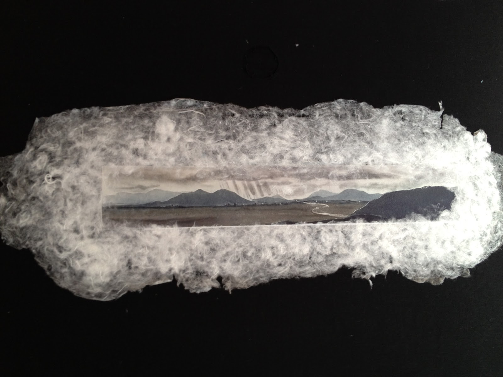
Floating on black is pretty much matting to me. Paper with a deckled edge is often served well by floating it rather than the straight line of a cut mat. However, I’ve had many clients insist on a float when it’s not necessary and far too often when only two or three edges have a deckle. That looks awful.
We’re actually considering the cheap tree piece that I linked to. It would fit a space over our bed, which is a tall four-poster so it’s visually framed by the bed posts already anyway. The walls are painted somewhere between avocado and mint green, with sort of a forest theme (the lamps are forged iron vines). We currently have a framed and matted print of bright orange fall leaves there. I loved it when we bought it a few years ago but now it’s a little old and I just don’t see it anymore. Part of the problem (with our whole house) is that we don’t have the right light to set off artwork, so things that look beautiful in an art store just look muddy and overlook-able when we bring them home. The orange fall leaves have a pale green mat that sort of ties it into the room, and while the frame and mat look good, I think they really detract from the print. But also the non-glare plexiglass also seems to mute the colors of the print.
I also hate glass in frames. They either hide the print behind glare or they make it look muddy. It’s possible I need to live in an art shop to be really happy.
Ugh, stay away from non-glare glass or plexi. You actually get more glare, and if you have a double or triple mat things get really hazy. Again, stay away. If you have the budget, Museum Glass and Optium are virtually reflection-free. It’ll probably be on display at a frame shop. Look for the little box frame on the counter that seems to be only half-covered by glass.
24x36 is pretty large already, and the colors don’t appear to need any help, so a mat isn’t necessary. Getting the wood mount would be a good option. I have a few like that and they look good, especially if the coating is fairly glossy (this makes it easier to keep clean, too).
If you do frame it, try to match the style and/or color of your bed posts. It otherwise sounds like it fits pretty well with the decor.
I hate matting! It always looks dumb. I get the “keep your limited edition print from sticking to the glass” but there’s no reason over half of your frame needs to be filled with white.
This is an unusual piece by Sarah Brayer. The scene is a street somewhere in a Japanese village, where it’s snowing. The print is attached to the back of a larger piece of handmade white paper that gives the impression of a cloud, in that the edges are not defined. Somewhat similar to this piece by her, but not so rectangular.
Thanks! (And to everyone who replied.) I really like the wood mounting for this, too.
Can I ask another artsy “please educate me” question that’s only slightly tangential to this? If you decorate a room with a theme, how do you know where to stop so that the theme doesn’t hit you over the head? Or is a theme a bad idea to begin with? Basically I grew up in a working poor family where the furniture was mismatched hand-me-downs and the only wall art was family photos. Now that I’m a grown up I buy matching furniture and other art besides family photos. When we remodelled our bathroom, we had a lovely soaker tub and the room looked nicely spa-like so I bought an inexpensive print of this, about 24x48, put it into a simple frame and hung it over the tub. It looks amazing, so I carried the nude female theme around the room with a few more framed prints until I suddenly realized I had probably one or two too many nude females on the walls!
So I wonder if I’m in danger of doing that again with the forest theme in the bedroom?
That’s more an interior decorating question than art, per se. Themes are fine and good if you like the theme, but you don’t want it to start looking like a vacation rental. When to stop? Hellifino
Dr. Cube–those examples you showed all seemed to have even proportions on all four sides of the mat. Ew. When I dabbled in graphic arts years ago, it was highly emphasized to have the bottom part of the mat be larger than the sides and top–for most works. I forget the proportions (3:4?), but I’m sure I’ve still got it notated on one of my steel rulers. I tend to agree with that aesthetic sentiment even now.
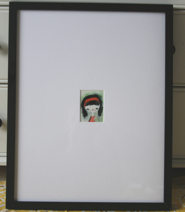
Yes, the example with the mat that was 8x the size of the artwork looked pretty stupid. But I could envision a similar scenario that would look ok with the right artwork.
Here’s a neat page about matting. If you want to see what I was talking about above re: making the bottom bigger, see the part about “bottom-weighting.”
P.S. garygnu, hats off to you. I hate(d) mounting, matting, and framing. So, I have a closetful of things I still might like to put on my walls (some of which I didn’t create, too!) but is languishing (well, wrinkling and delaminating onto each other) because I so despise doing your job, and it’s way too expensive to outsource.
Wanna come over and help? I’m a pretty good cook and cocktail-crafter…
 )
)
_-_La_Nuit_(1883).jpg)