One of my favorite classic TV series “The Fugitive” aired during the B+W to color transition timeframe. The black and white episodes had a starkness that was quite reflective of the dilemma of the protagonist. When the color episodes came along it didn’t seem like something was adeded, but like something was taken away. (I say this as a result of recent viewing, not to reflect my feelings as a 13/14 year old. We only had black and white tv anyway.)
Y’know, I’m trying to picture what The Addams Family would even look like in color, and I just can’t imagine it. This, even though there have since been color Addams Family movies. Yup, black and white is definitely the right choice, there.
The director of Creature from the Black Lagoon once said that he wouldn’t mind if they colorized it, provided they got the colors right. He said that the Gill-Man’s costume was a very delicate shade of mossy green. He said that poster artists and toy-makers always made the colors too garish.
The position that some of us are taking, is that if it had been filmed in color initially, it would be…the same as it is now, but it would look more realistic. The wit and humor would be exactly the same. Except no one would be wondering “what would it look like in B&W?”
Yes, the original cartoons were B&W, but the movies worked fine in color. As did A Charlie Brown Christmas. Is there a fan base out there thinking ACBC should have been done in a outline drawing style?
“Realistic” was not a quality sought in either Addams Family or The Munsters. As far as Charlie Brown goes, is there a fan base out there who thinks the Peanuts characters should have been drawn in a more realistic style?
Reality, in general, is overrated.![]()
The Elephant Man needed to be in black in white. In color, it would seem too lurid and garish.
Alien might look great in B&W, since there’s not a lot of color in it to begin with. I’m not sure how the final countdown to self destruct would look, though.
Funny you bring this subject up. I was just reading (in, I think, Huffington Post – will try to find the link) that the old cartoon show “the Jetsons” originally only lasted for a single season as a first-run show. But when it went into re-runs it became a cultural touchstone. The defining change being that “the Jetsons” (while ‘filmed’ in color) was a first-run show when color TVs were a rarity and most people watched it on B&W TVs and couldn’t get into it. When the series was reran about five years later, EVERYBODY had a color TV set and the show was a huge hit.
Perry Mason. My aunt has the DVD and the show was absolutely beautiful and crisp in black and white. They eventually filmed a single episode in color but it didn’t really work for me. Black and white encapsulated the PM universe in amber and the show still seems alive and vibrant.
Ever see the color Munsters movie? Man, did the makeup look bad in color!
I think costume dramas are pretty much always better off in color. I remember first realizing this when I saw the Scarlet Empress starring Marlene Dietrich as Catherine the Great. The film is beautifully shot in black and white in the expressionist style but the lurid story deserved a rich color palette.
Here you go. All in its pink and gold glory.
https://www.huffingtonpost.com/2013/11/21/addams-family-photos_n_4316085.html
Roger Ebert addressed this better than I could.
"Black and white movies present the deliberate absence of color. This makes them less realistic than color films (for the real world is in color). They are more dreamlike, more pure, composed of shapes and forms and movements and light and shadow. Color films can simply be illuminated. Black and white films have to be lighted. With color, you can throw light in everywhere, and the colors will help the viewer determine one shape from another, and the foreground from the background. With black and white, everything would tend toward a shapeless blur if it were not for meticulous attention to light and shadow, which can actually create a world in which the lighting creates a heirarchy of moral values.
In Hitchcock’s “Notorious,” there is a moment when Bergman walks slowly through a doorway toward Cary Grant. He is listening to a record of secret testimony, which proves she is not a Nazi spy. At the beginning of the shot, Grant thinks she is guilty. In the middle, he does not know. At the end, he thinks she is innocent. Hitchcock begins with Bergman seen in backlit silhouette. As she steps forward, she is half light, half shadow. As the testimony clears her, she is fully lighted. The lighting makes the moral judgments. To add color to the scene would clarify nothing, would add additional emotional information that might be confusing, and would destroy the purity of the classical lighting.
Most of us do not consciously look at movies in the way that I’ve looked at the scene from “Notorious.” But in our subconscious, that’s how we see them. In almost all serious black and white movies, bands of light and shadow are thrown across the faces and bodies of the characters from time to time, to involve them in a visually complex web. In “Night and the City,” Richard Widmark, as a cornered rat, seems trapped by the bars of darkness that fall on him. If you colorize the underlying image of his face and clothing, you lose the contrast of the lighting. Since the shadows are pure and the colorization is not, you get an oil and water effect, visually disturbing.
In “Casablanca,” the Bogart character is developed through the use of lighting. At the beginning of the film, he seems to be a cynical man who cares only about the profits of his nightclub. When he sees Bergman again after a long time, he is short and cruel with her, because he thinks she betrayed him. Then he learns more about her marriage to the Paul Henreid character, the Resistance hero, and by the end of the film Bogart has turned from a cynic into an idealist.
This change in his character is mirrored by the development in his lighting. In early scenes he is often harshly lit, or lit from beneath by the light of a lamp or a match, so his facial structure looks sinister. His face is rarely completely lighted. Henreid, by contrast, is usually well-lighted. Bergman’s face seems shadowed when we doubt her motives, and becomes more clearly seen as we understand her. If you slap the pinks and tans of the colorizer’s paintbrush onto their faces, you add a distracting dimension and you reduce the contrasts between lighter and darker areas. You make the movie look bland, less dramatic. You wash out the drama of the lighting.
Last night I was looking once again at another great black and white movie, “It’s a Wonderful Life.” This is the movie that Frank Capra thinks is the greatest he has ever directed, and Jimmy Stewart thinks is the best he has acted in. Stewart went to Washington to testify against the colorizing of the movie, and Capra, from his sickbed, made a plea that the film not be colorized. But because the copyrights had expired, the film was fair game - and a sickening colorized version has appeared on television and in the video stores.
The movie, once again, is about a moral transformation. In the early scenes the Stewart character is a bright young man who can’t seem to stop helping people, until he becomes the moral backbone of the little town of Bedford Falls. In later scenes, after a series of setbacks, he has a long night of despair. He loses hope. He turns bitter. He stands on a bridge and considers suicide.
Stewart’s face is one of the most open and trustworthy faces in the history of the movies. In early scenes, it is fully lighted - and the light of his moral character almost seems to shine through his skin. In the shocking later scenes, as he despairs, Capra shoots him in shadow, and seems to have even used makeup to darken him, make him look more ravaged by the night after he has walked out into it. Do we need to know, as he stands on the bridge, that his face is pink and his coat is brown and heaven knows what color his shirt is? "
Those publicity pictures from the “Patty Duke Show” were probably shot with optimal lighting and the best color film of the day. I’ve been at photo shoots, and they’ll take dozens of the same shot and pick the very best one to publish. I’m sure that’s why they look the way the do.
And they DO look great!
It was a big thing when my elderly aunt got the first local color TV set. We’d go over to her house Sunday nights and watch Disney and then Bonanza (and hope the NBC peacock would show up too). It was sad to go home and watch Gunsmoke in B&W, but I don’t think it’d look too much better in color - the scenery is itself pretty dusty. Then again, I’m not sure color helped Bonanza much either.
And yet, that is arguing for black and white after it came first. My point was, if color had come first, would many people have chosen black and white? You could today make movies only in shades of purple–and that would have interesting lighting challenges, too. But do you see a slew of art-house purple movies?
If shades of purple film had been the first type produced, and the first few decades of movies were in shades if purple, then people today would be waxing poetic about the artistic merit of purple films.
Perhaps. I’m reminded of the monks in A Canticle for Liebowitz, who painstakingly reproduced the exact color of blueprints, not realizing that the color was irrelevant and only an incidental result of the easiest process for making the prints.
Here’s a brief clip from the episode. You are right, it’s not right–as bizarre as it seems, color makes PM more dated.
The Twilight Zone wouldn’t have worked in color.
We recently bought a giant 40-quidillion digi-pixel whatever TV (my wife takes care of the techy stuff, I don’t really know what the TV is); I have to say that many of the black and white films on TCM look AMAZING – almost 3D in depth and definition.
I don’t know why this would be, since they obviously weren’t filmed in digital, but it’s quite luscious. It’s probably some kind of travesty of distortion of the originals, but I remain . . . transfixed.
This is way better than the 1987 reboot.
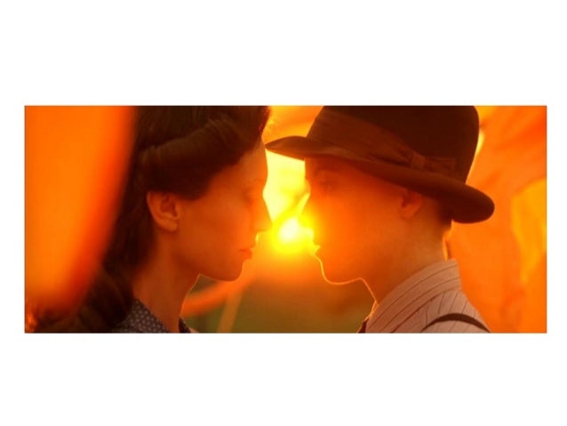
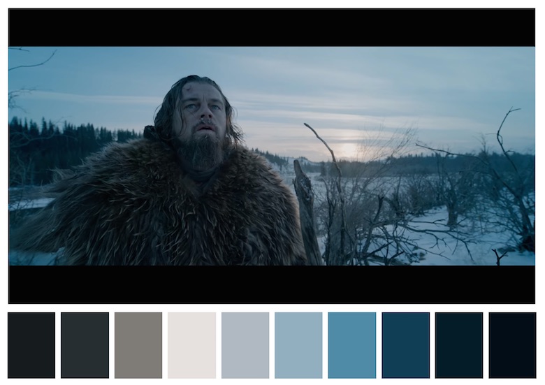
And yet today, directors are draining their films of color, or reducing them to orange and blue. Compared to earlier color films, this is basically proving you wrong. We had color. People have subsequently chosen to make films essentially colorless, or minimize coloring by working with a restricted palette. And there’s definitely nothing “realistic” about modern cinematography.