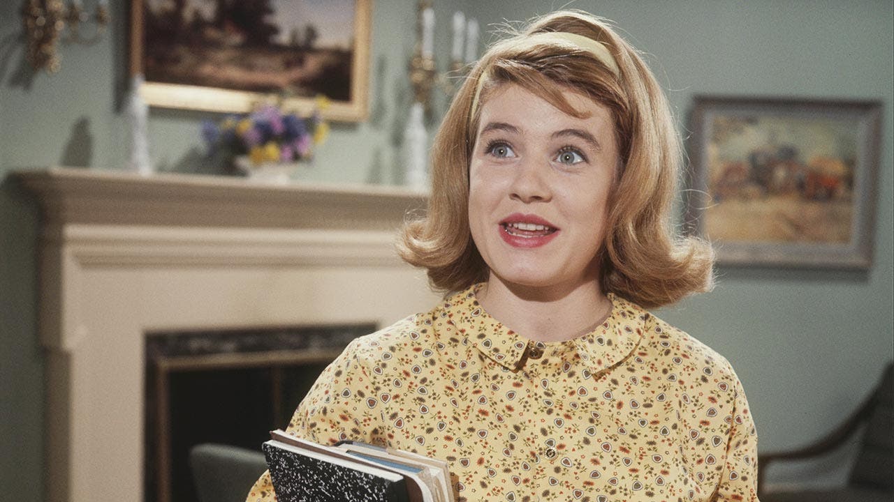
I often have the “Patty Duke Show” on early in the morning as I’m getting ready for work, nice comfort entertainment. I decided to look up some photos of the show, and when I saw color photos of the show, I was stunned how much better the show looked than when in B&W. What show or movie that’s in monochrome would you like to see in color. Or for that matter, are there any shows in color that would work better in black and white?
The X Files could have been very good in B&W with directors who know how to use effectively.
IMHO B&W is a limitation that had to be worked around, not a feature. If color had been an equally-priced and practical option from the very beginning of movies and television, I think that almost nobody would have ever chosen to use B&W instead.
A position I’ve always supported. But there are still people who not only consider B&W superior, but silent as well. They probably love the jitteriness of hand-cranked cameras, too.
People have chosen to use B&W long after color came in: Psycho,
Manhattan, Blancanieves etc. And certain types of comedy are funnier in B&W (Siskel and Ebert showed a scene from Blazing Saddles both ways to prove that point).
If you dismiss B&W and silent films, you don’t really care about movies.
Which is why I said “almost” nobody instead of “absolutely” nobody.
Feel free to show me where I “dismissed” anything. I’ll be waiting.
In the hands of the right director, black and white can be used to great effect. However, most directors aren’t great enough to pull it off, and for everyone else, it just comes across as pretentiousness. Plus, many of the most effective uses of black and white have been combined with color in some way, such as the transition from Kansas to Oz, or the red dress in Schindler’s List.
All that said, after-the-fact colorizations are even worse than black and white. Would, say, It’s A Wonderful Life have been as great if it were filmed in color to begin with? Maybe, or maybe even better. But the colorized version is just a travesty.
And if you think they are superior to sound and color, just by virtue of being so, you’re deluded.
When I was a kid, everything was in B&W. All we had was a B&W TV. All of The Wizard of Oz was B&W. Star Trek. 2001. Forbidden Planet. Hawaii 5-0. All the seasons of Gilligan’s Island. All glorious B&W. I knew there were households out there, whose parents could afford color TV. I dreamed of color TV. But I enjoyed the shows despite being B&W, not because of.
Now that I have color TV, do I watch everything desaturated, to recapture those glorious days of my youth? Revisit those memories of grey-shirted Enterprise crewmembers dying weekly on ST? Do I want dull grey Oz? Hell no! As God is my witness, I’ll never go colorless again! But neither do Iw ant a colorized Casablanca, or IAWL.
Yes, in a hypothetical past where the very first photographs were produced in full, rich, naturalistic color–and the first motion picture film–and someone had then come along and said “hey, I’ve got this new kind of film–it strips all color from the image, leaving nothing behind but shades of grey! You can record images like nobody has seen them, ever!” I really doubt many directors at all would have lept at the chance to make movies without color. A few might have made them, as a fad, but the fad wouldn’t have lasted long, and the films wouldn’t have had much success.
The main problem with the colorized version of It’s a Wonderful Life is that everything looks … off. The colorization technology at the time was not advanced enough to avoid the “uncanny valley” effect.
Getting back to the OP, in 1937 David O. Selznick produced Nothing Sacred, a knockabout screwball comedy, and The Prisoner of Zenda, a swashbuckling adventure. One was in B&W and one was in color. If you have not seen either movie, you’d likely guess Nothing Sacred was the one in B&W and Zenda was the one in color but, in actuality, it’s the opposite. Selznick’s biographers have wondered for years why he chose the comedy rather than the adventure to film in color and the best explanation is color was very new at the time and filmmakers weren’t completely sure what type of movie worked best in it.
So far Star Trek Discovery could be cinematically in B&W so far, thought ST Enterprise belongs in full HD.
I don’t agree at all. I watch the colorized version every year. It is over saturated, but that was the style of color at that time. And it does have black and white sections to indicate darkness, which would be blue in modern day film aesthetic.
I do admit I turn down the saturation, and would love to edit the dark sections as blue. But, even without that, I prefer it to the black and white version. It’s hard to do black and white without contrast problems. I can’t say I remember many B&W films that have contrast right–and most of them that did were either early works or used for effect.
Sure, I notice the bad colorizing of skin tones, just like I do in photographs. But the rest of the movie just looks so much better in color. And the skin tones don’t look any worse than all the color grading done in modern movies. All those muted colors look awful.
Who thinks this way, or who thinks this in reverse? I’ve lived with film majors, and I’ve never heard anyone say black and white or color are superior just by being so. I’m a still photographer myself and would never say one is better than the other. Both mediums take slightly different approaches. With color you have the added compositional element of, well, color to worry about. In a controlled environment, this is great. In an uncontrolled one, color can be a pain in the ass and distracting. They also lead the eye slightly differently, and usually require different lighting.
Probably most costume/historical epics of the 1930s and 1940s would have been better in color. For example, the 1938 Bette Davis & Henry Fonda ‘old South’ drama Jezebel has a major plot point concerning a red dress—which of course is grey in the black-and-white film.
The 1939 versions of Stagecoach and The Hunchback of Notre Dame are other examples of films that might be even more enjoyable had they been filmed in Technicolor.
How about The Treasure of the Sierra Madre, where you had a character named “Gold Hat” and you couldn’t see that he had a gold hat! Not to mention the camera panning across the vein of gold that didn’t look gold, and all of the mining of grey crumbs.
Color isn’t dominant over black and white, since it’s possible for a particular movie to be better in black and white than in color. But color is better than black and white, in that the movies that would be better in color are far more numerous than the movies that would be better in black and white, and it takes much more skill, skill which most moviemakers don’t have, to do a good job with black and white than with color.
If you can find a DVD of Frank Darabont’s, “The Mist,” he included a B&W version which is supposed to be tweaked to be B&W (as opposed to just taking out the color).
At the Somerville Science Fiction Film Festival this past year they ran a print of Mad Max Fury Road that was made in black and white, rather than the standard color version. It worked surprisingly well.
As Ray Harryhausen pointed out, Merian C. Cooper’s next directoral effort was an adaptation of H. Rider Haggard’s novel She. It’s regarded as the overall best version. But before it was made, the studio abruptly cut the funding for what was to be a color film, so they had to shoot it in black and white. Harryhausen oversaw the conversion of the black and white film to color, which works far better,
A lot of those old black and white films were designed for black and white, and meant to be seen that way. King Kong took a lot of its cues from Gustave Dore’s engravings, and were intended for that look (which is one reason a lot of people were annoyed by the colorized version). I don’t think Citizen Kane or The Maltese Falcon or Casablanca work well in color (although some have been colorized). Harryhausen’s 1950s flicks were intended for black and white, and many of the scenes in The Beast from 20,000 Fathoms and 20 Million Miles to Earth work better that way, I think (although Earth Vs. the Flying Saucers WAS colorized, apparently with Mr. H’s approval. Seventh Voyage of Sinbad was going to be black and white, but they got more money, and he revamped it as a color film.)
Most science fiction works better in color, I think, but The Day the Earth Stood Still looks just fine in black and white. So does Luc Besson’s first SF effort, Le Dernier Combat.
Good example—the glint of the gold would have dramatized the characters’ greed much more effectively than did, as you say, the grey crumbs.
Both the mid-60s Addams Family and The Munsters were shot in black and white for TV. I’ve always thought Munsters would have looked better in color, but it would have ruined Addams Family.
Compare this original color photo of the set of the* Dick Van Dyke Show* with this shot from a colorized episode. Notice the chair in the background? Sure, the red one pops better in color, but the green one not only looked better in black and white, but it looked more authentic in the “living room suite” of a 1960’s suburban home.