It probably only bothers me because I’m in Optics, and used to give lectures on rainbows, but it bugs me when people get it backwards.
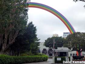
everyone knows the order of colors because of ROY G. BIV or some other mnemonic, but that doesn’t mean that they put the colors correctly on a rainbow. I stumbled across this image of a rainbow at Sony studios in Culver City California:
It’s at the site where the 1939 Wizard of Oz was filmed, which is undoubtedly the reason for its presence. Do you see what’s wrong?
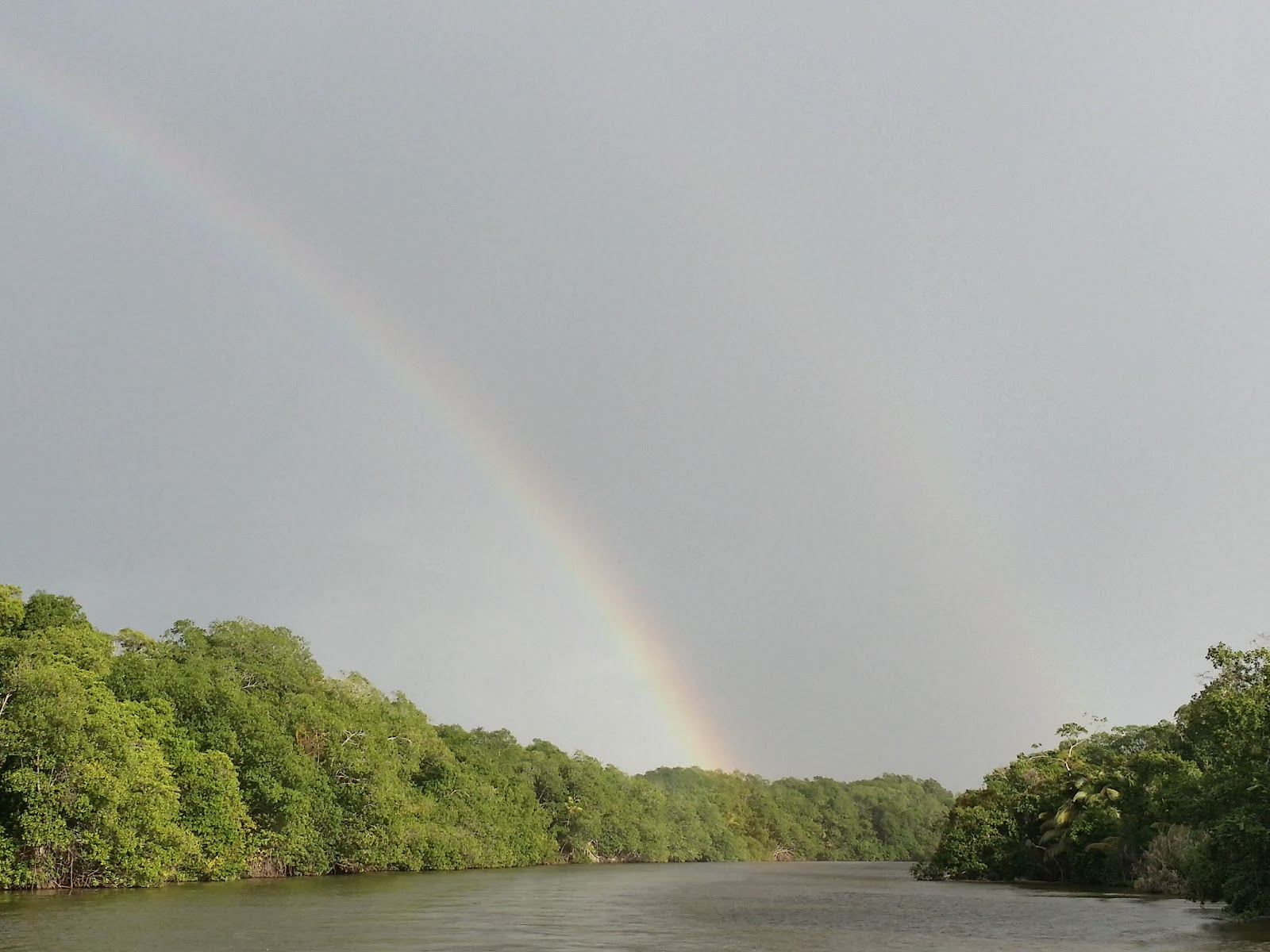
Here’s a picture of a real rainbow, for comparison:
The red band is on the outside, not the inside*. This is a sort of test of the artist – it shows their observational and memory skills. Even Peter Paul Rubens got this one wrong:
*(Don’t tell me that it’s on the inside of the secondary rainbow – that secondary rainbow is only visible if the primary rainbow is particularly bright, so an artist painting a secondary rainbow ought to be showing an even ore prominent primary bow – with the red on the convex outside)
Actually, it looks to me that Rubens got it pretty much right. His colors from outside to in are red, yellow, and blue. You seem to be objecting to the fact that there is a paler reddish band inside the blue. However, many photographic images, including your own, show a paler band inside the blue/violet. Rubens may not have gotten the color of the innermost band completely correct, but he deserves credit for having gotten the colors mostly correct and noticing that there was a paler band there at all.
I would have said I’ve never noticed such a thing but, coincidentally, just yesterday I was watching tv and when the NBC logo came on, I had a conscious, albeit fleeting thought about how the colors were in the wrong order. Not exactly the same thing, but I notice when they aren’t in the order I expect them to be.
Most reproductions I’ve seen have a prominent inner red band, but not an outer band. I disagree that “he got the colors mostly correct” – his rainbow is atrocious in colors, and it’s in the wrong part of the sky, as well.
The Rubens one is close enough for me, and subject to artistic interpretation, anyway, because of the general color palette of the image. There’s a reddish color on top, a darker blue one somewhere towards the bottom–I’m perfectly fine with it. A literal rainbow would look garish in that scene.
I have a little rainbow toy in my 3-year-old’s room that drives me slightly nuts. The rainbow starts out fine: red, orange, yellow, but then goes blue and green, before stopping. I don’t mind the “abbreviated” rainbow, but the flip-flop of blue and green does irk me.
But the one you linked to clearly has a red outer band, as do other examples on Google. All of the colors are correctly located, except possibly the innermost one. It’s a poor example to illustrate what you are talking about.
One has to consider the possibilities that:
The colors are off in the reproduction vs the original, as they often are.
The colors have faded in the original over the nearly four centuries since it was painted.
The relatively subdued colors are an artistic choice. Rubens may have decided that having bright primary colors in the rainbow would be too much of a contrast with the neutral colors of the rest of the painting. Rubens was clearly going for a harmonious landscape. The actual one was certainly not as symmetrical and balanced as the one he painted. Such considerations would account for the placement of the rainbow as well.
Rubens wasn’t going for scientific accuracy, but for an artistic effect. So to claim that they are the result of poor observation on his part is probably not correct. The colors may not be entirely accurate, but they are not an “error” on his part.
I completely disagree. There isn’t a clear outer red band in Rubens’ painting, and his colors are abysmal, and very bad match. If he didn’t want colors in his landscape, he could have avoided the rainbow at all. That he chose to paint it, and paint it badly (in a time when naturalistic painting did strive to reproduce nature) doesn’t speak well for him.
There very definitely is a reddish outer band, which can be objectively established. I downloaded a copy and checked the color balance of that band in Photoshop. A typical reading is Red: 182; Green: 139; Blue: 114. Not a primary color to be sure, but definitely reddish. And the colors are clearly not “backwards,” as you allege, since yellow and blue are in the correct relationship.
With all due respect, I think I trust Rubens’ artistic judgement (and those of art critics) over yours.
In any case, Rubens choice of color in the rainbow can’t be attributed to observational error, but rather to artistic considerations.
Not an artist I take it? That rainbow is perfect with the color palette he was using for the painting (and his color palette as an artist in general). Like I said, a literal one would be garish. It’s beautiful as is and speaks to his competence as an artist, IMHO.
Besides, look at this enlargement. At the very top of the rainbow (left side, just before it goes out of frame at the top), I see muted versions of the colors in order. I see red, orange, yellow, green, blue, violet and then a brownish smudge under the violet that may be part of the rainbow, or part of the sky. It looks absolutely fine and harmonious with the subject and mood of the painting.
And here’s a real photograph of a rainbow, with, apparently, the color balance shifted towards yellow that looks very similar (to my eyes) as Ruben’s rainbow. He’d be doing something similar mixing his colors to harmonize with the browns and ochres and other earth tones of the image.
