Putting the mundane in MPSIMS:)
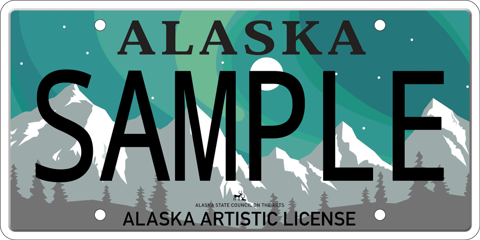
This week I saw a car from Alaska that sported a great looking license plate (although the photo doesn’t give it justice). It’s a special Northern Lights license plate, not the normal one. What license plate do you admire for their looks. Or are there any license plates that just look awful?
The new Nevada plates are kinda ugly. Bland pale blue and washed out pastels. Yuck!
The old-style 1980’s ones, which are a Metallic Cobalt Blue with white letters are much nicer. I’ve got a couple cars with those on them.
California’s standard plates are kind of boring, although putting “California” in a script font is an improvement over the previous ones with a white background and block lettering. But I many of the special interest plates are quite nice looking. My favorite is the Yosemite one, but the Arts Council one is quite nice, too. I’ve never been willing to actually pony up the extra fee for one, though.
The state name has been in script since 1994. I think it’s time for a change.
It is weird, but with all of the specialty plates, the concept of a state’s “plate” seems somewhat outdated. As far as “standard” plates, IL really took a swing and a miss w/ their recent in-house re-design. A goofy partial image of Lincoln on one side, w/ vague silhouettes of bidgs/structures.
New Mexico always catches my eye, the bright turquoise background w/ the red and yellow centered symbol.
The standard Oregon plate, with the tree in the middle, is quite nice and some of our vanity options like the Oregon Trail and salmon ones are good. Some, though, like the Cultural Trust plate and the Crater Lake plate just look like a muddled mess from a distance and don’t do much for me.
I always liked the cowboy on a bucking horse symbol on Wyoming’s plates. The problem for a long time was the colors they used were atrocious. The background from 1988-1992 was a good choice. But they’ve since gotten into very noisy backgrounds.
License plates, like flags, could benefit from some of the design criteria from vexillology.
Texas plates are boring because they want you to spend money on more interesting tags through Myplates. The original explanation is that the uncluttered background increases safety. No mention on how the colorful custom plates you pay extra for helps readability.
The best plates I see in my area are on cars with Mexico tags. One example
Maryland has a gazillion different plates - the list on the left has the categories, and within each are a couple to many different plates. I do rather like the Chesapeake Bay plate.
The one on my car isn’t even listed - it was the War of 1812 anniversary plate, which was current when I bought my 2012 Sonata. ![]()
[geezer mode] Back when I was a kid, we had *one *kind of tag - and we liked it that way! [\gm]
But for God’s sake, was it necessary to put that abomination of a bridge on the plate? The thing is a necessary evil at best. The previous plate version was much nicer.
I love the smaller porcelain black Delaware tags. The look great on black or white cars, and pretty good on anything else.
Plus their sort of a status symbol there, you can only get them for older numbers.
Alaska has had several good ones over the years. I always liked the one with the brown bear standing on its hind legs, and the gold rush plate depicting the long line going up over Chilcoot Pass from Skagway.
I’m a fan of Rhode Island plates.
Colorado has the mountains on it as standard fair. It’s not a vanity plate. I like 'em, but I’m biased.
I liked the “Chile Capital of the World” plate on our rental car in New Mexico.
I also like the “California 1960s Legacy” plate linked earlier. That looks good in person, especially on a black car.
The Northwest Territories has a pretty cool polar bear shaped plate.

While not pretty, the black on yellow Wisconsin plates were at least easily recognizable.
Brian
I like them, but I think of them as more nostalgic than good looking. A throwback to the days when states didn’t put fancy graphics on their license plates, just the name of the state and the plate number in a contrasting color on a plain background.
The Chile plate is growing on me. It also sounds like a fine dinner idea.
New Mexico has both the best and the worst looking plates. The turquoise plate looks fantastic on any color of car. The Patriot plate ironically looks like the US flag is on fire.
States should be banned from putting any URL on their plate. It looks so stupid.
Colorado has some really good looking specialty plates although a few too many. What I like is they incorporate the mountain motif from the regular plate so even if you have a specialty plate it is quickly recognizable as a Colorado plate.