If the pictures on the page are correct, it appears they added the boobs in 1957.
But by that argument, the Union Jack is a Canadian symbol, because it’s part of the full accomplishment of the arms (the lion supporter holds a Union Jack).
Sure, the Red Ensign of Canada was a Canadian flag; but there was very little on it that was unique to Canada, that you could say without qualification was a symbol of Canada.
No, that was the change. It stemmed from an ambiguity in the description of the arms, which said the maple leaves were “proper” in colour. In heraldry talk, that means the leaves were their natural colour.
Problem was, maple leaves have three natural colours. Green of course, in spring and summer, but when fall comes, the leaves of some species of maples turn yellow, while the leaves of other species, especially the sugar maple, turn red.
Green was used from 1921 to 1957, but in that year, they decided that red was more appropriate, since Canada’s colours are red and white.
The government decided to use red in all official renditions of the coat of arms starting in 1957, but the definition never actually changed. The leaves are officially colored “proper,” so any natural color can be used.
(Likewise, there was never an official decree that the harp shouldn’t have boobs. It just wasn’t drawn with boobs any more.)
So for instance, if you go to the Supreme Court, the arms behind the Bench have green leaves, because the courthouse was built in the 1940s, before the decision to use red leaves.
Local news item: in Regina, on Albert Street Bridge, the city often puts up flags to mark special holidays.
This weekend, they put up about 100 Canadian Maple Leafs to mark the 50th anniversary.
Plus one Austrian flag.
The Austrian is red - white - red, so in the ballpark.
But the stripes are horizontal, not vertical.
And there’s no Maple Leaf.
Close enough for government work, I guess.
Austrian flag among Canadian flags an error, City of Regina says
If you turn your head sideways and squint… no, all the way sideways. Now head downwind so the apparent aspect ratio changes. Then stare at the sun for a second so you’re seeing spots.
There you go, looks just like a Canadian flag to me!
I got a score of 4/10 on the flag quiz, by the way. But what’s the correct answer to the last question, about non-Canadians who put the Canadian flag on their backpacks when traveling?
Flag-jacking. I guessed, but got it right.
Thanks.
Just what I came in to say! ![]()
I was told they are John and Jacques, symbolizing the irreconcilable differences between the Anglophone and Francophone communities of the country.
No clue what this means. ![]()
Happy Birthday, Maple Leaf.
In a timely coincedence, I was watching an old James Bond film the other night (From Russia With Love, I think) and in an early scene a Russian is playing chess against a Canadian. Though the flags in the hall were not unfurled, I pointed out that the movie was over fifty years old, because it was clear the flag was the old standard and not the new fangled Maple Leaf.
A modified Red Ensign was made the provincial flag of Ontario shortly after the national flag was changed. Many Ontarians strongly objected to the change in the Canadian flag, and felt that it was primarily motivated by anti-British bias on the part of French Canadians (or a desire by others to placate them based on a political calculus).
My great-aunt Bessie, who lived in Hamilton Ontario (on “the mountain”), proudly flew the Union Jack and the Red Ensign every day, but for the rest of her life refused to fly the new flag, which she would refer to as “that ugly French rag.”
I think though that the “new” flag has really stood the test of time, and is a striking and effective piece of graphic design. It also powerfully symbolizes a Canada that was ready to go its own way, and to finally grapple with and attempt come to a settlement of its own internal challenges and divisions. Almost all Canadians have now accepted the flag as theirs, and part of their identity, and I’m glad that the change was made and that this one was was picked over any of the (inferior in my view) alternatives.
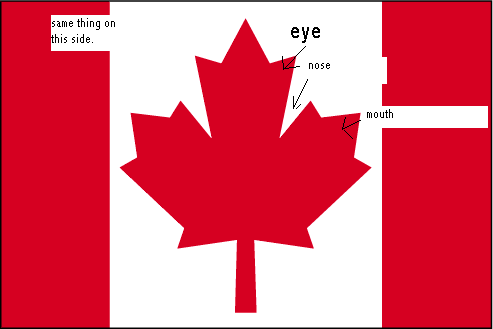
I never noticed it before, until the post, but if you look at image of the leaf flag, it looks like the white part can be imagined as two faces yelling at each other. I was about to try to explain it in word but, luckily, someone has already made a handy diagram.
Make that 55 years old today!
The Red Ensign was an unofficial flag anyway (it didn’t even have a fixed appearance, they changed it a few times.) Canada’s official flag until February 14, 1965 was, in fact, the Union Jack.
We also didn’t adopt “O Canada” as our national anthem until 1980.
It is a remarkably lucky accident that we ended up with what is unquestionably the best design of all the possible candidates. It’s about as well designed a flag as one could possibly come up with.
0 out of 10: I’m Australian, and the quiz isn’t visible.
Oh. I get it now. “Feb '15” means an unspecified date in February, 2015. Nice Discourse gag.
Nice post, but thanks for making me feel old! ![]() The “Pearson Pennant” was actually made into flags and I had a small version of it that I flew on my bike when I was a kid. I remember it attracting quite a bit of attention. In retrospect, I think the version we finally adopted is more subtle and dignified.
The “Pearson Pennant” was actually made into flags and I had a small version of it that I flew on my bike when I was a kid. I remember it attracting quite a bit of attention. In retrospect, I think the version we finally adopted is more subtle and dignified.