I got into a discussion with an art teacher, and we’re kind of stuck at the point about brown being clearly visible to humans, but not being in the rainbow. I know why black and white aren’t colors, but what do we say for brown? Apparently the rainbow does not cover all of the possible perceptions by humans.
One simple way to see this: A rainbow contains a one-dimensional continuum of colors. That is to say, given a rainbow, you can specify a color in the rainbow with a single number, to say where on the rainbow it is. But the full space of colors visible to humans is three-dimensional. You need three numbers to specify a general color, such as the R, G, and B values used in a computer monitor.
Actually, RGB numbers don’t completely specify all of the colors humans can see, either: There are some colors that, to reproduce them exactly, you’d need a negative value on one or two of those numbers. But RGB-space is at least a pretty good approximation of the full color space.
One other point that bears stressing: Although you often see discussion of colors in introductory physics courses, it’s really not a physics topic. It’s all about what humans, and humans specifically, can perceive. Some animals can distinguish between colors that would look completely identical to humans, and a sufficiently-advanced sensor can distinguish even more than any animal.
You mean dark orange?
It’s not typical terminology to say that white, black and brown are not colors. They are indeed colors, but they are non-spectral colors.
Some references:
Yes - one way of looking at brown (at least in subtractive color mixing theory, that is, mixing colors from paints rather than from colored lights) is as a shade of orange. By that I mean: take orange paint, add black, and you get brown.
I am basing this on the simple color theory system I learned in middle school, whereby:
-
a “shade” is defined, not as a nuance of a color (i.e. indigo vs. cobalt vs. royal blue), but as the color with an admixture of black (similar to a shadow)
-
a “tint” is defined as a color plus white (thus pink is a tint of red, similar to being exposed to very bright light)
-
a “tone” is defined as a color plus gray (or alternatively as a color plus black plus white)
Perceived color is not determined only by the spectrum of the light. It is also dependent on the contrast with other things in the field of view. Brown is a darker version of yellowish orange. You can easily find examples on the internet. For example a cube with a brown square on the brightly illuminated top, but the same color is orange on the less illuminated side.
I’ve written a column for Optics and Photonics News about brown. I can send you a copy, if you’re interested.
Brown is, in essence, dark yellow or dark orange. You don’t see it in a rainbow because you don’t get the full range of brightness. In a dark enough rainbow, brown would be present.
As noted above, purple and its variations (magenta, pink) are not part of the color spectrum, and are the result of mixing colors from the blue and red ends of the spectrum. But, to be fair, it’s not correct to say that you don’t see them in a rainbow. Pink and aqua are the colors of the Supernumerary Rainbow, which you can see if all the droplets are of fairly uniform size. In that case, you have colors mixing inside the blue edge of the basic rainbow. You also see pink and aqua when you have multiple-order white light interference, as in soap bubbles and oil films.
Depends on which RGB space you’re specifying. The ACES CG Linear color space incorporates all human perceivable colors plus a bunch of imaginary colors out in the corners.
Brown is called dirty orange. Orange is red and black at its simplest but that will result in a dingy orange. So you use blue and red (?) mixed with white to get your orange and then add a bit of black. I think that is correct, it’s been awhile since I looked it up.
Now make beige…I planned a post a long time ago called “Breaking Beige” but I never got around to posting it.
@CalMeacham, any chance you could share that paper with all of us (or at least me too)? I’d love to read it, please.
As for @Cardinal and the OP: I want to attempt a broader, beginner’s explanation here, but please, anyone, correct me wherever I’m wrong…
“Brown” is a cultural shorthand that we use to describe a certain range of warmish hues at low brightness — basically “dark orange”, as others have pointed out. It’s a relatively recent agreement at that (maybe a few centuries? see Wikipedia), and even today, some cultures still describe “brown” as the color of chocolate or coffee or tea.
Colors, in general, are a complex mix of different phenomena working together to influence perception:
- It all starts with the the physical properties of the light source, whether it’s starlight from our sun, a particular kind of light bulb, or your computer monitor
- That light is filtered by the composition of the Earth’s particular atmosphere, which selectively filters, absorbs, and transmits different parts of starlight
- It is then further filtered by the absorption, transmission, and reflectance properties of whatever thing you’re looking at
- The light is then detected by the rods and cones of your particular eyes detecting & sampling the light coming off the thing you’re looking at
- And influenced by the way your brain interprets those signals, making things like optical illusions possible
- And ultimately given a name depending on your culture and upbringing, which can change over time
Change any one of those components, and the end result would be a different “color” altogether.
Physics & light sources
Starting from the beginning, the term is “light” is a linguistic construct that roughly means “the part of the electromagnetic spectrum that humans can typically see”. That most humans can see this particular part of the spectrum is largely a function of evolution (as far as we know); our eyes are detectors that evolved the sense the radiation that managed to reach Earth’s surface. More below.
Almost everything in the universe “glows” somewhat, and we give names to the most useful-to-us parts of the electromagnetic (EM) spectrum, like “visible light” or “radio” or “x-rays”:

Stars are some of the brighter emitters of EM radiation. What they emit is a function of their mass, composition, age, and ultimately temperature — they are approximately “blackbody radiators” that mostly follow a temperature curve:

Our sun in particular is a middle-aged, middleweight star that mostly glows around the visible light part of the spectrum, at least for the time being:

This will change as our sun ages and its temperature changes, but you’ll probably be dead by then.
Of the EM radiation currently emitted by our sun, only a portion gets through the Earth’s atmosphere. Some of it bounces off the atmosphere, some of it gets absorbed, and some of it gets scattered. Some if it, like radio waves, can be detected by special sensors, just not our eyes.
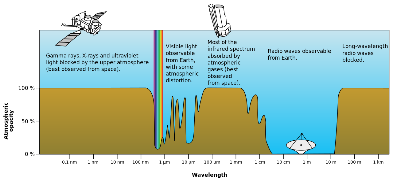
Of the part that gets through, we call the part of it that we can see with our eyes “light” or more precisely, “visible light” (to us). That’s the small rainbow in the previous image. At the fringes of this rainbow are infrared and ultraviolet, and it’s a matter of semantics whether we also call those parts “light”. Other animals, like mantis shrimps, birds, bees, and snakes, can see into those fringes better than we can:
![]()
(Snakes would be on the left side of that, able to detect into the infrared using specialized organs).
So far, it’s all been about starlight (specifically sunlight, the starlight from our favorite star). If it were nighttime, you’d often still see some sunlight (reflected by the moon). If you locked yourself in a dark room, you’d see nothing. If you turned on a light bulb, then you’d see whatever frequencies it emits, which varies by bulb type:

Nicer bulbs with a higher color rendering index will more accurately represent the visible spectrum (it better approximates the completeness of sunlight or other blackbody radiators), though it may also be shifted to emphasize the warmer or cooler colors depending on your preference (color temperature). Something with a high CRI and a 5500k color temperature will look approximately like daylight to our eyes.
You can see how the top bulb is smoother, closer to sunlight:

Computer/phone monitors, similarly, differ in how well they produce visible light. Those are more complex, though, and usually measured by their gamut, a fancy word meaning “that part of the visible light spectrum that this device can reproduce”:

Your basic generic monitor will typically be limited to the “sRGB” triangle inside that graph. Nicer ones can go beyond that: Our Monitor Picture Quality Tests: SDR Color Gamut - RTINGS.com
With emitted light, their perceived colors are additive; the specific wavelengths and intensities of emitted light can be combined and “added” together to create different colors. It doesn’t really happen in nature, but does with artificial light sources like the bottom bulb above whose spectrum is divided into discrete little stripes instead of a smooth continuum:

If you added those red, blue, and green stripes together, you’d get different colors. Altering their individual intensities (brightness) is how monitors can produce other colors other than those three primary colors of light. Combine all three in “equal” intensities (normalized to human eyes) and you’d get what we see as “white”. Drastically ramp up the intensity and you’d go blind.
Paints, pigments, and reflected light
A pause here. So far we’re only been talking about emitted light coming from some source, whether it’s sunlight from our star or crappy light from your old florescent.
Now we’re going to do a big shift into reflected light, which is the basis of pigments and paints and such.
Paint works the “opposite” way. Of the visible light hitting a pigment (or any surface), much will be absorbed by its material. A red piece of paper is an EM absorber, sucking up most radiation (turning it into waste heat) and only reflecting the red parts of visible spectrum:
![]()
(From How Do We See Color: The Science Behind Color Vision (2025) • Colors Explained)
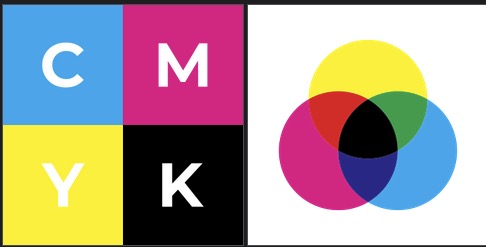
So for reflected light — including paints and inks and basically everything that doesn’t itself glow in the visible spectrum — we instead use a subtractive color model to measure what it absorbs.
When you mix different wavelengths of light, you “add” them together because you are (essentially) adding more total light to the mix. But when you mix different paints together, you “subtract” the total light because each paint absorbs some particular range of EM radiation, and together they absorb even more. Cyan ink absorbs red light. Yellow ink absorbs blue light. Mix the two together and you have a substance that absorbs red and blue light, leaving mostly green light behind. Add magenta ink (which absorbs green) and you’d get mostly black, though this isn’t a perfect mix (which is why printers typically have black ink and not just CMY… leads me to wonder what it’s made of).
Mix enough pigments together, and nearly all visible light will be absorbed, leaving black. But even with a black piece of paper, some light is still reflected.
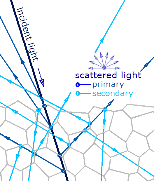
Different materials have different physical properties that absorb, scatter, and reflect different wavelengths of light.

Almost always, any given paint or ink or any material will typically exhibit a range of behaviors combining all of those due to microscopic variances in their surfaces or just below their surfaces:
In the aggregate, this broadly leaves you with diffuse and specular reflections:

Most materials have some combination of the two. In a metal paint, the pigments might cause diffuse reflectivity, and the metallic flakes in it might cause specular reflections that we call “shiny”. A white piece of matte paper might look diffuse; a glossy white one would look more specular, though both are still mixes of the two. Scotch tape or frosted shower-door glass are also a mix, combined with subsurface scattering, same with milk or your skin or a leaf under a bright light source. These phenomena combine to give a material its visible texture, translucency, glossiness, etc.
If you had a nearly perfect specular reflector, you’d get a mirror. The best ones are used in space telescopes. If you had a nearly perfect absorber that reflected nothing either diffusely or specularly, you’d get vantablack, a spooky “super-black” that looks like someone printed a black hole:

Biology and photoreceptors
Next part: Now, whether the light was emitted or reflected or some combination of the two, eventually it reaches your eyes.
This is where biology comes in, and your photoreceptors can detect them. In most humans, your cones are roughly most sensitive to red, green and blue light:
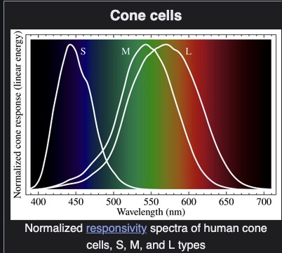
I say most because mutations can cause color-blindness or super color vision (tetrachromacy) that a few people, mostly women, have.
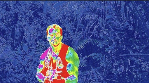
Other species have different photoreceptors with different evolutionary advantages. Some snakes can see into the infrared and hunt their prey through their heat signatures, like in this (false color) image from Predator:
Many birds can see into ultraviolet and use that to differentiate flowers better than we can:

(From Photography of the Invisible World: How to simulate what birds may see: simulated bird vision)
Octopus skin might also be able to sense light in a way we don’t understand yet, even when their eyes are covered: How do octopuses change color? | Live Science (we don’t fully know how they are able to camouflage themselves to blend in to their surroundings).
Mantis shrimps are also able to see light and color in much more detail than we can, but we don’t fully understand their visual processing either, in their eyes or brains or other parts: Mantis shrimp - Wikipedia
The average person can’t even see what Concetta Antico, a tetrachromat artist, can: https://concettaantico.com/
Culture & language
So far, to get to this:

We’ve started from a light source (the sun or a monitor) and went on to your eyes absorbing and processing that EM radiation. Along the way, the brown may have been a dimmed orange combined by mostly red and a little bit of green light (on your monitor), or else white light subtracted by different pigments and leaving only the same dark mostly-red-with-a-bit-of-green light reflected.
Then those signals get sent to your brain and processed (in a way I can’t even begin to understand or explain, sorry). But at some point after that, you label it “brown”.
Different cultures have different labels (color terms) for colors and color ranges. In the modern time, broad Westernization and technologies (like printing, Pantone, computer monitors, RGB color spaces, etc.) have led to a more widespread normalization in our ability to communicate the “same” color across cultures.
But that wasn’t always the case, and there is debate about why (and specifically how) different cultures came up with the color terms they most often use: Linguistic relativity and the color naming debate - Wikipedia
The blueish-greens in particular are not so clear-cut, and many cultures group them together into what what English-speaking linguists refer to as “grue”:

In Japanese, for example, both green and blue could be called “青い”.
In conclusion, to go from “big space fireball” to “this is brown”, the simple explanation is simply “this paper absorbed most radiation except for dark orange light”. The longer explanation is that really complicated — but super-cool, IMHO — interaction of physics, biology, history, and culture.
And even then, even to the same person, brown isn’t always brown. This is made apparent by a variant of the checker shadow illusion:

That same color might look brown up top, but orange in the middle, just because of the shading near it. It’s the same color either way:
![]()
I still don’t know much more than that about brown in particular (and very much look forward to CalMeacham’s article), but in the meantime, I hope this overview was a little interesting…
Though please do correct me where I’m wrong, or just if there’s more nuance. I’d love to learn more…
(Edit: Sorry for the length. I initially put it inside an expandable accordion, but removed that because it was screwing with the images)
Lots of color names are just the name of some object or substance that’s that color. Orange, of course, is the color of a citrus fruit, and pink is a kind of flower similar to a carnation.
Snakes have two separate “vision bands”. Their eyes can detect light in something close to the same range as ours, and their pits can detect thermal infrared, which is way past the left edge of that diagram. I don’t think they can detect near infrared with pits nor eyes. Of note, when a snake sees a mouse with its eyes, it’s detecting light from some other source (probably the Sun) reflecting off of the mouse, but when it “sees” a mouse with its pits, it’s seeing light that was produced by the mouse itself. One advantage of their infrared “sight” is that it therefore doesn’t need an external light source. But it’s also much lower resolution.
I’m kind of confused here. I was always told that orange = red + YELLOW, and that blue + red = PURPLE.
It was originally published in Optics and Photonics News over a decade ago, and you can’t read back issues of OPN online unless you’re a member of Optica (formerly the Optical Society of America – OSA). I published an expanded version in my 2013 book How the Ray Gun Got its Zap! (Oxford University Press), so if you find a copy of that you can read it. It’s too long to reproduce here, but if you send me your email via dope Board Messaging I can send anyone a copy.
Thanks for the details! Animal sensing is always fascinating.