I think it’s because of the general trend in modern capitalism of simplifying everything, making them as bland and utilitarian as possible. Of giving the customer as little as possible, even something like a logo more complex than a few words.
Moderating:
We are trying to get away from the sexist assumption that the important thing about a woman is what she looks like. And I really don’t think the physical appearance of some cracker barrel executive is relevant to this thread.
Because references to Pogo will bring the desired new, younger customers pouring in. Nothing says “new image” like a comic strip that ended 50 years ago!
1989–1993 revival
Starting on January 8, 1989, the Los Angeles Times Syndicate revived the strip under the title Walt Kelly’s Pogo, written by Larry Doyle and drawn by Neal Sternecky. Doyle left the strip as of February 24, 1991, and Sternecky took over as both writer and artist until March 22, 1992. After Sternecky left, Kelly’s son Peter and daughter Carolyn continued to produce the daily strip until October 2, 1993. The strip continued to run for a couple months with reprints of Doyle and Sternecky’s work, and came to an end on November 28, 1993.[6]
Judging from Wiki, they aren’t doing terribly. In 2011 they had “Over 600” restaurants; following the pandemic they now have 658 restaurants. They’ve had positive profits for the past 4 years and they have a PE of 21.3 (caused admittedly by sharply lower earnings over the past 2 years or so).
So yeah, I can understand why they are trying new things. I’ve never had the pleasure of dining at the establishment, so I can’t say much more. Wall Street is worried about another MAGA boycott, but I don’t think this is a Bud Lite situation: the latter had a lot of reasonably close substitutes.
I think the new logo is mediocre, but the old one was dull as well. Drawing an iconic simplified barrel sounds challenging to me. Look at all the lines below:

Now that I think about it, I will say that the problem with both the old and the new logo is the color scheme. Brown and orange really doesn’t do anything for me, it looks stale.
I think of Cracker Barrel as old people food. It’s not horrible, but it’s pretty boring with the exception being their breakfast menu. I don’t go there very often, but when I do I always order something with pancakes no matter what time of the day it is. If you order blueberry pancakes the blueberries are cooked inside rather than added as a lame topping.
Cracker Barrel didn’t just change their logo, they’ve updated their interior by stripping away the country antiques in favor of something a bit more modern. I don’t quite understand why this qualifies as a point of contention in the ongoing culture wars, but apparently it does. While I’m fine with their traditional decor, the update is fine and I can’t say I care any more about it than I did with McDonald’s changing their interiors. I just want some pancakes.
Nobody has worn bib overalls since Dexy’s Midnight Runners made that video 40 years ago. And the barrel is going to lose its cachet when people have to start wearing them when the Second Great Depression arrives next year.
Fake meat- strike one. Logo change- strike two.
I saw a funny tweet somewhere complaining that they took away the cracker and the barrel, but I agree with the general consensus: the new logo is bland and uninspired.
^ This.
Don’t get me wrong - I’m not dissing the restaurant by saying I’ve only eaten there twice. The little general store was cute. The food was good even if not spectacular. I’d be willing to eat there again while traveling, or if a friend wanted to go there.
I do think lightening up the interior is a good idea. Especially for us old farts with old fart eyesight.
Yeah, that’s the one, on the way to Bar Harbor for me.
They have great iced tea and they’ll refill it into a to-go cup for you, the service is friendly, their country store has all this great classic candy. I think we also bought Johnny Cash’s greatest hits on CD there once, on the way up, and my kids loved that disc. Also, their bathrooms are usually clean! Whatever the logo, I’m sure we’ll still stop in on the way up or back.
The name “Cracker Barrel” always makes me think of cheddar cheese, and for good reason --it is! For the curious, herewith a bit of backstory about it and even a trade infringement lawsuit.
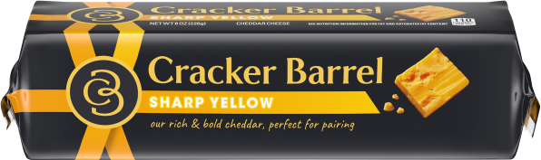
The “Cracker Barrel” name for a line of sharp cheddar products was launched by Kraft in 1954, and was inspired by the same old country store cracker barrel that gave the restaurant the name. Kraft apparently felt that there was enough distinction between the restaurant operation and their retail products that they didn’t bother charging trademark infringement.
That all changed when Cracker Barrel Old Country Store very unwisely began selling retail products in supermarkets under their name. In 2013 Kraft sued them, and the products were rebranded “CB Old Country Store”.
In 2020 Kraft sold the rights to the “Cracker Barrel” name and product line to Lactalis, a large privately owned French dairy product company with global operations. Though oddly, Kraft continues to sell Cracker Barrel Mac & Cheese, but other cheese products are sold under their own name. The Cracker Barrel cheese company has this disclaimer on their website, which sounds like a kind of truce among the three companies:
Cracker Barrel is a registered trademark of Lactalis Heritage Dairy, Inc. It is not associated or affiliated with Cracker Barrel Old Country Store or CBOCS Properties, Inc. Cracker Barrel Macaroni & Cheese is a registered trademark owned by Kraft Foods.
Although it makes me wonder whether dropping “Old Country Store” from the new logo makes them more vulnerable once again to a lawsuit (besides the fact that the logo change cost them $100 million in lost value). Lactalis is no small potatoes – it’s the largest dairy products company in the world.
Uh-oh. I wear them for yard work. The pockets are handy, the open top shed body heat and the thick denim protects from poison ivy
(ETA: although I am a nobody, but I’ve made my peace with that)
I wear them for all kinds of work, too. Sure I’m an old man, but they work just as well as they always have, nothing to do with fashion or style.
“Wokies are trying to make everything bland and soulless” has been a rallying cry in certain quarters of the Right for years. See, e.g., the South Park Christmas episode where the school strips away so much potentially offensive material from the Christmas pageant that it ends up a monochrome minimalist dance recital. (Of course, that was written by two Jewish guys poking fun at people who think the Left wants that outcome.)
It’s been a long time but IIRC there was a scene in that episode where they hook a bunch of people up to brain scanners to detect what their brains find offensive, then start saying phrases at them to see what triggers the machines.
Just saw this Twitter post from Byron Donalds, Republican congressman who’s running for governor in 2026 with Trump’s approval:
“In college, I worked at @CrackerBarrel in Tallahassee. I even gave my life to Christ in their parking lot. Their logo was iconic and their unique restaurants were a fixture of American culture. No one asked for this woke rebrand. It’s time to Make Cracker Barrel Great Again”
I think he’s serious.
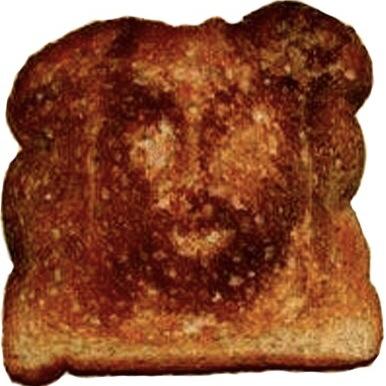
Not serious: the response from the Gary Peterson parody account, in which he said he gave his life to Christ when He appeared to him on a slice of Denny’s toast.
He is. This manufactured Cracker Barrel drama is a great barometer of who does and doesn’t understand MAGA.
If you don’t understand why conservatives are melting down about Cracker Barrel you’ll probably never understand them.
But that’s a topic for a different thread.
The new logo looks like an intern went to a logo design website and opted to stick with the free version.