I’ve done some of that with movie/tv quotes. I did this one back in April. Never shared it, but I really liked what happened with it. First First image is “Why did it have to be snakes.” Second image is an evolution of the first with “Indiana Jones” as a second prompt. I love how it basically kept the first image but added in Indy looking down from above. It was very fitting for the movie moment.

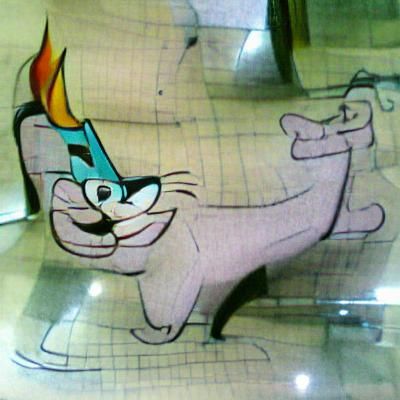
“Cartoon Cat, Style of Hanna-Barbera” was disappointing in both Artistic and Coherent flavors
I hoard early iteration images that I think might someday be useful. This is an example tonight that paid off. I wanted to make a girl in sugar skull makeup. The text-only version was very bad. So I started to use a googled image as a starter, but wanted it to be unconnected to someone else’s material so I dug through my iteration images for something that could work, got this:
Could be better, but not bad.
Without posting ten fail images, lemme just tell you all that ASCII Art Style ain’t a winner ![]()
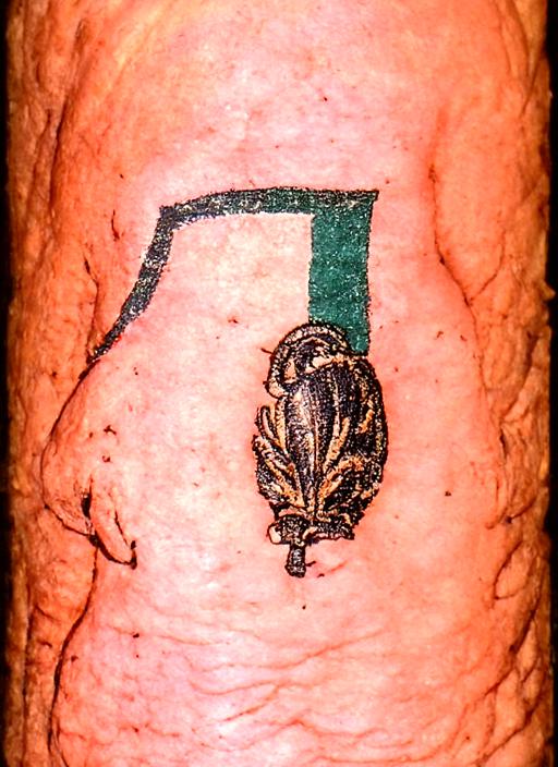
a tattoo of Pagliaccio
???
a tattoo of Pierrot
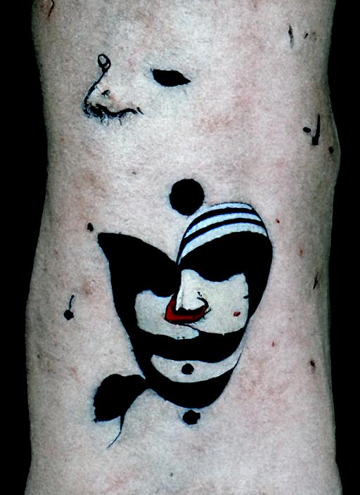
I guess it does not really do tattoos?
Sure it does. Those are on an approximation of human flesh.
Found a new prompt set that tends to throw out really nice black and white images with hints of color. One of my favorites is this one. I hoped that the AI would think the thing with hints of green looked kind of like a giant cabbage too, so I used an early iteration for the start image of a “girl with giant cabbage” prompt. I then evolved that result with Frida Kahlo. I’m pretty pleased with both the results.

The prompts
Summary
Yurei parade on lush alien landscape | hyperdetailed pencil drawing | ukiyo-e | japanese scroll | Dan witz | margaret keane | Zdzisław Beksiński
Girl with giant cabbage | hyperdetailed colored pencil drawing | ukiyo-e | japanese scroll | margaret keane | postcard
Girl with giant cabbage | hyperdetailed colored pencil drawing | ukiyo-e | japanese scroll | frida kahlo | postcard
Just got 40 credits and the “superstar” badge for passing 500 likes on my main account. (I have 20 badges now. It is more badgy than Discourse.)
I’ve mentioned before the challenge with editing images for super-resolution upscaling, where you are working on the pixel level. I decided to edit the face of the cabbage girl. Take a look at this.

The bad eye was the easiest, just cloning and flipping the good eye with a little blending work. The mouth was pretty easy, too. But the nose? It took several rounds of editing and upscaling to get an acceptable shape and nostrils. And it came down to the darkness of individual pixels. If I go for another round of editing (I might lighten that patch on the left by the eye) I could change the shape of that “pinch” in the nostril on the left by slightly darkening just two pixels.
(The AI really does an amazing amount of guessing from what little information is available.)
I hate to make so many posts in a row, but there have been changes to the site. It now does a lower number of iterations standard—I think 120, but it isn’t listed. (I don’t notice any drop in image detail/quality). There are options for 2x or 3x accuracy boost. And, oddly, for a moment there were two new sliders—along with overall prompt weight, there was one for overall image weight and one for the amount of noise to add to the seed. But those two sliders disappeared. (Probably be back later.)
Another song lyric: Little Old Lady got Mutilated Late Last Night. It’s a movie poster.

Maybe working in some element of the American Werewolf in London poster? It has text in the lower right.
BTW, an image I made today tuned out really Thomas Kinkade-y, I think (through no effort of my own.)
Today I worked with the “style of dungeons and dragons guidebook” mod, which can make some really interesting stuff. My most liked post yet (20) was using it.
I tried making a field of broken swords but got I don’t know what.
Rerunning the prompt gets stylisticly similar I don’t know whats. Nothing swordy. So I thought maybe what you put in the first prompt didn’t matter? A field covered in broken dreams might be a little bit different, but if so it is subtle. But a field covered in broken hearts? Definitely makes a difference.

Hey, if I were a wizard, and I had just defeated a Colossal Umber Hulk, I’d totally turn its skull into a cottage, too! I might even seek out a Colossal Umber Hulk just for that purpose.
So, others have been using the advanced options to put in multiple styles. But it occurred to me that you could also use it to put in no style. I’ve mostly been using “Oil Painting”, because it seemed to be the most “neutral” of the preset standard styles, but I just tried a few with no style:
First, “Circle Square”
And it delivers. There are circles there, and there are squares. It looks like, with a “weak” prompt like this, in my previous experiment the “oil painting” style was overwhelming the prompt itself, and all that extraneous garbage was there because it was the sort of thing one would expect in an oil painting (at least, if one were an AI with no real-world experience).
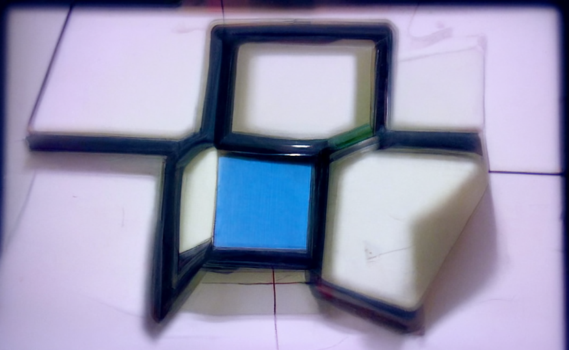
Then, continuing the experiment I wanted to do before, “Red Circle Blue Square”:
There is a circle, there is a square, and both of them are the correct colors. ![]()
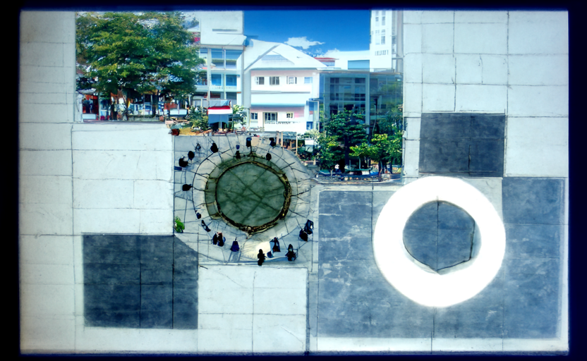
And “Blue Circle Red Square”:
…OK, I probably should have anticipated that. There’s definitely a blue circle, but I suspect that both the tile pattern, and the buildings in the background, are from Moscow.
Still, it’s definite that the order of the words in the prompt does matter, because I didn’t get anything like that from “Red Circle Blue Square”.
Oh, and “Flag of Ukraine” (no style, coherent) works much better than my earlier attempts of “Flag of Ukraine” (oil painting, coherent):
“American Flag” not so much, but it’s trying:
I also wonder if the AI actually treats “style of” as a keyword (using the thing it’s in the style of just for stylistic purposes like textures), or if styles are just another prompt, or if it looks for library images that literally have “style of” in their tags. But I’m not sure yet what the best way would be to experiment with that.
In my experience, style of doesn’t seem to matter.
BTW, Adolf Wolfli, mentioned in another thread? Works as a style.
Sometimes I imagine the AI as some put-upon artist sitting at his desk, a glass of whiskey at one hand, a cigarette dangling forgotten from his lip, and someone steps in and says “I need a detailed colored pencil drawing of what it would have looked like if Dan Witz, Margaret Kean, Zdzisław Beksiński, and Leonid Afremov had collaborated to produce a Dungeons and Dragons Guidebook postcard of a field covered with Hello Kitty heart cloisonne kaiju in a lush alien landscape.” And the artist takes a big swig of whiskey, heaves a deep sigh, and gets to work.

Summary
Field covered with hello kitty heart cloisonne kaiju | lush alien landscape | hyperdetailed colored pencil drawing | Dan witz | margaret keane | Zdzisław Beksiński | Leonid Afremov | Dungeons and Dragons guidebook | postcard
I am not sure how revealing this is, but I tried, just in my own notebook, specifying multiple prompts: “circle square”, “circle”, “square”. Both shapes were there in early iterations, but the circle quickly disappeared:
With only “circle square”, both shapes are present: