Ireland vs. Ivory Coast: really, the latter is the common 3:2 ratio while Ireland uses the less common 2:1 ratio (twice as long as tall). often the Irish flag’s ratio is incorrect in iconography. The one in the link above does appear to be the Ivory Coast/la Côte d’Ivoire.
Well, Nepal has the only *modern * and *national *flag that is not a rectangle, with a jagged edge. So if you view it backwards, the edge is on the left.
Or Italy and Mexico, as the “lazy man’s sketch” omits the eagle emblem. Italy is 3:2, Mexico is 7:4; slightly longer.
Coming from my dad’s mixed family, either one worked.
I’m not sure that this question has been answered directly. A country’s government gets to decide what to display and it can choose whatever it wants. If that choice results in diplomatic problems with the government of another country, then the government will have to decide whether to compromise or not.
Australia and New Zealand have quite similar flags. Union Flag in the top left corner, field of blue, Southern Cross in the body of the flag. Subtle differences (to a casual observer) in the number and colour of stars, but confusing to anyone who is from neither country.
And the same tune was, pre-1918, also the national anthem of Germany (with the lyrics being “Heil dir im Siegerkranz / Herrscher des Vaterlands / Heil, König, dir”). It’s really a tune that has had a remarkable career when it comes to national symbolism.
It was used to provide the link for the Oregon flag with the beaver on the back upthread. On the main page there’s a “search by topic or subject” there. For instance, “identical” gave me this page:
Apart from any official control of flags, btw, there are also some “vexillological institute” organizations which attempt to promulgate rules of good flag design:
The giveaway for me, has always been that on the Aus. flag, the stars are plain white; on that of NZ, they’re white outside, red in the centre. I’m not very numerate: so if the flags had been identical colour-wise, though different re numbers / arrangement, I’d have been in trouble.
These examples make a lot of sense from a common sense point of view, but heraldry and vexillology are full of rules which are much less intuitive. A good example is the classic rule of tincture, considered the cornerstone of heraldry and vexillology, according to which metals (i.e., gold and silver, which are represented as yellow and white) should not be placed next to colours (the other colours). All attempts to provide an historical explanation for this rule, which is taken very seriously by experts in the field, fail to provide any sort of justification why present-day governments should feel bound by it.
A bit of a derail; but, I love this stuff in general. In the “flags of the world’s nations” set out in the endpapers of my Philip’s Great World Atlas, the only flag featuring just a totally un-embellished field of one colour only, is that of Libya (all green). Is anyone aware of any other such, unknown to “Philip’s”?
Thanks ! As you can tell, I’m not a super-attentive follower of current affairs. I notice with a bit of shock, that my “Great World Atlas” is dated 2003 – who knows what else has changed vexillogically, since then?
The abovementioned rule of tincture: OK, heraldry is one thing. As regards flags, however: “yellow or white not to be placed next to other colours” – unless I’m misunderstanding something crucial, that would seem indescribably limiting; looking at my published display of the flags of the world’s nations, it would appear that at least 98% of them violate that supposed rule.
The rule comes from heraldry and so is primarily used for coats of arms, but it’s my understanding that in vexillology it is also used to some degree. It is, however, more complicated than the sloppy formulation in my previous post suggests. It prohibits placing colours “upon” other colours (and metals upon metals), and “upon” is not quite the same thing as “next to” - field divisions in coats of arms are not considered to be placed “upon” each other.
Even under the strict and non-technical “next to” interpretation, however, a surprisingly large number of flags are in line with the rule. In the British and French flags, for instance, the colours blue and red (which have important sounding different names in heraldry, but let’s not get into that) are carefully separated from each other by the metal white. Same for the colours red and green in the Italian flag, or the Mexican flag (where, however, the coats of arms in the white field violates the rule). The American flag would violate the rule, because the blue square and some of the red stripes directly touch each other. Even the rather complex flag of South Africa carefully separates the colours black, green, red and blue from touching each other by means of the metals yellow and white. The flags of New Zealand and Australia described above also follow the rule; you will never find red directly next to blue, or yellow to white, in these flags. I haven’t done a complete survey, but my feeling is that the rate of compliance by national flags with the rule, but my feeling is that the rate of compliance is quite significant (and far above 2 %), even if you interpret it in the strict “next to” sense.
Edit: Upon edit, I see that there might have been a misunderstanding of what the rule says, owing to a misformulation on my part. Under the strict “next to” interpretation, it would prohibit placing yellow next to white, and any colour that is not yellow or white next to any other colour that is not yellow or white. It does, however, permit yellow or white to be placed next to a colour that is not yellow or white; in fact, this would be the only contact between colours allowed under the rule. In essence, yellow and white are metals; everything else is a colour; and a metal is not to be placed next to a metal, nor a colour next to a colour.
The Vatican flag is notable for violating the rule by putting yellow and white next to each other.
The supposed reason for the rule was to help distinguishing designs at a distance. If darker colors are always separated by yellow or white and vice versa that aids in creating an easily viewed design in adverse conditions.
The easiest formulation of the tincture rules is probably: don’t put light on light or dark on dark as there won’t be enough contrast.
The metals Gold/Yellow and Silver/White are “light”. The other colours are “dark”. (Furs and things can stay right out of this for now).
So, to use the NZ flag example mentioned earlier, the red stars (dark) could not go directly onto the blue field (also dark), but they can once they’re edged in white (light).
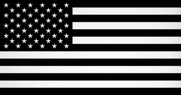
“Next to” isn’t as big a deal – consider the US flag for a moment, several of the red bars (dark) lie “next to” the blue canton (also dark). But dark and light aren’t put on each other.
My personal way of defining it is just a slight bit different: If you replace the metals (white and yellow) with white and the colors (everything else) with black, you should be able to make out the general design.
Plus all those rules are sort of post facto: by the time someone thought of coming up with them, people had been decorating their shields and coats with house or personal colors for quite a while. And it’s not as if there is a Coat of Arms police: like the Academies of those languages that have them, the people writing down the rules have no enforcement power, and like in grammar or vocabulary, you have the conflict between descriptivism and prescriptivism. Heraldry is sort of a limited-use language, after all.
