This may be a stupid question but are there different fonts in asian (i.e. Chinese, Japanese, etc) writing, analogous to fonts in the latin alphabet?
I’m sure there is bold, and possibly italic, and surely everyone’s handwriting is different, but is there something analogous to, say, a blackletter gothic font or a scaaaaary halloween font when printing in Chinese or Japanese? At the very least I’d think adding serifs would change the meaning of the symbols. Other than seeing some symbols written thicker/bolder than others, I can’t tell if there are actual fonts or not.
I know what you mean, but not really. Fonts such as the very popular “mincho” (The “Times New Roman” of Japanese, if you will) have a feature analogous to serifs, namely a small perpendicular extension at one end of each stroke. Other fonts are “sans-serif” in the sense that they lack this feature. These may have rounded or squared off ends on each stroke.
Another feature that differentiates fonts is the relative width of vertical and horizontal strokes. Normally vertical strokes are narrower than horizontal (the opposite of western fonts), but you can find fonts where the width is constant (similar to Arial).
For another example: imagine a character whose basic form is a square (the character for mouth: 口) In some fonts, the vertical strokes will extend below the level of the lower vertical strokes, while in others they do not.
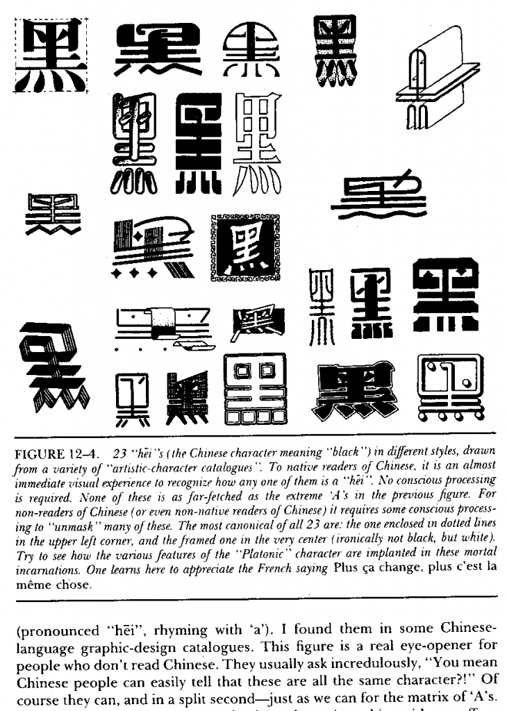
Martin Gardner, in his book “Gödel, Escher, Bach” explores how the human mind works and one thing he explores is fonts. What is the essence of the letter “a” that is captured by the different fonts. A lower case a with a handle on top is very different from the rounded a with no handle (like in Comic Sans) and yet we have no trouble identifying them as the same letter. He then explores fonts in other languages and has an entire page filled with the chinese character 黑 (black) in different fonts. For a westerner it my be difficult to see them all as representation of the same thing but a chinese person would immediately identify them as such.
My copy of the book is in storage and I do not have access to it but maybe someone has a copy and can post a scan of that page.
That takes training, though; we don’t just see them in a vacuum and identify them, any more than we identify this z and a handwritten one (which may have a dash through the middle depending on location, and depending on how fanciful the writer, loops on the angles or curly lines instead of straight ones).
Yup, it’s called “learning to read”. That’s why someone who cannot read Chinese will have difficulty seeing the same symbol in different fonts while a Chinese person identifies them as different representations of the same thing.
Not quite, since it is (or used to be) perfectly possible to reach teen years without having encountered a “curl on top a”. Learning to deal with different types of script is a part of reading, but which “different types” a person encounters can vary wildly by location, time… and not just language.
There’s a YA detective book where one of the clues was a crossed-out 7: one of the main characters identifies this as being “something people in Europe do”. When I first visited the US and people mistook my crossed-out 7s for 1s and found my no-foot 1s confusing; thanks to the memory of that scene and some asking I was able to determine that I needed to leave my 7s uncrossed and put something under my 1s. I’d always seen crossed 7s and foot-less 1s (in handwriting and print); the Americans weren’t used to my version, the Europeans were, the Welshman who’d already traveled extensively was familiar with both.
Yeah, but Nava’s main point holds true. Have you ever tried reading old handwriting? It’s all in Latin script, but damned if I can’t read certain versions of it, especially in other, also Latin-letter-based languages. You have to learn along the way all these different “fonts,” whether consciously or not.
ETA: Oh, I see that Sütterlin is a handwriting script. That’s exactly the kind of thing I’m talking about.
As a non-native learner of Japanese, I can attest to the difficulty of recognising characters that differ from their “canonical” form. In calligraphy the character may be drawn in a highly stylised way that captures the “essence” of the character in a way that is opaque to learners. Similarly the simplified characters used in China are not easily recognisable to me (whereas to Japanese people they presumably do look like simplified versions of the same characters).