No such implication was intended.
The graph I provided uses the actual data from the Hadley and UAH sites. If you don’t believe it, graph the data yourself. The links are provided below. There has been zero global warming over the past decade as shown by these data in the graph I provided.
Again:
Hadley: http://www.cru.uea.ac.uk/cru/data/temperature/hadcrut3vgl.txt
UAH: http://vortex.nsstc.uah.edu/data/msu/t2lt/uahncdc.lt (not a page, Open or Save)
Nonsense!
He’s too busy taming the Might Moon Worms! 
Apparently, that depends on what year you start with
Maybe you could start with the warmest year in recorded history - 1998.
Hey, wait a minute…
OK, I just did. If you plot just the past 10 years and use a +/- 3 degree range, it matches the plot in the OP and it does look like there’s no global warming. But if you plot the whole 30-year data set with an expanded vertical scale, you can see that (1) there is a rising trend over the past 30 years, and (2) the global warming is small compared to the month-to-month and year-to-year variation, so you can’t say anything about it with just a 10-year data set.
What, having a name for the phenomenon that adequately describes what has been being studied, without being a newspaper headline label?
The goalposts have always been the science, not the simplistic shorthand.
:Shrug:
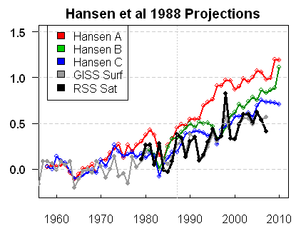
It would appear that since 1998, global temps have consistently fallen short of Hansen’s 1988 predictions Not only that, but the gap appears to be growing.
As I alluded to earlier, if this “weather” keeps up, it’s a big problem for catastrophic AGW theory.
This subject has been covered in two very long recent threads. Is there any point in starting a third one so soon, especially since the very question raised in the OP has already been done?
![]() What kinda graph is this, anyway?! An axis for years on the bottom, an axis for temperature at the left, and an axis for CO2 concentration at the right?! It’s like multiplying apples by altar boys! Anyway, you can’t map three variables on a two-dimensional Cartesian grid!
What kinda graph is this, anyway?! An axis for years on the bottom, an axis for temperature at the left, and an axis for CO2 concentration at the right?! It’s like multiplying apples by altar boys! Anyway, you can’t map three variables on a two-dimensional Cartesian grid!
I wonder if you would make the same criticism of this graph.
Why ever not? The idea is to compare relative growth in two variables against a common axis.
Yeah, I’m not seeing a problem with that either BG. Why are you saying you can’t do that?
-XT
While I don’t think that is actually happening, if it is, is that better or worse than regurgitating your own previous OP, one in which even intention, no big fan of the AGW crowd, said your analysis was crap?
Why 30 years? Who made up that rule? Why not go back to 23,000 BC, the glacial period, when the global temperature anomaly was -8C? Everything looks warm relative to that starting point.
Maybe an objective statistic like Durbin-Wardin could see if there is a recent cooling trend or not, regardless of when you want to start the analysis.
Ummm, it is a standard feature in almost every graphing software, even Lotus.
Yeah! we should concentrate on 7 years or 8 years or 15 year periods.
The problem with moving averages is that they are always “looking back” and have an inherit inertia to never see trends until well after they have started.
Just think if 15 year moving averages were used on economic data. There would never be a recession.
Looking at the 7 and 8 years shows that you are still wrong. Your analysis indeed only works by ignoring the big picture.
Nope, a LSF of the global temperatures 1/98 to 2/08, 122 months, indicates a 0.0000C trend in the global temperature, with a cooling trend on the tail end. Give it a try.