As it was mentioned before and the trends show, grabbing one set means little.
I plotted all the data given in your link. I believe it starts 30 years ago because that’s how this set of instruments have been in operation.
There is nothing intrinsically incorrect with graphing two quantities both dependent on another quantity on the same graphs. However, it is important to remember that when someone does this, they have at their disposal two free parameters controlling the relative scaling and placement of one quantity relative to another and can hence use that to emphasize or de-emphasize a correlation between the two quantities. So, it is important to keep this in mind when looking at the graph.
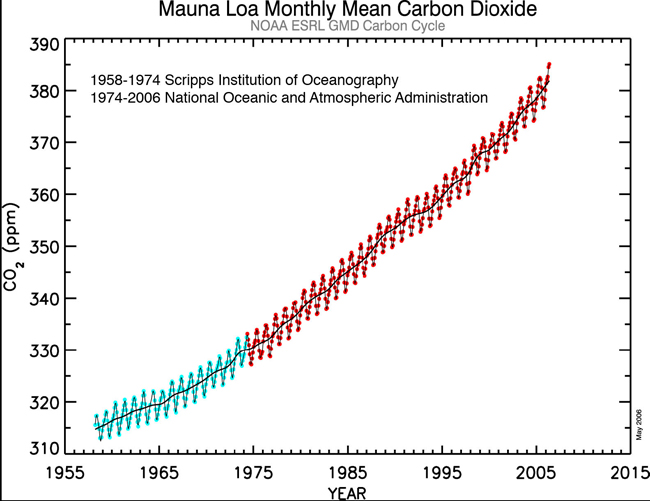
As others have noted, the problem is that one has to look over a larger range to see a robust trend because of the considerable variability in the climate system. And, the scale chosen for the temperature in this plot is kind of bizarre…presumably to try to de-emphasize the fluctuations. Another thing is that the “Mauna Loa” graph can immediately be recognized as not simply being the raw monthly data as the seasonable cycle that is clearly seen in the true data is absent here. Presumably, the data has been averaged or smoothed in some way. (Perhaps it is the smoothed data represented by the line that is drawn through the Mauna Loa data in that figure.)
Just to emphasize how badly the CO2 vs. T axes have been scaled in the OP’s graph, I just did a rough calculation and get that if the CO2 and T curves had the same slope on this graph, then this would imply a (transient) climate sensitivity of somewhat above 40 C for a doubling of CO2 levels. In actual fact, the best estimate for what the equilibrium climate sensitivity is is around 3 C per doubling…and the transient sensitivity will be even less than this (because there is a lot of thermal inertia in the oceans so that some of the warming predicted by the equilibrium sensitivity would occur after CO2 levels had stabilized).
So, roughly speaking, the axis for temperature relative to the axis for CO2 is mis-scaled by about a factor of 20 from anything that would be physically justifiable.
Scientists have done core samples of the ice sheets in the artic and antartic that can date back as far as 80,000 years (they count the years by the layers of pollen, smoke particles from fires, ect., to determine how many years).
Now huge swaths of artic and antartic ice are melting. The polar bears got no where to go. Supposedly lakes in southern Canada and Northern Minnisota that have frozen every winter are no longer freezing like they used to.
These climate change naysayers claim temps are actually dropping, yet how do they reconcile with this?
How did Climate Zone get banned already?!
Or is that one of those questions we’re not supposed to ask?
It should be obvious from post #3…
I’m not sure what “climate change naysayer” means. The climate has been changing for a long time and will continue to change in the future regardless of what mankind does or doesn’t do.
For me, the question on the table is whether mankind’s CO2 emissions will cause the earth’s climate to warm to dangerous levels.
Like they used to WHEN?
Dropping since WHEN?
I admit the lake observations only go back as far as the old timers remember. But what about the ice sheets? If 80,000 year old ice sheets are melting in the span of one generation, and if creatures that evolved on these ice sheets are going extinct, it might be more than the weather cycle.
Its not mankinds’ CO2 emmisions. Its sequestered CO2 thats been built up for the past couple of billion years that has been dug up and released in the span of a generation. Its hard to imagine that wouldn’t have consequences.
Which ice sheets are we talking about?
Which creatures are going extinct?
Here is an article you might find interesting:
From 1922.
And here is another snippet you may find interesting:
From the New York Times, January 28, 1934
I don’t see what the difference is. If mankind were synthesizing CO2 and emitting it, it would still be the same set of problems (or non-problems) right?
I can imagine it (at least as far as serious consequences go). After all, CO2 is still a minuscule part of the atmosphere. (And no, I’m not trying to argue that because CO2 is a minuscule part of the atmosphere, it couldn’t possibly have an effect.)
What if the amount of helium in the atmosphere doubled? Is it likely that there would be no significant consequences?
jshore, I’m afraid I don’t follow this. How does changing the scale on a graph change the sensitivity? That doesn’t make any sense at all. No matter what the scale is, the change in temperature or the change in CO2 over a given time period doesn’t change.
So how can the sensitivity (which is temperature/CO2 change expressed as forcing) change merely by changing the graph? I agree that the way that the graph is scaled is misleading and not at all informative, but that doesn’t change the sensitivity. What am I missing here?
My best to you,
w.
intention: I wasn’t saying that the scaling would change the sensitivity. Let me try to explain what I was saying in more detail:
Basically, that graph has two different y-axes, CO2 and temperature. Now, one is welcome to plot each on any scale one wants…but I would argue that some choices are more illuminating than others. In particular, the choice made in this case is not very illuminating because if you work out what the graph would look like for any plausible value of the climate sensitivity, what you get is a temperature that should rise with a much more shallow slope than the CO2 rises. So, the fact that temperature looks so flat on the graph in question is (in addition to being a result of the fact that temperature does show a lot of noise and he hasn’t shown a very long period of time) also the result of the choice of the relative scaling of the CO2 and temperature axes.
So, my point is that a better choice to make would be one where some plausible climate sensitivity (of, say, 3 C per doubling…although this, as noted, would probably be on the high side of estimates for a transient sensitivity) if followed by the temperature would then lead the temperature and CO2 graphs to have roughly the same slope.
As a small correction to my previous post, I think I was a bit inaccurate in my claim last night that the axes chosen would result in the two curves expected to have the same slope only if the climate sensitivity is something above 40 C per doubling. I forgot to take into account a factor of ~ 0.7 [that comes from ln(2)], so in fact his graph would lead to equal slopes expected for CO2 and temperature for a (transient) climate sensitivity of about 30C per doubling. But, my basic point remains the same, as I think we can all agree that such a climate sensitivity is ridiculously high.
Thanks, jshore, much clearer, and much appreciated.
However, it is worth noting that both CO2 levels and levels of other GHGs have not stopped rising since 1998. This increase in forcing since 1998 should (by IPCC figures and calculations) have caused a warming of about 0.3°C in the last decade, or half of the total warming of the last century …
So, while you are correct that the graph is misleading, the point is valid - where is the expected warming?
In the past, when there was unexplained warming from 1980-2000, AGW supporters said “since we can’t find any other explanation, the warming must be from GHGs … after all, they’re increasing”. I’ve argued against this interpretation as being totally unscientific, with little success. Defaulting mortgages are going up as well, but that doesn’t make them responsible for the warming. I have said it may simply be natural variability, and been laughed at roundly.
But now we have a decade with an unexplained lack of warming. I say it may be because the sun’s magnetic field is very quiet, which historically has led to cooling, but that we don’t really know the reason the earth hasn’t warmed over the last decade. What’s your explanation?
If you say, however, “It’s just natural variability”, don’t be surprised when I laugh roundly …
w.
Alvin, Theodore and Simon would seem less exotic?
Not that I want to disagree with you, but I’d like to point out thatfossil fuels were formed from biological material that grew mostly in the Carboniferous period, about 360-300 million years ago. Roughly a third of a billion.
Carry on.
Sailboat
According to this article, it’s apparently not in the ocean.
It seems to me that “where is it” is an important question.
Thanks for the response, intention. Well, I would say a few things:
(1) The estimate of 0.3°C is a little on the high side of an estimate of expectations since this would imply a considerable acceleration from the rate of about 0.2°C or just under this that was occurring in the previous couple of decades or so.
(2) As you know, there are expected to be (and have been in the past ~35 years) considerable fluctuations in warming rates over periods of this length. RealClimate (and yes, I know it’s not your favorite source) has a nice discussion of this with illustrations here.
(3) Looking over the period since 1998 is a particularly fortuitous starting date from the point of view of minimizing the temperature rise since, as a result of a very strong El Nino, 1998 saw global temperatures that were ~0.15 to 0.2°C above any previous year.
(4) As either the CRU or NASA GISS temperature records show, running averages based on the temperature records have in fact continued to increase since 1998. (The CRU temperature record does show a leveling off of their running average since ~2002 although in actual fact, how that average ultimately looks will presumably depend strongly on what happens over the next few years. Running averages are often not very trustworthy near the endpoints of the data and depend strongly on the assumptions made there.)
I think that your summary of the entire field of detection and attribution is, to put it mildly, a caricature. In fact, there is much more than just not being able to find any other explanation. First, there is also a well-understood mechanism by which CO2 causes warming. (And, yes, feedbacks and such make it complicated to determine very precisely what the climate sensitivity to this known forcing is, but a variety of estimates from climate models, the climate response to the eruption of Mt. Pinatubo, and the estimated climate response to the estimated forcings during the ice age – interglacial cycles seem to agree on a central value that also provides a reasonably good explanation of the warming seen, albeit with additional uncertainties due to the negative forcing from aerosols which is more difficult to determine.) Second, there are the various ways in which the patterns of the warming are compared to the patterns expected from the forcing due to greenhouse gases. Third, I don’t think there is evidence either in the models or the temperature record / temperature reconstructions to support the notion that “natural variability” in the sense of variability in absence of some external forcing (like volcanoes, solar irradiance changes, or such) can explain such a large and sustained warming…And, all the natural factors that have been identified as potential offering explanations don’t seem to have changed in such a way to have caused the warming.
Well, the leveling off over the last few years could be influenced at least a bit by us passing through a minimum in the 11-year solar cycle. And, the more recent drop over the past year in temperatures is almost certainly due to the pretty strong La Nina that has developed.
And, yes, as the length periods considered get shorter and shorter, there is more and more room for natural variability as an explanation.
First of all, what this thread is sorely lacking is a real chart. As in, one that properly describes the phenomenon that is trying to be explained.
So here you go. The CO[sub]2[/sub] data is from http://cdiac.ornl.gov/ftp/trends/co2/maunaloa.co2; it does not contain data from 2004-2007, but it’s the most complete site I can find (the FTP links from the OP are dead). HadCRUT3 data is from http://www.cru.uea.ac.uk/cru/data/temperature/hadcrut3vgl.txt.
The raw data for both are plotted by month for 1958-2008, then in 10-year chunks from 1958-1967 to 1998-2007.
http://img180.imageshack.us/img180/7517/tempco2ack9.png
http://img180.imageshack.us/img180/2397/tempco2bgu4.png
http://img180.imageshack.us/img180/8199/tempco2cfx4.png
http://img527.imageshack.us/img527/3923/tempco2dgn2.png
http://img182.imageshack.us/img182/933/tempco2eir4.png
http://img527.imageshack.us/img527/2694/tempco2fxw3.png
That the deep ocean has barely warmed is a phenomenon that has been well-known by the IPCC since the Third Assessment Report in 2001. This stratification is important because the deep ocean has an enormous heat capacity, but the turnover time from the surface ocean to the deep ocean occurs on relatively long time frames, so that while we can dump a lot of CO[sub]2[/sub] and heat into the deep ocean, it will take several hundred years to do so.
As a matter of fact, the relative non-warming of the deep ocean has been highlighted many times. Here’s an abstract from Science which is most clear - it has warmings for both the top 300m (+0.31[super]o[/super]C) and the vertical average (+0.06[super]o[/super]C). For comparison, average ocean depth is 3800 m.
Long cycling times is why most of the publications combine air & sea surface temperatures (SST) for temperature measurements and exclude the deep ocean.