brazil: It is impossible to have a civilized discussion with someone who ignores two published, peer-reviewed reports clearly showing how the temperature has evolved in time as compared to the IPCC projections over the last 17 years, dismissing them as historical re-writes, and then claim he knows better by looking at graphs that have scales that do not allow one to see the requisite detail for the period. It is just utter and complete garbage and not worthy of Great Debates.
If you are going to accuse reputable scientific sources as committing fraud and substitute in their place your own interpretation of a graph that does not have sufficient detail to allow you to draw the conclusions that you do, then it is really pointless having this sort of discussion. Frankly, you should be posting in another forum.
That graph has a y-axis of 6 C and, according to this graph the width of the shaded region in 2000 is about 0.1 C. You simply can’t see it on the scale of that graph. Furthermore, if you look at the slope of the shaded region boundaries in 2007 according to this graph , it will look like they extrapolate back to zero around the year 2000 but in reality they are curved so that the width remains nonzero between 1990 and 2000.
And, no, the projections did not start in 2000 because the IPCC convention is to start the runs in 1990. Already by 2000, there is a spread in the model results.
There are so many wrong statements in these few sentences that it is hard to analyze them all:
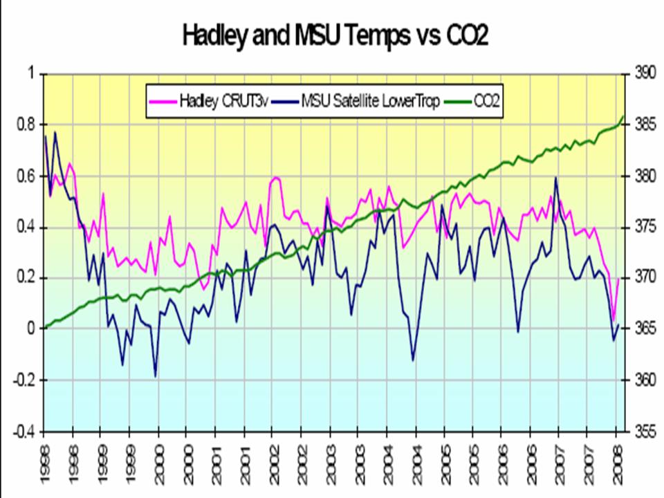
(1) Temperatures have not been “essentially flat for the last 8 or 10 year”. If you look at the 8-year trend obtained for a least-squares fit of a line through the data, you get a trend of +0.12 C per decade for the Hadcrut3 data and +0.25 C per decade for the NASA GISS Land+Ocean data. If you look over 9 years, the trends are even larger. If you look over 10 years, they shrink down again because of the warmth of 1998, but the trends still range from +0.05 C per decade for the Hadcrut3 data to +0.18 C per decade for the NASA GISS meteorlogical stations data. Of course, all of these trends tend to have large error bars because of the relatively short span of time, which is why the bounce around quite a bit just based on including another year of data. If you go to longer periods than 10 years, the trends start to increase again and the Hadcrut3 and NASA results converge so that by 15 years, the Hadcrut3 data trend is +0.22 C per decade and the NASA GISS trend is +0.26 C per decade.
(2) The IPCC does not predict the short-term variability, which is dominated by other effects and is very sensitive to initial conditions. Nonetheless, in individual runs of climate models, comparable short-term variability is seen. See for example, here.
(3) As the IPCC AR4 figure and the Science article show you, in fact the smoothed average global temperatures remain well within the IPCC envelope and are closer to the high end than the low end.