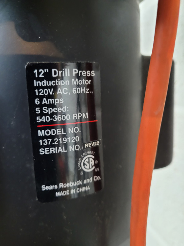
O.K. manufacturers, look, you should never use the letter S in a model number, part number, serial number, inventory number, whatever. I just ran in to this today. It looks like a damn 5. And when I write it down, I use $ instead of S, just to remind myself that it’s an S and not a 5. Likewise, try your best to not use a 5, because it (duh) looks like an S. (Though this is not a big deal if there’s nothing but numbers.)
S, of course, is the worst. But almost as bad is a lowercase L (l), upper case I, or the number 1. Please, just don’t do it.
The letter O and zero (0) are bad, too. If you insist on using zero, put a damn slash through it or something. Better yet, just don’t use them.
You’re not wrong, but for the last 12 years, I’ve usually just taken a picture of the label with the Model and Serial Number on it so this is no longer a problem for me. I got into the habit for many reasons including S and 5 confusion. Though mainly just accuracy.
I disagree, I grabbed the first example in hardware folder.
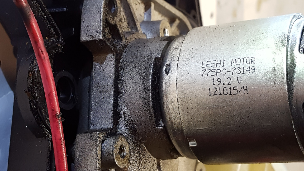
I can see a clear difference between the O in motor and 0 in 121015. once I zoom in. Many computer related parts use the zero with the diagonal slash through it which is a huge help.
There are fonts where O & 0 look very different. There are fonts where O & 0 look very similar. Especially when dot-matrixed years ago onto a now-dirty part.
Guess which fonts are more common on things like this? The latter of course.
I have my secure password generator configured to avoid using any of the look-alike letters/numbers. Avoids a lot of squinting and guesswork at little loss of entropy.
Another way to avoid this whole issue is to provide the serial number in barcode or QR code format, so the user could just scan it. (One of the worst examples I’ve found is the serial number on the back of an Apple iPhone, printed in what appears to be 2point.
So says the person whose name is @abcdefghij. A true letterophile if ever I’ve seen one. Next thing you’ll be wanting an l or an I on your name. I know your type; just insatiable for more letters.
In keeping a database that only I use, I enter 0 and O as 0.
I letter instead of write, so one can tell the difference, the top of the 5 is flat, I put a slash through zeroes.
As many of you said, the font is at fault.
Slightly related: I’m very particular about the font I use when writing or reading code. My test word is Il1O0S5, and I need to be able to easily read the differences. The Courier font fails, but is far too often the default fixed-width font.
Agree w @Chronos. The “O” in motor and the maybe-“0” in the serial number have the exact same pattern of the exact same dots. You can count them individually.
Way back in the 1960’s, I was taught in computer systems to write capitol O with a little loop at the top of the O, so it was clearly a letter. Rather like the Palmer Penmanship letters we learned in grade school cursive handwriting.