Plus, Republicans ignore the meaning of “per capita” like they ignore climate science. It’s why they think those voting maps that show the country bigly red mean something.
When the area on the map is proportional to electoral college votes, the 2020 election is not so red.

Yeah. Plenty of smarter maps here:
My fave is always the county by county “purple america” maps. Which clearly show that what mattes is now big a city you live in/near, not which state you’re in.
I’m amused by the little blue corner of Nebraska. Dunno why, but it makes me smile.
It’s just proof that even in benighted Nebraska, there is a small enclave of people who went to college and actually learned something.
I got curious, and found a map that showed the counties that went for Biden:

I then looked at a geographical map of Nebraska (because I don’t know the state at all), and the election map corresponds to the cities of Lincoln and Omaha. Of course.
My favorite map is a combination of the purple map along with a 3d projection of population. So the country has large flat swaths of red with tall blue and purple towers. Really clearly demonstrates the urban rural divide (link) it may take a while to load, but its worth it, pan zoom and rotate controls are on the lower left corner.
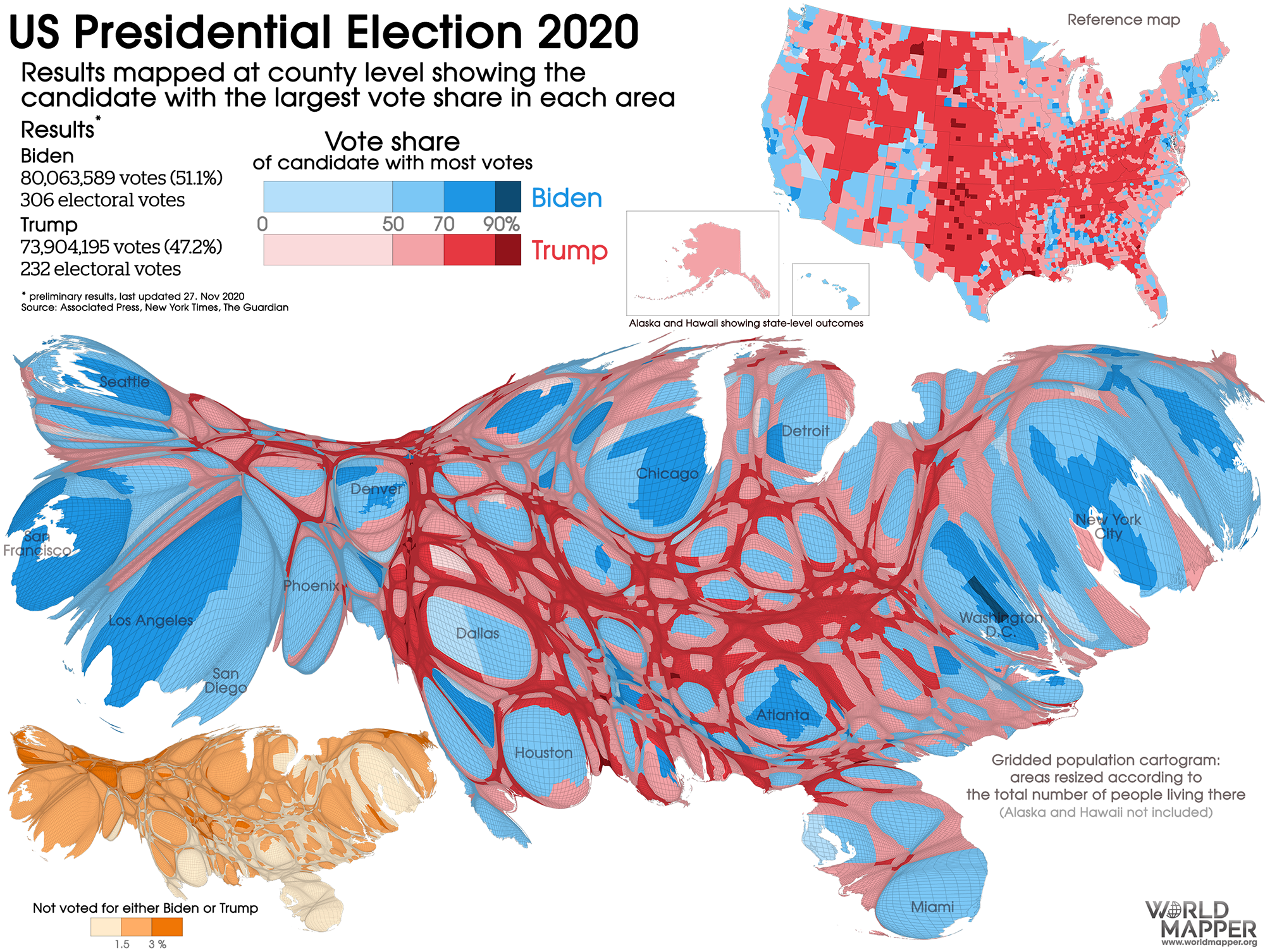
That’s the rural-urban divide in one neat picture.
Most of the red counties literally have more cattle or pigs than voters.
That looks like a medical diagram of the circulatory system of some weird alien animal.
It’s the endocrine system of a xenomorph!
The problem is that under the Senate and the EC system, the empty dirt votes. And votes hard-red.
I use that very map (a cartogram) in my classes.
Anyway… Brazil, no? Lula pulled a Grover Cleveland just a year ago at most, right?
That is not what “sic” is used for at all.
This person doesn’t know what a pun is; I am not at all surprised that he/she doesn’t know what (sic) means either. But you know people here are sooo dumb as to correct the botched lyrics when it’s “obviously” a “pun.”
Classy.