Magic Hat is a fairly large microbrewer based in Vermont and owned by a large company in Costa Rica. West 6th Brewing Company is a tiny brewer in Lexington, KY that opened in 2012 and distributes two of its beers regionally in cans.
Magic Hat is suing West 6th because they claim that West 6th’s logo is too similar to that of its #9, that it was intentional, and that this has caused Magic Hat irreparable harm. They’re asking for damages plus all the profit that West 6th has made up to this point–which, incidentally, is none at all.
What do you think? Are the logos really that similar, and either way does Magic Hat have a lawsuit here?
I can’t possibly be objective here; I’m a fan of West 6th. They’ve been great for Lexington, turning part of an old bread factory in a very unfashionable part of town into a social focus for a city that kind of needed one. They’ve also revitalized the craft beer scene in town, treating the other new breweries that have sprung up in their wake as colleagues. I’ve met the owners and as far as I can tell they’re the real thing.
So that said, my opinion is that the logos have some similarities, but not so close that it’s confusing. The idea that West 6th has done any substantial harm to Magic Hat seems fairly silly to me. At the same time, I have a hard time understanding what Magic Hat has to gain from all this; West 6th isn’t big enough to really hurt Magic Hat’s volume, and West 6th’s canned beers are unlike anything in the Magic Hat line.
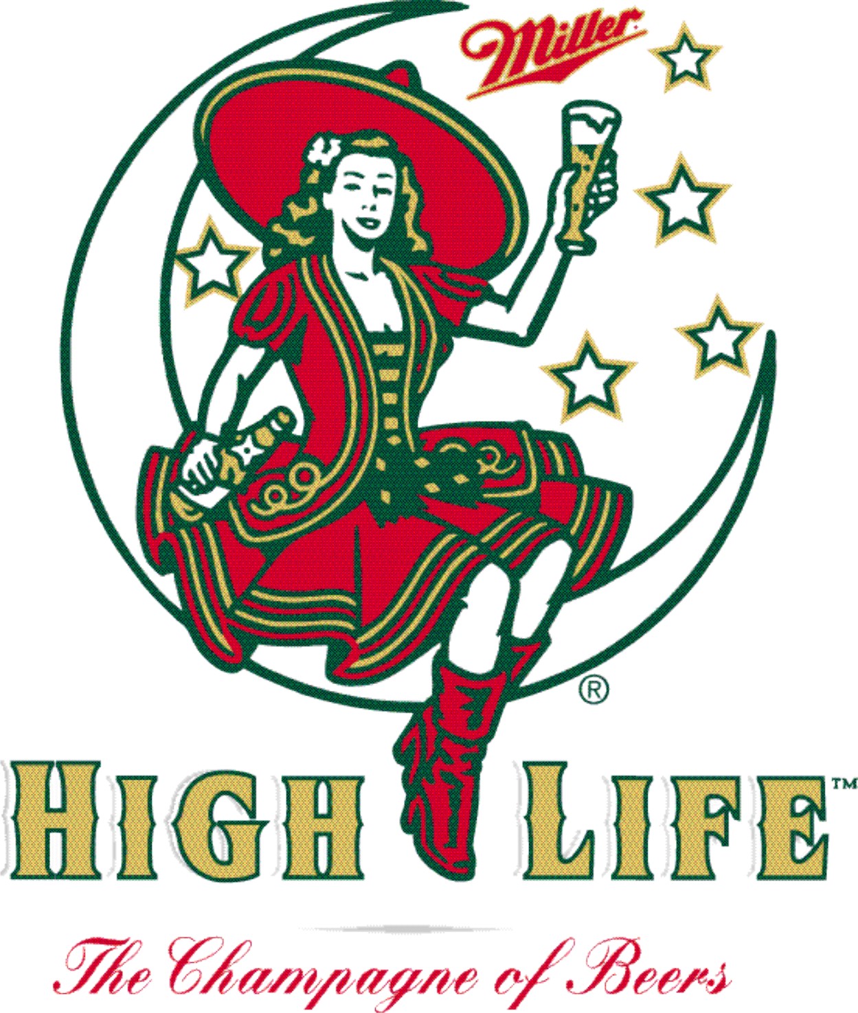
They are less similar than this motif (the ovoid circle of words, with the name across the centre), which dominates the beer industry and nobody seems to care.
I didn’t read the article, so maybe this is mentioned (and hopefully it is), but that’s not Magic Hat’s logo. That’s the logo they use for one specific beer (#9).
Having said that, I don’t think they look at all alike. All West 6th is going to have to do is find someone that knows fonts (a good graphic artist should do) and have the explain the differences. I can spot a few just looking at them. After that, a lawyer should be able to ask the jury if Magic Hat is going to be able to (successfully) sue every company that has a number in their name or just beer companies that use nines or sixes?
ETA, I didn’t see the start in the MH logo until now, that makes them a bit more similar…but still.
I guess the question is, if I sent you to the store for some Magic Hat #9 and described the box to you, would you pick up that one by accident? If you might, that MH has a case.
Here’s a rule of thumb that has served me well over the years in deciding whether or not logos can be regarded as similar for the purposes of an infringement suit (N.B. The issue of similarity of logos also arises in cases other than infringement suits, and the standard of “similarity” in those other cases may be different).
If you were to ask your grandmother to go down to the corner store and pick up a box of X, and you explained to her how to identify the product - (e.g., “It says PRINGLES in yellow lettering and there’s a cartoon face of a guy with a big mustache”) - and then you remember product Y, and tell your grandmother not to bother because you suddenly realise that there’s a good chance that she’s going to mistakenly buy product Y instead, you’ve got a good case for satisfying the general requirement of infringement (which is usually something like there must be potential or actual confusion among customers in the marketplace).
Disclaimer: I have not read anything about this case, but looking at the two products in the links shown above by joey P, I think the entire packaging, taken as a whole, are not similar to each other at all. There may be other examples of packaging, where only the round logos are visible, I don’t know, and in that case, my opinion might be different.
And since it hasn’t really been mentioned, if you look at my Magic Hat link, the label on the bottle neck is their actual logo, not the #9. I don’t know how big of a difference that makes, but it might be worth pointing out. Beers, specifically micros and crafts, are a bit unique in that often times each beer (from the same brand) will have it’s own logo or at least something to set it apart from the other beers. Unlike a macro beer where they use the same everything and just change the wording from one type to the next.
I didn’t think they were too similar until I noticed the star. If you go to the Magic Hat web site the star looks to be a common theme in most (but not all) of their beers. Here is a prime example.
But A)That doesn’t mean that no one else can use a star and B)West 6th is using a different star and their star doesn’t have a moon in it. Maybe Miller should sue Magic Hat for using the crescent moon in their logo.
Magic Hat has responded to the controversy, since their Facebook page was (and is) being carpet-bombed over this. They claim that West 6th had agreed to make some changes but are now “going back on their word”.
That’s not how I read the letters they posted at all. West 6th offered to make some changes, Magic Hat didn’t consider them sufficient, and there was negotiation happening. The last letter includes another such offer from West 6th, but there’s no letter from Magic Hat saying that they would accept those terms.
(I don’t know how this squares with the claim from West 6th that they “tried to reach out to them individually to see if there was any way to resolve the amicably, but to no surprise, no one ever called us back”. I suspect this means they tried to go around the lawyers, which is rarely a good idea once lawyers are involved.)
That’s my feeling . . . not that someone would confuse the two specific beers, but that the branding is similar enough that, put the two on a shelf next to each other, and one could easily assume they are from the same brewer.
I live within the shadow of Lexington and enjoy West 6th beers (although I slightly prefer Country Boy’s beers), so I’m obviously biased. I will note that my local bar has taken Magic Hat off tap and is considering also removing any other North American Brewery products as well. (I’ll be up in Lexington in about half an hour; I may stop by West 6th just to show my support… and, uh, drink some lunch.)
I am not a lawyer, but I did work at a film studio in the Copyright & Trademark department.
I believe the basic premise for any infringement lawsuit is the danger of confusion by any consumer. If you can prove someone might be confused or tricked into buying another product, due to the similarities in trademark/logo, you have a case.
I personally don’t think I could be tricked into confusing either of these. Different colors, different numbers, one is a more cluttered design and the other is cleaner…so I think it will be hard to prove anyone accidentally bought the wrong product due to similarities.
If the West 6th logo had all of those squigglies around the number like the Magic Hat #9 one does then I could see the case. As it is, though, no. All they are is “a number in a circle, with a star involved somehow”, and even that’s not a very good description of the Magic Hat one, where the squiggles make it hard to see the number.